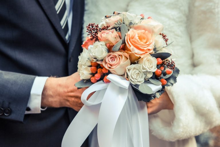
Best Wedding Signage Fonts Guide for 2026 Trends & Tips

Best Wedding Signage Fonts for a Stunning Celebration in 2026
Estimated Reading Time: 7 minutes
- Prioritize legibility to enhance guest experience.
- Reflect your theme through font choices for cohesiveness.
- Pair fonts wisely to create visual balance and hierarchy.
- Limit font selections to maintain a clean aesthetic.
- Ensure signage materials enhance rather than hinder readability.
Table of Contents
- Why Wedding Signage Is More Than Just Direction
- Popular Types of Wedding Signage
- Decoding Font Categories for Wedding Signs
- Elegant Script Fonts: The Essence of Romance
- Timeless Serif Fonts: Classic Sophistication
- Modern Sans-Serif Fonts: Sleek and Minimalist
- Playful Display & Novelty Fonts (Used Sparingly)
- Expert Insights: Choosing the Right Fonts for Your Wedding Signs
- Consider the Signage Material and Medium
- Reflect Your Personal Style
- Practical Planning Advice for Wedding Signage
- Real Wedding Inspiration: Fonts in Action
- Elevating Your Event with Cohesive Wedding Branding
- Key Takeaways for Brides
- Frequently Asked Questions (FAQ)
Why Wedding Signage Is More Than Just Direction
Wedding signage is far more than just a functional detail; it’s a pivotal design element that enhances your wedding’s aesthetic, guides your guests, and reinforces your chosen theme. In 2026, the careful selection of best wedding signage fonts is crucial for creating a cohesive and memorable guest experience. From elegant welcome signs to modern bar menus, the typography you choose speaks volumes about your celebration’s style, setting the tone from the moment guests arrive. This comprehensive guide will explore the top font trends, essential design tips, and practical advice to help you select the perfect typography for your wedding signs.
Popular Types of Wedding Signage
The scope of wedding signage is vast, offering countless opportunities to infuse your personality and theme into every corner of your event. Each type of sign benefits from thoughtful font selection to ensure both beauty and functionality.
- Welcome Signs: Often the first visual touchpoint for guests, setting the overall tone. An elegant wedding signage font here can make a grand statement.
- Seating Charts & Escort Cards: Essential for guiding guests to their tables. Legibility is paramount, often pairing a decorative font with a clean, readable one.
- Bar Menus & Food Station Labels: Informative yet stylish, reflecting the culinary experience. A modern wedding sign typography often suits these best.
- Directional Signs: Guiding guests to parking, restrooms, or ceremony/reception areas. Clarity is key.
- Guestbook & Card Table Signs: Gentle reminders for guests on where to leave well wishes and gifts.
- Favors & Dessert Bar Signs: Adding charm to sweet treats and thoughtful takeaways.
- Photo Booth & Hashtag Signs: Encouraging guest interaction and sharing.
- Table Numbers: Both decorative and functional, often using unique or subtle fonts.
Decoding Font Categories for Wedding Signs
Understanding the different categories of fonts is the first step in making informed choices for your wedding signage. Each category brings a distinct personality and aesthetic, suitable for various elements and overall themes.
Elegant Script Fonts: The Essence of Romance
Script fonts are the quintessential choice for couples seeking a romantic, luxurious, and personal touch. Mimicking elegant handwriting or calligraphy, these fonts instantly evoke a sense of tradition and sophistication.
- Characteristics: Flowing lines, graceful swashes, interconnected letters (or appearing so). Often found in formal invitations and calligraphy fonts for wedding signs.
- Pros: Highly decorative, conveys romance and elegance, perfect for names, dates, or short, impactful phrases. Adds a bespoke, handcrafted feel.
- Cons: Can be difficult to read in all-caps or small sizes, especially from a distance. Overuse can make signage appear cluttered.
- Design Tips: Best used for headlines, names, or key phrases on wedding welcome sign fonts. Always pair with a simpler, highly legible serif or sans-serif font for body text or detailed information to ensure clarity.
Timeless Serif Fonts: Classic Sophistication
Serif fonts, characterized by the small decorative strokes (serifs) at the ends of their letterforms, exude timeless elegance, tradition, and authority. They are incredibly versatile and remain a strong contender for wedding signage in 2026.
- Characteristics: Clear, traditional, sophisticated, often with varying stroke widths. Excellent readability.
- Pros: Inherently classic and formal, highly legible for longer passages of text (e.g., menu descriptions, program details). Creates a grounded, refined look.
- Cons: Some serif fonts can feel overly traditional or dated if not chosen carefully to match a contemporary aesthetic.
- Design Tips: Excellent for main information blocks, body text, or for a classic, understated headline. They pair beautifully with both ornate scripts and clean sans-serifs, offering a strong foundation for your typographic hierarchy.
Modern Sans-Serif Fonts: Sleek and Minimalist
Sans-serif fonts, lacking the decorative strokes of serifs, are celebrated for their clean lines, modern aesthetic, and superb legibility. They are a staple for contemporary, minimalist, and industrial wedding themes.
- Characteristics: Clean, uncluttered, often geometric or humanist in form. Exceptional readability across various sizes and distances.
- Pros: Modern, versatile, incredibly legible, and adaptable to virtually any wedding style from ultra-modern to rustic chic. Ideal for large blocks of text or where clarity is paramount.
- Cons: Can sometimes appear too stark or casual if not balanced with other design elements or a complementary font.
- Design Tips: Perfect for body text, detailed information on seating charts, bar menus, or as the primary headline font for a truly minimalist aesthetic. Their clean lines make them ideal for acrylic wedding sign fonts or sleek metal signage.
Playful Display & Novelty Fonts (Used Sparingly)
Display and novelty fonts are designed to catch the eye and are often highly stylized. They can add a unique personality or a whimsical touch when used judiciously.
- Characteristics: Highly distinctive, often theme-specific (e.g., vintage, art deco, quirky hand-drawn).
- Pros: Adds immense character and can reinforce a specific niche theme. Great for single words or very short phrases.
- Cons: Often have poor legibility, especially for extended text. Can quickly become overwhelming or dated if not used carefully.
- Design Tips: Reserve these for small accents, a single impactful word, or a specific graphic element within your signage design. Never use them for critical information.
Expert Insights: Choosing the Right Fonts for Your Wedding Signs
Selecting the perfect fonts for your wedding signage is an art that blends aesthetics with practicality. Here’s what design experts consider:
Legibility Is Paramount
No matter how beautiful a font is, if it can’t be read easily, it fails its primary purpose. This is especially true for signage, which guests might view from various distances, in different lighting conditions, and sometimes on the move.
- Distance: Consider how far guests will be from the sign. What looks great up close might be illegible from ten feet away.
- Contrast: Ensure strong contrast between the font color and the background. Light text on a dark background or vice versa.
- Size: Don’t be afraid to go large. Important information needs to be clearly visible.
Harmonize with Your Overall Wedding Branding
Your wedding signage should not exist in a vacuum. It’s a key piece of your overall wedding branding, which also includes your invitations, wedding website, programs, and even favors. The fonts you choose for your signs should ideally complement or be a continuation of the typography used in your other wedding stationery. This creates a cohesive and professional look that ties all elements of your celebration together. Consistency in font choices helps reinforce your wedding theme and makes your event feel thoughtfully curated.
Font Pairings: The Art of Contrast and Complement
Mastering font pairings is crucial for dynamic and balanced signage. The goal is to choose fonts that complement each other without competing for attention.
- Contrast is Key: A common and highly effective strategy is to pair a decorative font (like a script or a bold display font) with a simple, highly legible one (like a serif or sans-serif). For example, using an ornate calligraphy font for wedding signs for the couple’s names and a clean sans-serif for the date and location.
- Limit Your Choices: Stick to a maximum of two or three fonts per sign, and ideally for the entire wedding branding. Too many fonts create visual chaos.
- Hierarchy: Use different fonts, sizes, and weights to create a clear hierarchy of information, guiding guests’ eyes to the most important details first.
Consider the Signage Material and Medium
The material on which your sign is displayed significantly impacts how a font appears and its overall legibility.
- Acrylic Signs: Often require clean, crisp fonts. Acrylic wedding sign fonts benefit from bold, clear lines that stand out against the transparency.
- Wood Signs: Can lend themselves to both rustic scripts and strong, etched sans-serifs. Wood wedding sign fonts might look best with slightly thicker strokes to prevent them from getting lost in the grain.
- Mirrors: Similar to acrylic, often demand bold, contrasting fonts.
- Chalkboards: Offer a hand-drawn aesthetic, where slightly irregular or brush-script fonts can shine.
- Fabric/Banners: Need fonts that remain clear even when slightly textured or draped.
Reflect Your Personal Style
Ultimately, your wedding signage should be a reflection of your unique love story and personal style.
- Classic & Traditional: Opt for elegant serif fonts paired with graceful scripts.
- Modern & Minimalist: Clean sans-serifs are your best friend, possibly with subtle geometric details.
- Bohemian & Rustic: Think hand-lettered styles, organic sans-serifs, or slightly distressed fonts.
- Whimsical & Playful: Incorporate a charming display font for accents, balanced with a simple, readable secondary font.
Exploring a wide range of creative wedding sign fonts allows you to truly personalize every detail.
Practical Planning Advice for Wedding Signage
Beyond the design, the practical aspects of planning your wedding signage are equally important for a seamless execution.
- Budgeting: Custom signage, especially with specialized materials or hand-calligraphy, can add up. Factor this into your overall decor budget. DIY can be cost-effective but requires time and effort to maintain quality.
- Working with Vendors: Communicate clearly with your stationery designer, calligrapher, or sign maker. Provide examples of fonts you like and ensure they understand your overall vision. Ask for mock-ups before final production.
- Proofreading is Crucial: Double-check every single word, name, date, and time on your signs. Even minor errors can be costly or embarrassing. Have multiple people proofread!
- Timeline: Custom signage takes time to design, produce, and often ship. Plan to finalize designs several months before the wedding to avoid last-minute stress.
Real Wedding Inspiration: Fonts in Action
Seeing how fonts are applied in real wedding scenarios can spark your own inspiration for best wedding signage fonts 2026.
- Classic Elegance: Imagine a grand wedding welcome sign fonts on a mirror, with the couple’s names in a sweeping script like “Great Vibes” or “Lavanderia,” paired with a refined serif like “Playfair Display” for the date and venue. This evokes timeless romance.
- Boho Chic: A rustic wood wedding sign fonts guiding guests to the ceremony, featuring a whimsical, slightly irregular sans-serif like “Quicksand” or “Montserrat Light,” perhaps with a hand-drawn arrow detail. This creates an inviting, relaxed atmosphere.
- Modern Minimalist: A sleek acrylic wedding sign fonts for a bar menu, utilizing a clean, geometric sans-serif such as “Open Sans” or “Lato” in varying weights for headings and details. This design is sophisticated, clear, and perfectly aligns with a contemporary aesthetic.
- Urban Industrial: Consider a bold, condensed sans-serif like “Oswald” for directional signs, spray-painted onto reclaimed wood or metal. Paired with a simpler font for subtext, this creates a strong, edgy look.
Elevating Your Event with Cohesive Wedding Branding
Beyond individual pieces like signage or invitations, the true magic lies in cohesive wedding branding. This holistic approach ensures every visual element speaks the same language, creating an immersive and unforgettable experience for your guests. Your chosen elegant wedding signage fonts and modern wedding sign typography are direct extensions of this brand.
A strong wedding brand starts with a thoughtful wedding logo ideas and a curated color palette, which then informs everything from your stationery suite to your floral arrangements and, of course, your signage. Typography acts as a consistent thread, connecting these diverse elements. When your invitation suite features a sophisticated script and sans-serif pairing, those same fonts, or complementary ones, should appear on your welcome sign, seating chart, and even your custom cocktail napkins. This level of detail communicates intentionality and luxury. For couples and designers exploring a vast array of options to perfect their wedding branding, resources such as those found at https://fonts.wedding can be invaluable for discovering the ideal wedding typography trends and font combinations.
Key Takeaways for Brides
- Prioritize Legibility: Always ensure your chosen fonts are easy to read, especially from a distance and in various lighting conditions.
- Match Your Theme: Select fonts that truly reflect your wedding’s overall style, whether it’s classic, modern, rustic, or whimsical.
- Embrace Font Pairing: Combine a decorative font (script) with a simpler, clean font (serif or sans-serif) for balance and visual hierarchy.
- Limit Your Choices: Stick to 2-3 primary fonts across all your wedding elements to maintain a cohesive look.
- Consider the Material: The sign’s material (acrylic, wood, mirror) can influence how a font appears and its readability.
- Proofread Meticulously: Avoid costly errors by carefully checking every detail on your signage before production.
- Integrate Branding: Ensure your signage fonts align with your overall wedding stationery and branding for a polished, unified aesthetic.
Frequently Asked Questions (FAQ)
Q1: What are the most popular fonts for wedding signs in 2026?
A1: In 2026, popular choices for best wedding signage fonts continue to lean towards elegant scripts (like “Lovely Friday” or “Brighmore”), timeless serifs (“Playfair Display,” “Crimson Text”), and clean, modern sans-serifs (“Montserrat,” “Lato,” “Open Sans”). The trend is often to pair one decorative font with a highly legible, simple font.
Q2: How many fonts should I use on my wedding signage?
A2: For optimal design and legibility, it’s best to use no more than two to three fonts on any given piece of wedding signage. This typically involves a primary font for headlines or names and a secondary, more legible font for body text or details.
Q3: Should my wedding signage fonts match my invitation fonts?
A3: While they don’t have to be identical, your wedding signage fonts should absolutely complement and harmonize with your invitation fonts. This creates a cohesive “wedding brand” that provides a unified visual experience for your guests across all touchpoints.
Q4: What’s the best font for a DIY wedding sign?
A4: For DIY wedding signs, especially those using stencils or hand-painting, highly legible and slightly bolder sans-serifs or classic serifs work well. Fonts like “Open Sans Bold,” “Bebas Neue,” or even a simple “Times New Roman” can be effective if you’re aiming for crisp lines. For a more rustic hand-lettered look, practicing with a simple brush script can be rewarding.
Q5: How can I ensure my signage is legible from a distance?
A5: To ensure distance legibility, choose fonts with clear, uncluttered letterforms and good spacing. Opt for larger font sizes, ensure high contrast between the text and background colors, and avoid overly thin or intricate script fonts for critical information that needs to be read from afar. Simple, bold sans-serifs are often the safest bet for maximum readability.