Wedding Color Palettes 2026 Guide with Best Ideas


Wedding Color Palettes 2026: Selecting Harmonious Hues That Reflect Your Vision and Stand the Test of Time
Estimated reading time: 18 minutes
Key takeaways:
- Wedding color palettes should reflect your personal style, emotional associations, and celebration vision rather than simply following trends.
- Successful palettes balance psychology, lighting, materials, and application across stationery, décor, florals, attire, and photography.
- Timeless combinations like navy and white, cream and green, or black and gold create beauty that lasts well beyond the wedding day.
- Testing colors in real venue lighting and on actual materials is essential for avoiding unexpected results.
- Restraint, contrast, and thoughtful accent use help create cohesive palettes that feel polished and memorable.
Table of contents
- Understanding Color Psychology and Emotional Communication
- Evaluating Personal Color Resonance
- Developing Harmonious Color Palettes
- Color Application Across Celebration Elements
- Lighting Considerations and Color Perception
- Skin Tone and Fashion Coordination
- Common Color Palette Mistakes
- Budget Considerations for Color Palette
- Timeline for Color Selection
- FAQ
Understanding Color Psychology and Emotional Communication
Color profoundly influences mood, perception, and emotional response. In weddings, color is often the first emotional signal guests notice, shaping the tone of the entire experience.
Primary Color Psychology
Red — passion, energy, romance
- Intense, dramatic, attention-commanding color
- Communicates passion, love, and excitement
- Can feel overwhelming if overused
- Works beautifully as an accent or bold primary color
- Sophisticated in deeper shades such as burgundy, wine, and crimson
- Modern in bright, saturated versions
Blue — calm, trust, stability
- Universally appealing and psychologically calming
- Communicates trust, reliability, and peace
- Navy feels formal and traditional
- Lighter blues feel fresh and contemporary
- Aqua and teal feel modern and artistic
- Universally flattering for most skin tones in photography
Green — nature, growth, renewal
- Calming, natural, organic quality
- Communicates sustainability, growth, and renewal
- Sage and muted greens feel sophisticated
- Emerald and jewel greens feel luxurious
- Brings outdoor vitality to interior celebrations
- Increasingly popular for nature-conscious couples
Yellow — joy, optimism, warmth
- Cheerful, energetic, optimistic
- Communicates happiness and positivity
- Can feel juvenile if overused or too bright
- Soft, pale yellows feel elegant and warm
- Golden yellows feel luxurious and romantic
- Limited use as an accent creates impact
Purple — creativity, spirituality, luxury
- Sophisticated, artistic, imaginative quality
- Communicates creativity, mystery, and luxury
- Deep purples such as plum and eggplant feel elegant and formal
- Lavender feels romantic and whimsical
- Mauve feels contemporary and refined
- Increasingly popular for artistic, creative couples
Pink — romance, femininity, tenderness
- Romantic, soft, delicate quality
- Communicates love, romance, and compassion
- Pale pinks feel gentle and romantic
- Blush feels sophisticated and contemporary
- Deeper magentas feel bold and modern
- Works beautifully across gender presentations in contemporary celebrations
Orange — warmth, creativity, enthusiasm
- Warm, energetic, creative quality
- Communicates enthusiasm, warmth, and optimism
- Can feel overwhelming if overused
- Burnt orange feels earthy and sophisticated
- Coral feels fresh and contemporary
- Works beautifully as an accent color
Neutrals — foundation and balance
- White — purity, cleanliness, simplicity; may appear cold or sterile without warmth
- Cream — warmth, softness, elegance; a sophisticated alternative to stark white
- Gray — sophistication, balance, calm; ranges from cool to warm depending on undertones
- Beige — warmth, earthiness, neutrality; safe but potentially boring without strategic use
- Black — drama, formality, sophistication; adds contrast and definition
Color is not just decorative. It is emotional communication, visual structure, and one of the clearest ways to express your celebration’s identity.
Evaluating Personal Color Resonance
Authentic color selection reflects genuine couple preferences. The most successful palettes feel personal, not performative.
Visual Preference Assessment
Clothing analysis helps reveal what colors naturally suit and energize you:
- What colors do you naturally gravitate toward wearing?
- What colors make you feel confident and attractive?
- What colors appear frequently in your closet?
- Do you prefer warm tones such as gold, orange, and warm red, or cool tones such as silver, blue, and cool red?
- What colors photograph well on you?
These natural preferences reveal authentic color alignment.
Home décor reflection often exposes your deeper aesthetic instincts:
- What colors dominate your home?
- What colors appear in artwork or furnishings?
- Do you prefer bold statement walls or neutral palettes?
- What colors create spaces where you feel most comfortable?
- What aesthetic do your spaces communicate?
Your home environment reveals authentic taste beyond momentary trends.
Emotional color associations add meaning to your palette:
- What colors evoke positive emotions for you?
- Do specific colors connect to meaningful experiences or memories?
- What colors align with the celebration mood you envision?
- Do colors relate to your relationship story or values?
- What emotional response do you want guests to experience?
Personal associations ensure color selections feel authentically meaningful.
Trend Analysis and Timelessness
Current trends recognition can help inform decisions without controlling them:
- Sage green appears frequently in 2026 celebrations
- Jewel tones such as emerald and sapphire remain consistently sophisticated
- Blush pink maintains romantic appeal
- Navy blue endures as a classic formal choice
- Metallics such as gold and rose gold remain the luxury standard
Recognize trends without surrendering authentic preference.
Timeless color combinations age beautifully and photograph well for years:
- Navy and white: timeless, traditional, enduring
- Black and gold: sophisticated, luxurious, ageless
- Cream and green: natural, romantic, eternally relevant
- Burgundy and gold: formal, elegant, timeless
- Blush and gray: contemporary, romantic, enduring
- White and jewel tone: sophisticated, striking, classic
Timeless combinations ensure photographs remain beautiful years later.
Developing Harmonious Color Palettes
Successful palettes require thoughtful coordination. The goal is not just beauty, but visual coherence across every element of the celebration.
Color Palette Structures
Monochromatic palette — a single color in varied intensities
Approach: Select one primary color, then use lighter and darker variations.
Example: Sage green monochromatic
- Light sage: stationery, linens
- Medium sage: accent walls, floral
- Dark sage: formal elements, signage
Strengths: Sophisticated, cohesive, minimalist
Considerations: Requires variation in texture and material to prevent monotony
Analogous palette — adjacent colors on the color wheel
Approach: Select 2–3 colors positioned next to each other on the color wheel.
Example: Blue-green analogous
- Navy blue: formal elements
- Teal: accent pieces
- Sage green: natural elements
Strengths: Harmonious, naturally coordinated, creates flow
Considerations: Less contrast than complementary palettes
Complementary palette — opposite colors on the color wheel
Approach: Pair colors directly across from each other for maximum contrast.
Example: Emerald and gold complementary
- Emerald green: primary color
- Gold: accent and luxury element
- White: balance and breathing room
Strengths: High visual impact, dramatic, memorable
Considerations: Requires careful balance to prevent an overwhelming appearance
Triadic palette — three equally spaced colors
Approach: Select three colors equally positioned around the color wheel.
Example: Blue, yellow-orange, red-purple triadic
- Navy blue: formal base
- Coral: warm accent
- Plum: secondary accent
Strengths: Vibrant, balanced, distinctive
Considerations: Requires careful intensity management to prevent a chaotic appearance
Neutral plus accent — neutral foundation with color emphasis
Approach: Establish a neutral base such as white, cream, or gray, then add single or dual accent colors.
Example: Cream, burgundy, and gold
- Cream: primary, stationery, linens
- Burgundy: accent color, florals, signage
- Gold: metallic accent, luxury touches
Strengths: Sophisticated, flexible, timeless
Considerations: Success depends on accent color quality and application restraint
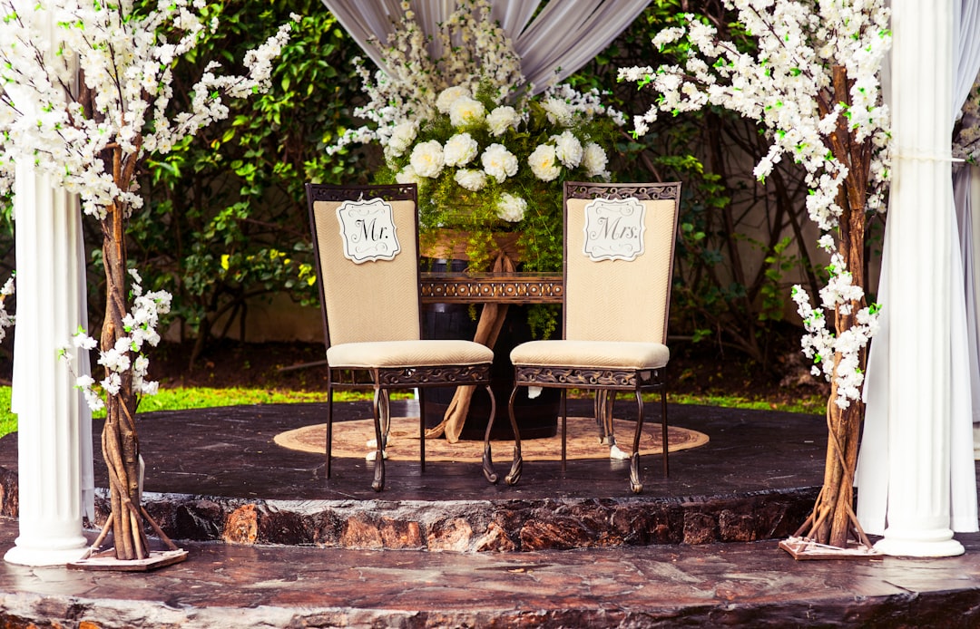
Specific Palette Recommendations for 2026
Classic Luxury Palette — emerald and gold
- Deep emerald green: sophisticated, luxurious, natural
- Gold metallic: warmth, luxury, elegance
- Cream or white: balance, breathing room
- Psychological effect: sophisticated, nature-connected, luxury
Contemporary Romance Palette — blush and sage
- Blush pink: romantic, contemporary, soft
- Sage green: natural, calming, organic
- White: balance, simplicity, breathing room
- Psychological effect: romantic, modern, organic
Bold Statement Palette — sapphire and rose gold
- Sapphire blue: striking, sophisticated, dramatic
- Rose gold: warmth, femininity, luxury
- White: balance, contemporary, breathing room
- Psychological effect: bold, modern, glamorous
Organic Minimalism Palette — warm neutrals
- Cream: warmth, softness, sophistication
- Warm beige/taupe: natural, earthy, grounding
- Minimal accent: single metallic or subtle color
- Psychological effect: natural, minimalist, organic
Jewel Tone Elegance Palette — mixed jewels
- Primary jewel such as emerald, sapphire, or amethyst: luxury, sophistication
- Secondary jewel: complementary shade for depth and interest
- Gold or metallic accent: warmth, luxury
- Psychological effect: rich, artistic, luxurious
Playful Contemporary Palette — unexpected combinations
- Dusty mauve: contemporary, artistic, soft
- Mustard yellow: warmth, creativity, energy
- Navy blue: grounding, contrast, stability
- Psychological effect: creative, confident, distinctive
Color Application Across Celebration Elements
Strategic color application creates a cohesive visual experience. Color should feel intentional from the first invitation to the final photo.
Invitation and Stationery Application
Cardstock color sets the foundation of the visual impression:
- White: clean, formal, traditional
- Cream: warm, elegant, timeless
- Colored cardstock: bold statement, personality expression
- Pale shade of accent color: subtle introduction to palette
Ink color selection communicates through printing:
- Black: traditional, readable, formal
- Dark shade of primary color: cohesive, intentional
- Metallic ink: luxury, sophistication, elegance
- Light ink on dark cardstock: dramatic, contemporary
Design accent application should be strategic:
- Monogram in primary color
- Metallic foil in accent color
- Subtle color blocking or borders
- Header or footer elements in accent color
- Creates visual interest while maintaining sophistication
Reception Space Application
Linens and textiles create large-scale color impact:
- Tablecloths in primary or neutral color
- Napkins in accent or complementary color
- Runners or overlays adding color dimension
- Chair covers or sashes adding accent color
- Creates visual foundation for reception aesthetic
Floral and botanical design brings color through nature:
- Flowers selected in palette colors
- Greenery supporting the primary palette
- Arrangements creating color focal points
- Balance between color-heavy and minimal florals
- Botanical elements conveying the palette authentically
Lighting and atmosphere affect color perception dramatically:
- Warm lighting makes colors feel inviting
- Accent lighting highlights color focal points
- Cool lighting emphasizes jewel tones
- Colored uplighting, used sparingly, reinforces the palette
- Lighting dramatically affects how colors appear
Décor elements reinforce the palette through details:
- Signage incorporating palette colors
- Décor items in accent colors
- Candles, glassware, and serving pieces in palette colors
- Details creating color reinforcement throughout
- Thoughtful placement creating intentional emphasis
Food and Beverage Presentation
Cake and dessert design often becomes the visual centerpiece:
- Cake frosting in palette colors
- Flowers or decorative elements in accent colors
- Color coordination with the overall aesthetic
- Creates an elegant visual focal point
- Photographed extensively throughout the celebration
Cocktail presentation adds color through beverages:
- Signature cocktails incorporating palette colors
- Glassware selection supporting the aesthetic
- Garnishes in palette-appropriate colors
- Creative color through thoughtful mixology
- Photo-worthy elements supporting the brand
Food plating can also echo the palette:
- Plate presentation incorporating palette colors
- Colorful ingredients creating visual interest
- Chef coordination with the overall aesthetic
- Elegant, artistic presentation
- Details demonstrating thoughtfulness
Photography and Visual Documentation
Location selection should support rather than compete with the palette:
- Neutral backdrops allow outfit colors to shine
- Garden or natural settings complement many palettes
- Architecture should coordinate with the color selection
- Thoughtful location selection enhances the palette
Styling and wardrobe coordination create color harmony:
- Wedding attire coordinating with the palette
- Bridesmaid dresses in palette colors or complementary shades
- Groomsmen attire supporting the overall aesthetic
- Guest guidance suggesting palette colors
- Coordinated appearance creating visual harmony
Edited photography aesthetic ensures consistency:
- Photo editing reflecting the palette colors
- Consistent color correction across the gallery
- Saturation levels supporting the aesthetic
- Warm or cool color temperature aligned with the palette
- Professional editing ensuring visual cohesion
Lighting Considerations and Color Perception
Lighting dramatically affects how colors appear. A palette that looks beautiful in daylight may feel very different under candles or reception lighting.
Lighting Type Effects
Natural daylight offers the most accurate color representation:
- Morning light creates warm, golden tones
- Afternoon light creates bright, neutral tones
- Golden hour creates warm, flattering tones
- Photographically beautiful lighting
- Consider time of day when selecting colors
Warm white lighting adds a yellowish tone in the range of 2700K–3000K:
- Makes colors appear warm and inviting
- Enhances reds, oranges, and warm neutrals
- Makes cool colors such as blues appear less vibrant
- Creates an intimate, romantic atmosphere
- Most flattering for most color palettes
Cool white lighting has a bluish tone in the range of 4000K–5000K:
- Makes colors appear brighter and more saturated
- Emphasizes blues and cool tones
- Makes warm colors slightly less warm
- Creates a contemporary, crisp atmosphere
- Works beautifully for jewel tone palettes
Candlelight creates a warm, intimate glow:
- Extremely warm tone making colors appear golden
- Softens and romanticizes most colors
- Emphasizes warm palette colors beautifully
- Creates an intimate, romantic atmosphere
- Particularly flattering for blush, gold, and warm neutrals
Colored uplighting can be effective when used sparingly:
- Adds colored light to spaces
- Can enhance or distort palette colors
- Works best as a subtle accent, not a dominant element
- Test thoroughly before implementation
- Often unnecessary with a well-planned color palette
Color Testing and Approval
Material sampling helps verify actual appearance:
- Request samples of linens, flowers, and cardstock in proposed colors
- Review samples in celebration lighting conditions
- Assess appearance under both natural and artificial light
- Verify actual colors match approved samples
- Make adjustments before production if needed
Lighting simulation helps test the venue environment:
- Bring color samples to the actual venue
- Review appearance in venue lighting
- Test under different lighting scenarios
- Photograph samples in venue lighting
- Ensure colors function beautifully in the actual space
Photography review reveals how palettes behave in context:
- Review similar celebrations photographed in your palette
- Assess how colors appear in photography
- Verify the palette creates the desired mood and aesthetic
- Ensure colors photograph well
- Adjust if needed based on photographic appearance
Skin Tone and Fashion Coordination
Colors function differently depending on context and wearer, especially in attire and accessories.
Bridesmaid Dress Color Selection
Palette alignment helps keep the overall visual story consistent:
- Select shades within the overall palette
- Consider multiple dress colors if the palette permits
- Ensure colors complement bridesmaid skin tones
- Verify colors photograph beautifully
- Balance palette aesthetic with individual flattery
Fabric and finish can change how a color appears:
- Matte fabrics appear more subdued
- Satin finishes appear more vibrant
- Metallic sheens change color perception
- Fabric weight affects how color reads
- Test actual fabrics, not just color swatches
Photography appearance should be a major consideration:
- Select colors that photograph beautifully
- Avoid colors that appear washed out or unflattering
- Review similar colors in professional wedding photography
- Test colors in your celebration lighting
- Ensure colors maintain vibrancy in photos
Groom and Groomsmen Attire
Color coordination should support the overall palette without becoming rigid:
- Traditional approach: black, navy, or gray suiting
- Contemporary approach: suits in palette colors or neutrals
- Vest or boutonniere providing a color accent
- Tie color supporting the celebration palette
- Coordinated appearance without forced uniformity
Tie and accessory selection can reinforce the color story:
- Tie incorporating palette colors
- Pocket square adding an accent color
- Boutonniere including palette flowers
- Cufflinks or accessories supporting the aesthetic
- Small elements creating color reinforcement
Guest Color Guidance
Communication approach should guide without demanding:
- Traditional approach: specify formal attire without color restriction
- Contemporary approach: suggest palette colors or complementary shades
- Guidance encourages coordination without demanding compliance
- Color suggestions should inspire rather than mandate
- Respectful communication recognizes guest autonomy
Invitation messaging can make the suggestion subtle and elegant:
- “Cocktail attire, earth tones encouraged”
- “Formal attire in jewel tones welcome”
- “Garden party, bright colors encouraged”
- “Black-tie optional; navy or black preferred”
- Messaging that guides without demanding
Common Color Palette Mistakes
A well-chosen palette can be undermined by avoidable mistakes. Here are the most common issues to watch for.
- Excessive color complexity — Using too many colors creates visual chaos rather than sophistication. Limit palettes to 2–4 colors maximum, allowing one to dominate.
- Trendy combinations chosen for fashion rather than personal resonance — Colors selected only because they are currently popular often feel dated within months. Prioritize personal preference.
- Insufficient color testing — Failing to test colors in actual venue lighting or on actual materials can lead to unpleasant surprises.
- Poor color contrast — Insufficient contrast between text and background reduces readability. Ensure signage and invitations remain clear from intended distances.
- Ignoring undertones — Warm undertones and cool undertones may clash if mixed without care. Verify undertone consistency within palettes.
- One-dimensional palette application — Applying color uniformly without variation creates monotony. Use different saturations, materials, and elements to create interest.
- Overlooking metallics and accents — Gold and silver differ significantly, and warm and cool metallics must coordinate with the full palette.
Restraint communicates intentionality. A palette feels more luxurious when every color has a purpose.
Budget Considerations for Color Palette
Strategic color selection can help optimize your budget while still creating a polished result.
High-Impact, Budget-Friendly Approaches
Printing optimization can lower costs without lowering style:
- Single-color printing on premium cardstock costs less than multicolor
- Monochromatic palettes reduce printing complexity
- Metallic foil application creates a luxury impression affordably
- Strategic use of color reduces overall production costs
Natural color is often the most cost-effective:
- Natural wood tones require no finishing
- Garden flowers in palette colors reduce décor costs
- Existing venue architecture reduces decoration needs
- Natural elements provide color without additional expense
Limited color application creates impact with restraint:
- Apply accent color to high-impact areas
- Use a monochromatic approach with whites and metallics
- Choose a single floral color to reduce flower variety costs
- Place color strategically for maximum visual effect
Premium Color Investment
Specialty printing techniques can elevate the experience:
- Foil stamping creates a luxury impression
- Letterpress or thermography adds sophistication
- Specialty paper colors enhance the aesthetic
- Additional cost is justified by the visual impact
Premium flowers can make the palette feel distinctive:
- Unusual flower varieties in specific colors
- Exotic blooms may command premium prices
- Specialized florists can source unique colors
- Investment in florals can create memorable impact
Custom color matching ensures flawless cohesion:
- Professional color matching ensures consistency
- Custom paint mixing creates precise shades
- More expensive, but highly effective for branding coordination
- Essential for high-level visual consistency
Timeline for Color Selection
Strategic timing ensures thoughtful color development and avoids last-minute compromises.
12 months before
- Gather color inspiration and mood boards
- Analyze personal color preferences and aesthetic
- Research
FAQ
What is the best wedding color palette for 2026?
There is no single best option, but emerald and gold, blush and sage, and warm neutrals are especially strong 2026 choices because they balance sophistication, warmth, and timelessness.
How many colors should be in a wedding palette?
Most effective palettes use 2–4 colors maximum. This creates cohesion while allowing one color to dominate and others to support the overall look.
How do I choose a wedding color palette that feels timeless?
Start with your personal preferences, then look for combinations that have long-lasting appeal such as navy and white, black and gold, cream and green, or blush and gray.
Should I match my wedding colors to current trends?
You can be aware of trends, but your palette should primarily reflect your taste and celebration vision. Trend-driven choices alone often feel dated quickly.
Why does lighting matter so much for wedding colors?
Lighting changes how colors appear. Natural light, warm lighting, cool lighting, and candlelight all alter saturation, warmth, and contrast, so testing in your venue is essential.
How can I make sure my palette photographs well?
Choose colors with good contrast, test fabrics and samples in real light, and review examples from similar weddings. Professional editing also helps preserve color consistency.
What colors work best for a romantic wedding?
Blush, sage, cream, lavender, burgundy, and soft metallics often create a romantic feel, especially when paired with warm lighting and elegant textures.
Can I use bold colors and still keep the wedding elegant?
Yes. Bold colors such as emerald, sapphire, plum, or coral can feel elegant when balanced with neutrals, used with restraint, and coordinated across all details.
Do metallics count as part of the color palette?
Absolutely. Gold, silver, rose gold, and other metallics have a major effect on the overall aesthetic and should be chosen intentionally to match the palette’s undertones.
What is the safest choice if I want a flexible, budget-friendly palette?
A neutral base with one accent color is usually the most flexible and budget-friendly approach. It reduces printing complexity, simplifies décor, and still looks polished.