Practical Talent Acquisition Tips for Timeless Wedding Fonts


How to Choose Timeless Wedding Fonts: Top Tips for Brides and Wedding Planners
Estimated Reading Time: 7 minutes
- Choosing the right fonts can set the mood for your wedding.
- Consistency across all materials enhances professionalism.
- Legibility is crucial to ensure important details stand out.
- Stay true to your wedding theme with thoughtful font pairings.
- Utilize design best practices for flawless printing results.
Table of Contents
- Why wedding fonts matter (and why they’re more than decoration)
- Core principles for selecting timeless wedding fonts
- Font choices by wedding theme (examples and pairings)
- Technical considerations and printing best practices
- Monograms, wedding logos, and signage: design with motion and scale in mind
- Actionable checklist for brides and women (practical takeaways)
- How wedding planners and designers can use fonts strategically
- Case example: Turning a rustic boho brief into a cohesive visual suite
- How our consulting and design expertise supports your wedding vision
- Download fonts and get started
- Related video resource
- Images to inspire your typography choices
- Final notes and next steps
Why wedding fonts matter (and why they’re more than decoration)
First impressions: Your invitation is often the first clue guests get about your wedding style. The font communicates mood — playful script for a boho wedding, clean sans-serifs for a modern wedding, or elegant serifs for a classic affair.
Consistency across touchpoints: Using a curated font family across invitations, signage, menus, websites, and the wedding logo ensures a cohesive experience that looks professional and intentional.
Accessibility and readability: Fancy calligraphy can be stunning, but if guests can’t read the RSVP details, it’s a problem. Choosing fonts that balance beauty and legibility is essential.
Keepsake value: Beautiful type choices elevate stationery from functional to collectible — invitations and programs that look like art pieces are treasured keepsakes.
Core principles for selecting timeless wedding fonts
- Start with mood, then narrow by function
- Define the mood: classic, romantic, rustic, minimalist, or modern.
- Match fonts to function: choose decorative or script fonts for names and headings, and pair them with strong, legible serifs or sans-serifs for body text (addresses, details, menus).
- Prioritize legibility over novelty
- Scripts and hand-lettered styles are popular, but reserve them for display use (names, monograms). For addresses, directions, and RSVP details, choose a readable serif or sans-serif at a generous size (10–12 pt for print).
- Use no more than three fonts
- Primary font for headlines (often a decorative script or elegant serif).
- Secondary font for subheads (a complementary serif or sans-serif).
- Tertiary font for body copy (a clean, highly readable sans-serif or serif).
- Too many typefaces create visual clutter and undermine a cohesive wedding theme.
- Pair fonts with contrast and harmony
- Contrast by style (script + sans-serif), weight (thin + bold), or proportion (large display + compact body).
- Harmonize by choosing fonts from the same foundry or families with shared characteristics (x-height, terminals, stroke contrast).
- Consider printing method and materials early
- Foil stamping, letterpress, and embossing affect how thin strokes reproduce. Delicate scripts may disappear with letterpress or foil if not adjusted.
- Paper texture can soften type — choose letterforms that hold up on textured stock if you’re using cotton or handmade paper.
Font choices by wedding theme (examples and pairings)
Classic / Elegant
- Headline: Timeless serif (e.g., Baskerville-inspired display or transitional serif with high contrast)
- Body: Clean serif or modern serif for readability
- Pairing example: A high-contrast display serif for names + a refined Garamond-style serif for details
- Keywords: wedding invitations, wedding logo, wedding color palette
Modern / Minimalist
- Headline: Geometric sans-serif or slightly condensed display sans (clean lines)
- Body: Neutral sans-serif with good x-height
- Pairing example: Futura-like display for headings + Helvetica/Inter for body text
- Keywords: modern wedding, invitation design, wedding signage
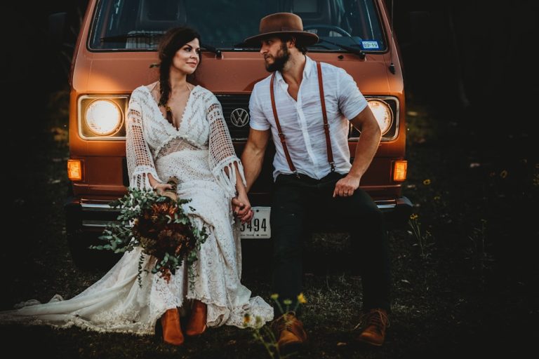
Rustic / Boho
- Headline: Casual script or hand-lettered font with organic strokes
- Body: Warm serif or humanist sans-serif
- Pairing example: Hand-lettered name script + Merriweather-style serif for readability
- Keywords: rustic wedding, boho wedding, wedding planner tips
Romantic / Calligraphy-forward
- Headline: Formal calligraphy or elegant script
- Body: Simple serif or narrow sans to provide contrast
- Pairing example: Copperplate-inspired script for monograms + a slender serif for details
- Keywords: calligraphy fonts, wedding invitations, monogram design
Technical considerations and printing best practices
- File formats: Use vector-based formats (EPS, SVG, high-resolution PDF) for logos and monograms; provide WOFF or web-safe formats for wedding websites.
- DPI and bleed: For print invitations, export at 300 DPI with proper bleed (usually 0.125–0.25 inches).
- Color contrast and accessibility: Ensure sufficient contrast for readability — avoid pale pastel type on light backgrounds unless text is large and bold.
- Size and spacing: Increase letter-spacing (tracking) slightly for scripts and display fonts to avoid crowding; use line-height (leading) of 1.2–1.4 for body text.
- Test print proofs: Always request a physical proof before final runs, especially for specialty processes like foil, letterpress, or thermography.
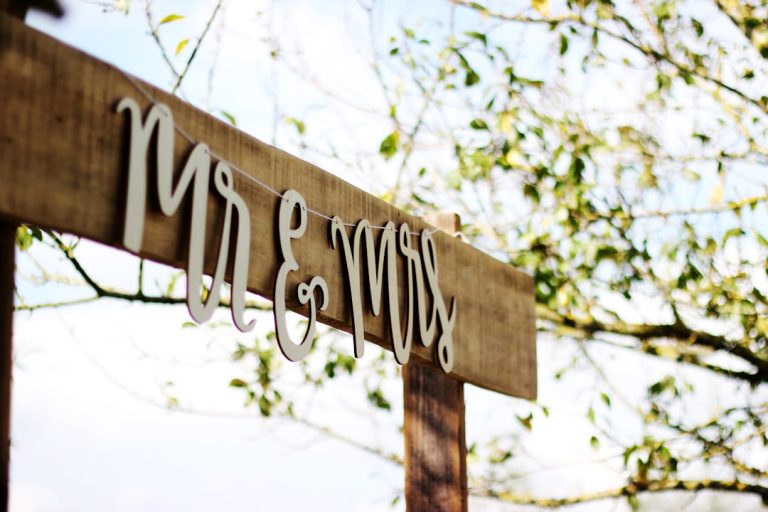
Monograms, wedding logos, and signage: design with motion and scale in mind
- Monogram versus full logo: Monograms excel on small surfaces (stamps, napkins), while full logos with couple names work better on websites and large signs.
- Scalability: Test your monogram at tiny sizes (envelope seals) and large formats (welcome signage) to ensure legibility.
- Cohesion with theme: Your wedding logo should reflect the same fonts and color palette used across invitations and decor to reinforce the visual identity.
- Signage considerations: For ceremony and reception doors, choose display fonts with thick strokes for outdoor readability; indoors, decorative scripts can be used on chalkboard signs or menus.
Actionable checklist for brides and women (practical takeaways)
- Define your wedding mood and pick one word (e.g., “elegant,” “rustic,” “modern”). Keep it visible during design decisions.
- Select a primary display font and a readable secondary font. Test them together on an invitation mockup.
- Reserve highly decorative scripts for names and titles, not for body copy or RSVP details.
- Order a printed proof on your chosen paper and with your selected print method — inspect thin strokes and negative space.
- Confirm color contrast for legibility (especially for older guests or visually impaired attendees).
- Collect digital font licenses for websites and email invitations — make sure web fonts are licensed for your usage.
- Create a mini-brand guide for vendors: list fonts, color codes (HEX/Pantone), logo files, and sample layouts to ensure consistency.
How wedding planners and designers can use fonts strategically
- Build mood boards that include type specimens alongside color palettes and fabric swatches to tell a more complete story to clients.
- Create templates for invitations, signage, seating charts, and social media assets to speed production and maintain consistency across events.
- Coordinate with stationers early to align font choices with paper, printing technique, and budget.
- Use font choices to communicate accessibility decisions — larger, simpler fonts for older audiences or multilingual invitations.
Case example: Turning a rustic boho brief into a cohesive visual suite
A bride wanted a “garden boho” weekend with handmade touches. We recommended:
- Headline: a relaxed, organic script for the couple’s names.
- Body: a warm serif for RSVP cards and the weekend schedule.
- Monogram: a simplified script-based emblem for napkin rings and favor tags, exported as SVG for laser-engraved wooden signage.
- Results: The font pairings maintained legibility on textured recycled stock while reinforcing the boho theme across printed and digital assets.
How our consulting and design expertise supports your wedding vision
As an AI-enabled consulting and wedding design partner, we combine industry insight with automated design previews to accelerate decisions. We:
- Run font pairing recommendations through visual simulations that show how type will render in foil, letterpress, and digital screens.
- Produce branded templates (invitations, RSVP cards, signage) and provide editable files so stationers and planners can scale production.
- Offer personalized consultations to address accessibility, multilingual layouts, and print logistics.
- Provide a curated library of license-safe fonts and design elements available for immediate download at https://fonts.wedding so you can see, test, and use the exact fonts that will define your wedding look.
Download fonts and get started
Ready to explore curated, wedding-ready fonts and professionally designed templates? Visit https://fonts.wedding to download fonts, find pairing suggestions, and access invitation and logo templates tailored by theme. Our library includes options for rustic wedding, modern wedding, boho wedding, and classic styles — all with clear licensing for wedding use.
Related video resource
Final notes and next steps
Selecting timeless wedding fonts is both an artistic and technical decision. By starting with a clear mood, prioritizing legibility, limiting your type palette, and testing on the intended materials, brides and wedding planners can craft stationery and signage that feel cohesive and memorable. If you’d like a tailored font pairing session, sample mockups for your invitation suite, or help creating a wedding logo and monogram that scales across prints and signage, explore our services and download fonts at https://fonts.wedding. Let’s make the first impression of your wedding as beautiful and readable as the day itself.