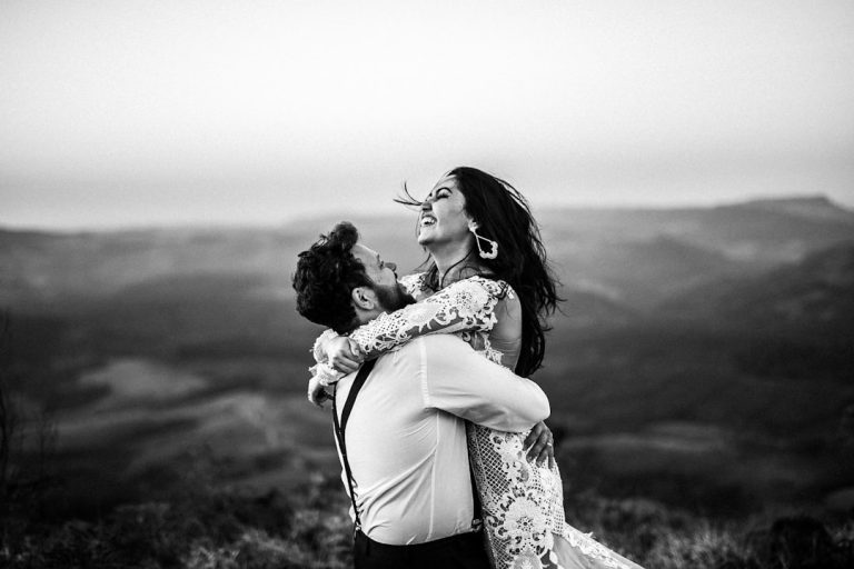
Timeless Wedding Fonts for Talent Acquisition Branding


Top 10 Timeless Wedding Fonts and How to Use Them in Your Wedding Design
Estimated reading time: 7 minutes
- Choosing the right typography greatly influences wedding aesthetics.
- Fonts should be used to create a cohesive wedding brand.
- Pairing fonts correctly can enhance readability and style.
- Modern tools and AI can simplify font selection and design processes.
Table of Contents
- Introduction
- Why fonts matter for weddings
- The top 10 timeless wedding fonts (and when to use them)
- Pairing fonts like a pro
- Practical design rules every bride and wedding planner should follow
- How typography connects to other wedding design elements
- Using AI to speed up wedding typography and branding
- Actionable checklist for brides and women planning fonts and stationery
- Budget-friendly tips for stationery and font use
- Common mistakes and how to avoid them
- How typography decisions influence vendor coordination
- Examples of font pairings by wedding theme
- Download inspiration and assets
- Related video inspiration
- Final thoughts
Introduction
Choosing the right typography is one of the most understated decisions in wedding design, yet it shapes every guest’s first impression—from save the dates and wedding invitations to signage and website headers. In this post, Top 10 Timeless Wedding Fonts and How to Use Them in Your Wedding Design, we’ll walk brides, wedding planners, and design-forward couples through font choices that read beautifully in print and on-screen, pairing strategies, and actionable design tips. We’ll also highlight how modern tools — including AI-assisted branding — can streamline the process so you get polished wedding invitations, logos, and signage faster and with less guesswork.
Why fonts matter for weddings
Typography sets tone and communicates style without words. A romantic calligraphy script signals a classic, elegant wedding; a clean sans-serif suggests a modern, minimalist celebration; and a textured serif might suit a rustic barn venue. Beyond style, fonts affect readability, printing cost, and accessibility. Thoughtful type choices help maintain consistency across wedding stationery, websites, social posts, and event signage — key for a cohesive wedding brand that makes planning smoother and the day feel intentional.
The top 10 timeless wedding fonts (and when to use them)
- Bickham Script (or similar formal scripts)
- Best for: Formal invitations, envelopes, place cards.
- Why: Elegant, flowing calligraphy evokes classic ballroom weddings and pairs beautifully with serif body text.
- Tip: Use sparingly for names or headings; pair with a readable serif like Garamond for event details.
- Didot
- Best for: High-end, editorial wedding stationery, wedding website headings.
- Why: High contrast and sharp lines feel refined and modern-luxe.
- Tip: Use in larger sizes (18–36pt) for impact; avoid tiny sizes where thin strokes may break in print.
- Garamond (old-style serif)
- Best for: Long-form wording on invitations, RSVP cards, ceremony programs.
- Why: Warm, readable, and timeless. Works with both classic and rustic palettes.
- Tip: Pair Garamond with a simple script for names to maintain elegance without sacrificing readability.
- Caslon
- Best for: Traditional invitations and printed programs.
- Why: Old-style serif with a humanist touch; versatile and trustworthy.
- Tip: Great for multi-page booklets and wedding day timelines.
- Montserrat
- Best for: Modern wedding websites, signage, and social graphics.
- Why: A clean geometric sans-serif that reads well on screens and prints.
- Tip: Use Montserrat for venue names or schedule headers when you want a contemporary feel.
- Futura
- Best for: Minimalist weddings, monograms, and bold signage.
- Why: Geometric and striking; creates a modern brand when paired with a softer script.
- Tip: Use Futura Bold for signage that needs to be legible from a distance.
- Playfair Display
- Best for: Romantic but modern invites and editorial layouts.
- Why: Transitional serif with high contrast, feeling both classic and current.
- Tip: Excellent for pairing with a sans-serif for body text to create hierarchy.
- Lora
- Best for: Boho and rustic wedding stationery with an elegant touch.
- Why: A contemporary serif with roots in calligraphy; legible and warm.
- Tip: Works well for wedding websites and printable timelines.
- Great Vibes (or modern script options)
- Best for: Names, headings, and signature lines on invitations.
- Why: Friendly flowing script that feels personal and romantic.
- Tip: Limit use to headings; combine with a neutral sans-serif like Helvetica for clarity.
- Raleway
- Best for: Clean modern designs, signage, and digital invites.
- Why: Stylish sans-serif family with multiple weights for flexibility.
- Tip: Use different weights to establish visual hierarchy (e.g., Raleway Bold for headings, Regular for body).
Pairing fonts like a pro
- Limit yourself to 2–3 typefaces. A good system: a script for names/headlines, a serif for body copy, and a sans-serif for signage/web.
- Contrast is key. Pair a high-contrast serif (Didot, Playfair Display) with a neutral sans-serif (Montserrat, Raleway) for balance.
- Match mood, not just style. A playful script clashes with a strict geometric sans-serif; choose options that share personality.
- Test pairings across applications: wedding invitations, mobile view, printer proofs, and signage mockups.
Practical design rules every bride and wedding planner should follow
- Readability first: For invitations and save the dates, keep body text at 10–12pt and choose fonts with clear counters and spacing.
- Ink and paper affect perception: Thin strokes disappear on textured stock; use heavier weights or bolder fonts for textured or recycled paper.
- Color contrast matters: Avoid low-contrast light gray text on pastel backgrounds. Ensure contrast for legibility, especially for older guests.
- Keep hierarchy clear: Name(s) → Event type (e.g., “Reception to follow”) → Date/time → Location. Use size, weight, and typographic style (italic vs. regular) to differentiate.
- File formats for print: Provide printers with high-res PDFs and outlines for scripts to avoid substitution issues. Include both OTF/TTF font files or link to downloadable fonts when sharing assets with designers.
- Accessibility: For wedding websites and digital invites, ensure body fonts are web-safe or embedded, and test for screen-reader compatibility.
How typography connects to other wedding design elements
- Color palette: Fonts take on personality through color. A script in gold foil on cream reads formal and luxurious; the same script in dusty blue on kraft paper reads rustic-romantic.
- Logos & monograms: A well-designed monogram combines a distinctive typeface with a symbol or intertwined initials. Serif-based monograms feel traditional; sans-serif monograms read modern.
- Signage and wayfinding: Use a consistent display font family (one with multiple weights) for venue signage to ensure legibility from a distance and maintain a cohesive brand.
- Floral and stationery: When florals are busy, simplify typography (neutral sans-serif + minimal script). For minimalist florals, a more ornate type treatment can add needed texture.
Using AI to speed up wedding typography and branding
- AI tools are changing how vendors and couples prototype wedding stationary and logos:
- AI font-matching can suggest harmonious pairings based on your selected wedding theme (romantic, modern, rustic), saving hours of trial and error.
- Automated mockups instantly apply chosen typefaces across invitation layouts, signage, and website headers so you can visualize the full suite before printing.
- AI-driven brand generators can create monograms and logo variations you can tweak, helping couples explore dozens of looks quickly.
- Our consulting team blends AI recommendations with human design judgment — ensuring suggestions meet print constraints, accessibility standards, and your personal taste.
Actionable checklist for brides and women planning fonts and stationery
- Define your wedding style in one sentence (e.g., “Modern garden party with soft pastels and minimalist décor”).
- Choose a primary headline font (script or decorative) and a secondary body font (serif or sans-serif).
- Select a third utility font for signage and digital use if needed — preferably one that scales well.
- Create a mood board with color palette, sample paper textures, and photography to test typography against.
- Order printed samples on the actual paper stock and at the intended sizes — scripts and fine serifs can look dramatically different when printed.
- Confirm final font files and export PDFs with fonts embedded or outlined for the printer.
- Keep a master file with font licensing details; ensure commercial use is allowed for wedding stationery and any vendor-created goods.
Budget-friendly tips for stationery and font use
- Use web/free fonts wisely: Many beautiful free fonts exist, but check licensing for commercial use (including resale of printed items).
- Limit ink-heavy designs: Single-color printing reduces cost; use foil or embossing selectively for emphasis (names, monogram).
- DIY options: Choose two typefaces and use template suites for invitations and signage. Hire a designer to polish a monogram or layout to avoid DIY pitfalls.
- Order smaller print runs: Consider printing only core items (invites and day-of stationery) professionally; print RSVP cards or maps at home if needed.
Common mistakes and how to avoid them
- Overusing decorative scripts: They’re beautiful but kill readability in long passages. Reserve scripts for names and headlines.
- Mismatched tone: A whimsical font with a formal venue creates cognitive dissonance. Always match typography to the wedding vibe.
- Forgetting mobile: Many couples send digital invites and create wedding websites. Test your font choices on mobile to ensure they remain legible.
- Ignoring printer specs: Printers may substitute fonts if files aren’t embedded. Always provide font files or outlined text.
How typography decisions influence vendor coordination
- Share a typography kit with your planner, stationer, florist, and venue contacts. Include font names, color hex codes, and preferred sizes for signs and menus.
- A consistent typographic system makes it easier for a wedding planner to coordinate signage, place cards, and digital assets, saving time and reducing last-minute mismatches.
- If working with an AI-savvy consulting team, ask them to generate a cohesive brand guide (fonts, colors, sample layouts) that you can hand to any vendor.
Examples of font pairings by wedding theme
- Classic Formal: Bickham Script + Garamond + Montserrat (for signage)
- Modern Minimalist: Futura + Raleway + Helvetica Neue (minimal script accent)
- Rustic Boho: Lora + Great Vibes + Playfair Display
- Editorial/Chic: Didot + Montserrat + a light script for accents
Download inspiration and assets
Ready to try type pairings on your own materials? Browse curated wedding font collections and downloadable design templates at fonts.wedding — you’ll find sample palettes, printable invite templates, and AI-assisted pairing suggestions to jumpstart your stationery suite.
Related video inspiration
Watch this video for more inspiration!
Final thoughts
Typography is one of the most cost-effective ways to elevate your wedding aesthetic. With the right font choices, clear hierarchy, and an eye for pairing, any couple can create invitations and signage that feel polished and personal. Whether you’re a bride designing invites, a wedding planner coordinating vendors, or a stationer building a brand, integrating thoughtful typography into your design system will make every detail feel intentional.
If you’d like a personalized font pairing or a complete wedding brand guide, we offer design consulting (including AI-assisted mockups) to help you test fonts across invites, signage, and web. Explore our services or download fonts and ready-made designs at https://fonts.wedding to get started on invitations and stationery that reflect your wedding story.
FAQ
What fonts are best for wedding invitations? A combination of elegant scripts for headings and readable serif or sans-serif fonts for body text is usually best.
How do I ensure my font choices are readable? Keep body text between 10–12pt and choose fonts with clear counters and spacing.
Can I use free fonts for commercial wedding stationery? Yes, but make sure to check the licensing agreements for commercial use.