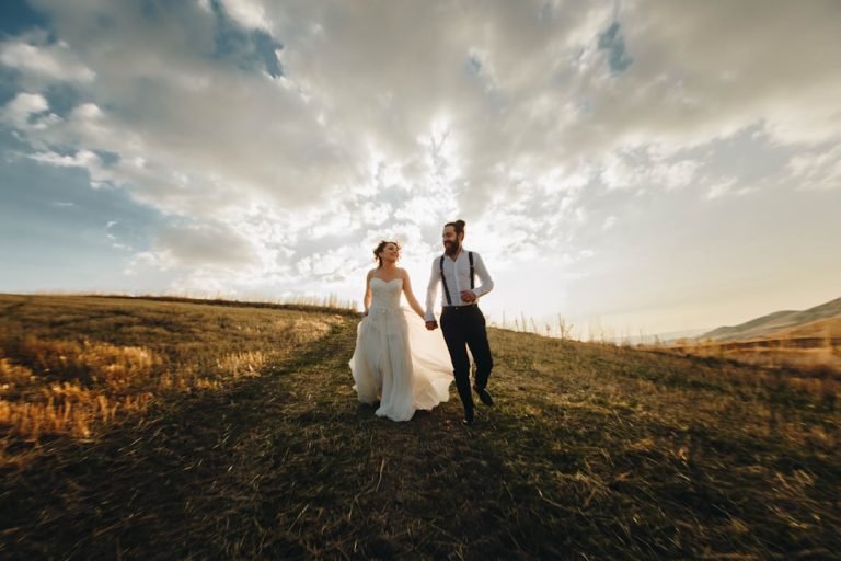
Top Talent Branding Tips for Wedding Visual Design


Top Tips for Choosing Wedding Fonts and Visual Designs
Estimated reading time: 7 minutes
- Understand the importance of typography and visual design.
- Match fonts to your wedding theme effectively.
- Prioritize clarity and legibility in all printed materials.
- Use AI tools for smarter design choices.
- Avoid common mistakes in font selection and usage.
Table of Contents
- Why typography and visual design matter for weddings
- Matching fonts to wedding themes (with examples)
- Typography fundamentals every bride should know
- Designing the invitation suite and wedding collateral
- Wedding logo and monogram tips
- Printing, materials, and finishing — what affects font choice
- Actionable planning steps and timeline
- Common mistakes to avoid
- How AI and modern tools help brides and wedding pros
- Practical AI workflow for font and design selection
- Budget-friendly tips for brides
- Practical takeaways — actionable checklist for women planning their wedding
- How this topic relates to our wedding services and expertise
- Related video for inspiration and step-by-step demos
- Next steps and where to find resources
- Final thoughts
Why typography and visual design matter for weddings
Guests judge an event (consciously or not) by the first things they see: a save-the-date, an invitation suite, or a wedding website. Typography and design tell guests whether your day will be formal or casual, classic or trend-forward. Good design helps with practicalities too: clear RSVP instructions, readable directions, and accessible on-site signage reduce confusion and vendor issues. For brides and planners, thoughtful choices reduce last-minute fixes and costly reprints.
Matching fonts to wedding themes (with examples)
Choosing fonts starts with your wedding theme. Below are reliable pairings and visual directions for common themes:
- Classic / Formal wedding
- Visuals: neutral palette, gold foil, elegant monogram
- Fonts: a refined serif (e.g., Baskerville-style) for names + a clean sans-serif for details
- Why: Serif conveys tradition and formality; sans-serif keeps body copy readable.
- Modern / Minimal wedding
- Visuals: lots of white space, high-contrast black or bold color accents
- Fonts: geometric sans-serif (e.g., Futura/Gotham family) + a light display or condensed headline font
- Why: Clean lines and minimal ornamentation reflect contemporary tastes.
- Boho / Outdoor wedding
- Visuals: earthy palette, florals, hand-drawn motifs
- Fonts: organic script for names + a humanist serif or clean sans for details
- Why: Script adds warmth and personality; pairing with a readable text face keeps info legible.
- Rustic / Barn wedding
- Visuals: kraft paper, twine, botanical illustrations
- Fonts: a textured display or slab serif for headers + simple sans for body copy
- Why: Texture conveys hand-crafted charm while sans-serif ensures reading ease.
- Romantic / Floral wedding
- Visuals: watercolor florals, soft gradients, handwritten accents
- Fonts: an elegant script for names + a classic serif for details
- Why: Scripts and florals pair naturally to communicate romance without sacrificing clarity.
Typography fundamentals every bride should know
- Establish hierarchy: Use 2–3 type sizes. Names/headlines (largest), key info like date/time (medium), and directions/details (smallest). Consistent hierarchy improves comprehension.
- Pair with purpose: Limit to two primary fonts (one for display/names, one for body text). Add a subtle third for accents only if needed.
- Prioritize legibility: Scripts look beautiful but can be unreadable at small sizes or in small contrasts. Save decorative scripts for big names or signage; use clean faces for addresses and RSVP cards.
- Mind spacing: Letter-spacing (tracking) and line-height (leading) affect readability. Give script and display fonts more breathing room.
- Test in real size: What looks good at large scale may be illegible on RSVP cards or mobile screens. Print and view samples at final sizes.
- Contrast for accessibility: Dark text on light backgrounds works best. Low contrast can be beautiful but problematic for older guests.
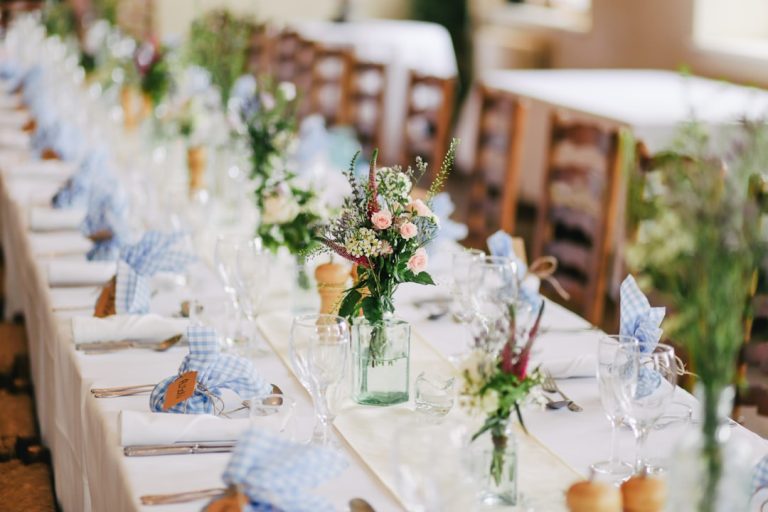
Designing the invitation suite and wedding collateral
Think of your wedding suite as a mini-brand system. Keep consistent elements across:
- Invitation: The focal piece. Choose fonts and hierarchy here first.
- RSVP card and envelope: Keep the typefaces consistent; ensure RSVP text is clear.
- Details card (directions, accommodations): Use the same body font and avoid decorative scripts here.
- Day-of items (programs, signage, menus, place cards): Use the same display and body fonts. Consider using a monogram or wedding logo as an anchor across pieces.
- Website and digital communications: Match the web-safe equivalents of your print fonts or use web fonts loaded through your site builder to preserve brand continuity.
Wedding logo and monogram tips
A simple monogram or wedding logo can elevate your suite. Keep it:
- Simple and scalable (works on small tags and large signs).
- Consistent in stroke weight with your chosen fonts.
- Usable in one color for engraving, embossing, or stamps.
Printing, materials, and finishing — what affects font choice
Different print techniques interact with fonts in unique ways:
- Letterpress: Looks best with simple, strong letterforms. Fine scripts may lose definition.
- Foil stamping: Great for shiny accents; high-contrast, bold fonts shine with foil.
- Thermography/raised print: Can add depth but may blur tiny hairlines.
- Digital print: Reproduces complex scripts well; choose high-resolution artwork.
- Paper stock: Textured cotton and recycled papers absorb ink differently—test proofs.
- Envelopes and liners: Contrast and inner patterns can affect text legibility when envelopes are closed or partially open.
Actionable planning steps and timeline
- 8–10 months before: Choose theme and basic color palette; collect invitation examples you love.
- 6–8 months before: Pick fonts and order test prints (1–2 styles) on intended paper.
- 3–4 months before: Finalize wording and guest list; order final suite and extra RSVPs/place cards.
- 1 month before: Address envelopes (calligraphy, printed, or sticker). Confirm signage and programs with venue and vendors.
Common mistakes to avoid
- Using too many decorative fonts — stick to a coordinated system.
- Choosing scripts for essential information (dates, addresses).
- Not testing print proofs in final size and paper.
- Forgetting to check font licensing for commercial use (weddings are often considered commercial if a planner or designer sells templates).
How AI and modern tools help brides and wedding pros
AI isn’t here to replace creativity — it’s a time-saving co-pilot:
- Smart font pairing: AI tools can generate on-brand font pairs based on your moodboard, narrowing thousands of choices to a handful that work together.
- Mockup previews: Upload photos of your venue or invitation layout and see real-time visualizations of font choices, colorways, and materials.
- Personalized websites: AI can auto-populate wedding websites and RSVP flows using your text, style preferences, and guest data.
- Vendor matching and timelines: AI tools predict workflow conflicts and suggest optimized timelines for the rehearsal, photography, and vendor arrivals.
- Copy and wording assistance: AI can help craft invitation wording variations for formal, casual, blended-family, and multi-event weddings.
Practical AI workflow for font and design selection
- Create a moodboard with 6–8 images of colors, textures, and details.
- Use an AI font-pairing tool to generate 6–10 pairings based on that moodboard.
- Apply your top 3 pairings to mocked-up invitation, RSVP, and website templates.
- Print sample cards in the intended paper stock and method (letterpress, foil, digital).
- Confirm legibility with a small group (trusted family or friends), and iterate.
Budget-friendly tips for brides
- Buy licensed font bundles rather than single premium fonts to save on licensing.
- Use DIY printable templates for RSVP and details cards while splurging on invitation and envelopes.
- Opt for digital RSVP and website solutions to reduce printing costs for smaller weddings.
- Use one luxe element (foil, letterpress, vellum wrap) to create perceived value without inflating the entire suite cost.
Practical takeaways — actionable checklist for women planning their wedding
- Pick a wedding theme and color palette first; let them guide font choices.
- Limit fonts to two primary faces and a single accent if needed.
- Save scripts for names and large headings; keep essential info in a readable sans or serif.
- Order printed proofs on your chosen paper and at final sizes before full print runs.
- Check font licensing for invitations, websites, and any commercial use.
- Use AI tools to generate font pairings and mockups; test at least three options.
- Plan printing timelines: allow 3–4 weeks for specialty printing and production.
- Consider accessibility: increase contrast and font size for older guests.
- Download curated, licensed wedding fonts and templates from reputable sources to avoid licensing issues.
How this topic relates to our wedding services and expertise
As a consulting firm with strengths in both wedding design and AI-driven solutions, we help brides and planners move from inspiration to execution with clarity. We pair design sensibilities (typography, color, paper selection) with intelligent workflows that reduce rework: automated proofs, font-license management, personalized website generation, and production troubleshooting. Our approach ensures you get a cohesive visual identity that works for print and digital touchpoints and that fits your budget and timeline.
Related video for inspiration and step-by-step demos
Watch here for inspiration and step-by-step demos.
Next steps and where to find resources
Ready to pull your visual identity together? Browse our curated, licensed wedding fonts and downloadable design templates to get started. You can preview pairings, download high-quality files, and use them across invitations, websites, and signage at https://fonts.wedding. If you want a guided experience, our team offers AI-assisted consultations to generate moodboard-driven font pairings, proof mockups, and print-ready files so you can move from idea to gorgeous printed suites with confidence.
Final thoughts
Typography and visual design are small investments with big emotional returns — they set the tone, reduce guest confusion, and make your wedding feel intentionally crafted. Follow these top tips for choosing wedding fonts and visual designs and you’ll be well on your way to a cohesive, beautiful day that feels unmistakably yours. If you’d like personalized help, download fonts and templates at https://fonts.wedding or reach out to our team for a consultation that blends creative design with AI-powered efficiency.
FAQ
What are the best fonts for a wedding invitation?
The best fonts depend on your wedding theme! Classic weddings often use refined serifs, while modern weddings can incorporate geometric sans-serifs.
How do I choose colors for my wedding suite?
Start with your wedding theme! Choose colors that complement the overall atmosphere you want to create.
Should I use decorative fonts for my wedding invitations?
Use decorative fonts sparingly; reserve them for names and headlines. Keep essential information in clean and readable fonts.
Can I use AI tools for wedding planning?
Absolutely! AI tools can help with font pairing, moodboard generation, and even crafting your wedding website.
What should I consider when choosing fonts?
Consider legibility, the theme of your wedding, and maintaining a cohesive look across all materials.