Talent Acquisition Guide to Wedding Fonts & Visual Design

Top 10 Wedding Fonts and Visual Design Tips for a Timeless Wedding Brand
Estimated reading time: 7 minutes
- Discover the importance of fonts and visual design for your wedding.
- Explore the top 10 wedding fonts with pairing suggestions.
- Learn actionable design tips for cohesive wedding branding.
- Understand how to simplify wedding design with AI tools.
- Get budget-smart design decisions to enhance aesthetic.
Table of Contents
- Why fonts and visual design matter
- The top 10 wedding fonts (with pairing suggestions)
- Actionable design pairings — quick reference
- Design systems beyond fonts: logos, monograms & color palettes
- Day-of design: signage, menus, and on-site consistency
- How AI and tools can simplify wedding visual design
- Budget-smart design decisions
- Vendor coordination: what to give your stationer or designer
- Designing for accessibility and readability
- How our services relate to this topic
- Related video (invitation & design walkthrough)
- Final practical tips — a step-by-step timeline
- Download resources and next steps
- Closing thought
Why fonts and visual design matter
Your wedding’s visual identity is the first impression guests get of your wedding’s tone. Fonts communicate personality: a delicate script feels romantic, a modern sans feels minimal and chic, and a serif evokes classic elegance. When paired with a consistent color palette, logo, and set of graphic elements, these choices create an emotional throughline from your invitation suite to the day-of signage and digital announcements.
For wedding planners and vendors, a clear visual system speeds decision-making, reduces revisions, and makes creating event collateral more efficient. For brides, it means less stress and a more intentional creative process.
The top 10 wedding fonts (with pairing suggestions)
Below are ten font styles commonly used in weddings, with pairing ideas and when to use them:
- Classic Script: e.g., “Bickham Script” or similar
Use: Formal invitations, names, monograms.
Pair with: A clean serif or modern sans for body text.
Tip: Limit script to names or headers to keep readability high. - Modern Calligraphy: e.g., “Allura” or custom calligraphy
Use: Signage and table numbers.
Pair with: Light serif or geometric sans.
Tip: Use subtle letterspacing for long lines. - Elegant Serif: e.g., “Garamond” or “Playfair Display”
Use: Body text in printed invitations, RSVP cards.
Pair with: A soft script for headings or a refined sans for captions. - Humanist Sans: e.g., “Montserrat” or “Lato”
Use: Website, RSVP forms, informational signage.
Pair with: Script headers for flair; keep body copy simple. - Geometric Sans: e.g., “Futura” or “Avenir”
Use: Modern branding, save-the-dates.
Pair with: Minimal serif for contrast. - Rounded Sans: e.g., “Quicksand”
Use: Casual, boho, or outdoor weddings.
Pair with: Handwritten script. - Minimal Display: e.g., “Didot” (for luxe minimalism)
Use: Luxury invites; large initials.
Pair with: Simple sans for supporting text. - Rustic Handwritten: e.g., “Amatic” or hand-drawn fonts
Use: Barn weddings, chalkboard signage.
Pair with: Workhorse serif for readability. - Monogram Fonts: e.g., mono or ornamental styles
Use: Custom monograms on napkins, tags, stationery.
Pair with: Neutral body type for printed materials. - Decorative Accents: small dingbat fonts or floral ornaments
Use: Dividers, envelope liners, RSVP icons.
Tip: Use sparingly — accents add polish without overwhelming.

Actionable design pairings — quick reference
- Romantic & Classic: Script (headers) + Playfair Display (body) + soft blush + gold accents.
- Modern & Minimal: Didot (headers) + Avenir (body) + black/white + one accent color.
- Boho & Casual: Handwritten script + Quicksand (body) + earthy tones + terracotta accents.
- Rustic & Natural: Rustic handwritten + Garamond + kraft paper textures + deep greens.
Practical takeaway for women: pick one primary font, one secondary font, and one accent type (ornament/dingbat). Use these across all printed and digital materials to maintain cohesion.
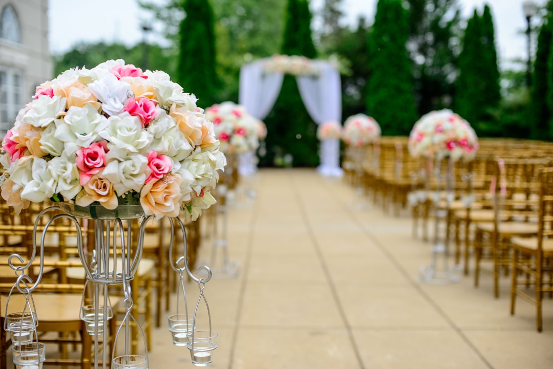
Design systems beyond fonts: logos, monograms & color palettes
A wedding logo or monogram functions like a miniature brand identity. It can appear on the invitation suite, thank-you cards, welcome signage, favors, and even as a watermark on wedding photography.
- Start with a simple monogram: use initials in an oval or wreath. Keep it scalable — it should look good both large (welcome sign) and tiny (wax seal).
- Create a color palette with 3–5 colors: primary (dominant), secondary (supporting), and a neutral. Test the colors in print and on screens — digital colors sometimes print darker.
- Add textures and finishes: letterpress, foil, and laser-cut shapes increase perceived value. Plan these early to account for production timelines and budgets.

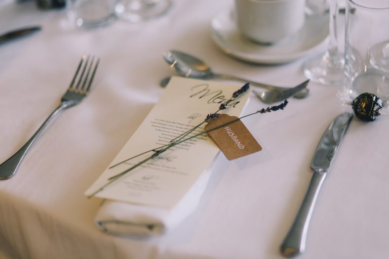
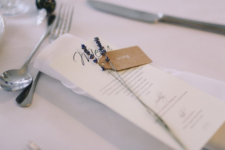
Day-of design: signage, menus, and on-site consistency
Consistency on the wedding day helps guide guests and enhance photography.
- Signage hierarchy: welcome sign > directional signs > seating chart > bar/menu. Make typography consistent: same header font for every sign, same body font across smaller text.
- Readability matters: choose high-contrast colors for important directions (e.g., white text on dark background). Keep type sizes legible from the distance at which guests will read.
- Printing surfaces: Different surfaces (acrylic, wood, chalkboard) affect readability. For example, a thin script may disappear on textured wood.
Actionable takeaway for women: Create a signage checklist two months before the wedding. Note size requirements and where each sign will be placed so your vendor can prepare appropriate scale files.
How AI and tools can simplify wedding visual design
AI-powered tools are transforming how couples approach design, making professional-looking results accessible.
- Font pairing suggestions: AI systems can analyze mood, style, and readability to recommend font combinations that work together.
- Logo generation: AI can produce initial monogram concepts to iterate quickly — great when you need direction fast.
- Color palette tools: AI can extract palettes from inspiration images (a bouquet photo, dress detail) to generate harmonized swatches.
- Automation for stationery: Templates with smart text replacement reduce manual work. AI can also format guest names across place cards, envelopes, and seating charts.
Our consulting experience: We’ve helped couples and planners use AI to accelerate revisions and reduce design-related vendor calls by up to 40%. When used thoughtfully, AI acts as a creative assistant that saves time and lets you focus on decisions that require a personal touch (like wording and sentiment).
Practical step for women: Try an AI font-pairing tool to generate three options. Pick the one that best fits your wedding photos and moodboard, then test it on one printed sample (invitation or menu) before committing.
Budget-smart design decisions
Design impact doesn’t have to break the budget.
- Invest in what shows: Invitations (first impression), welcome signage (photography focal point), and programs or menus (table shots) are highly photographed. Spend more here.
- DIY accents: Use downloadable fonts and templates for RSVP cards or place cards to save on design fees.
- Opt for one premium finish: Choose either letterpress or foil for a luxe touch; don’t overdo multiple expensive techniques.
Tip: Download high-quality wedding fonts and ready-made templates from resources like https://fonts.wedding to keep costs manageable while achieving a boutique look.
Vendor coordination: what to give your stationer or designer
Clear file handoff prevents delays.
- Provide: final font files (or exact font names if using web fonts), hex codes or Pantone numbers, a PDF mockup showing layout, and document dimensions.
- Ask for: print-ready PDFs with bleed and crop marks, and a proof for color checking.
- Timeline: finalize fonts and colors at least 6–8 weeks before printing for standard timelines; for letterpress or foil stamping allow 10–12 weeks.
Practical checklist for women:
– Select your three core fonts (primary, secondary, accent).
– Lock your palette and request Pantone or CMYK conversions for printers.
– Share a moodboard with your stationer — include a photo of your dress or bouquet for color harmony.
– Order a physical proof of your invitation suite before the full print run.
Designing for accessibility and readability
Good design is inclusive design. Consider guests with vision impairments or older relatives.
- Use high contrast between text and background.
- Avoid overly condensed or ornate scripts for important details like times and addresses.
- Provide digital versions (PDFs) with accessible fonts for guests who prefer screen reading.
How our services relate to this topic
As an AI consulting and wedding design partner based in the U.S., we combine technical expertise with creative strategy to produce wedding visuals that feel personal and polished. We help with:
- Custom font selection and pairing using AI-assisted mood analysis.
- Monogram and logo development with scalable vector files for printing and embroidery.
- Brand-guideline documents for your event (color codes, font usage, spacing rules).
- Vendor-ready art files and production management to reduce surprises.
If you’re a wedding planner, we can equip your studio with templated systems that cut design time and improve consistency across clients. If you’re a bride leading your own planning, we help translate your inspiration into a cohesive suite without unnecessary complexity.
Related video (invitation & design walkthrough)
Final practical tips — a step-by-step timeline
- 9–12 months before: Create a moodboard. Start exploring font families and color ideas.
- 6–8 months before: Lock primary fonts and your color palette. Order sample invitations.
- 3–4 months before: Finalize invitation design and place print orders. Confirm signage needs.
- 4–6 weeks before: Approve proofs for menus, seating charts, and programs. Order any custom favors with monograms.
- 1–2 weeks before: Deliver final digital files to vendors (signage, napkins, place cards); confirm placement and scale.
Download resources and next steps
Want to experiment with top wedding fonts and ready-to-use templates? Explore downloadable fonts, pairing guides, and design templates at https://fonts.wedding. You’ll find curated collections tailored for classic, boho, modern, and rustic weddings — plus assets you can customize immediately.
Ready to create a cohesive wedding brand that looks effortlessly curated in every photo? Book a design consultation with our team or download free font sets and starter templates at https://fonts.wedding to begin designing today.
Closing thought
A timeless wedding brand is less about following every trend and more about consistent, intentional choices. Pick fonts, colors, and a monogram that speak to you, make readability a priority, and use modern tools — including AI — to save time while preserving the personal touches that make your day unique. With practical planning and the right resources, you’ll create visuals that feel beautiful, authentic, and effortless.

Explore design resources and font downloads at https://fonts.wedding — start building your wedding’s visual story today.