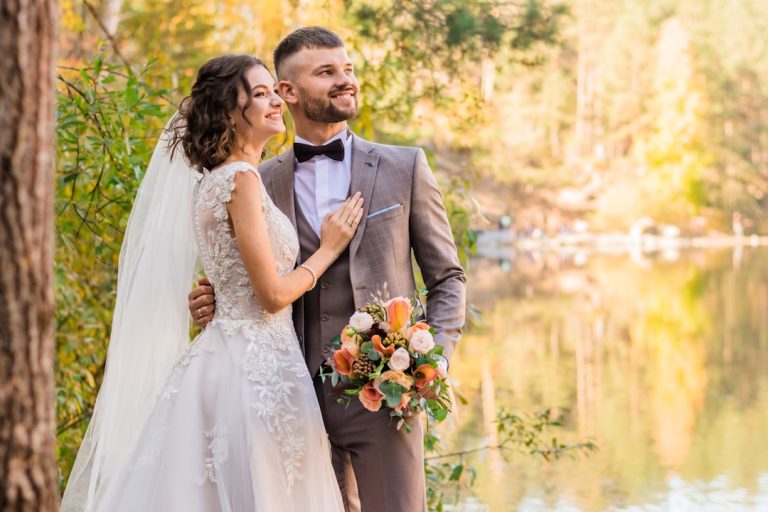
Essential Wedding Fonts Guide for Talent Acquisition Pros

Top 10 Timeless Wedding Fonts and How to Use Them for Elegant Invitations
Estimated reading time: 7 minutes
- Choosing the right typography can elevate your wedding’s visual identity.
- Understanding font psychology helps create cohesive designs.
- Pairing fonts effectively enhances readability and aesthetics.
- Practical printing considerations are crucial for final outcomes.
- Utilizing expert services can streamline the design process.
Table of Contents
- Why fonts matter for wedding design
- The top 10 timeless wedding fonts
- Font pairing principles that actually work
- Designing invitations: layout, spacing, and color
- Practical printing considerations
- How wedding planners and designers use fonts.wedding and design services
- Using AI to speed selection and ensure consistency
- Actionable checklist for designing elegant wedding invitations
- Practical takeaways for women
- How fonts influence other wedding services we offer
- Examples by theme: quick pairings and color ideas
- Example mockup workflow (for planners and designers)
- Conclusion
- Explore our services and download premium fonts and invitation designs
Why fonts matter for wedding design
Fonts are more than letterforms — they communicate tone, era, and personality. A flowing script suggests romance and formality; clean serifs feel traditional and refined; modern sans-serifs convey minimalism and contemporary taste. For wedding planners, designers, and couples, understanding font psychology helps create invitations and wedding logos that match the chosen wedding themes and color palette. It also ensures readability across print and digital platforms, an essential consideration for guest lists that span generations and tech comfort levels.
The top 10 timeless wedding fonts
Below are ten fonts that consistently perform well across styles and themes. Many are available for download or licensing on specialist sites like fonts.wedding, and can be paired for invitations, envelopes, wedding logos, menus, and signage.
- Garamond (Serif)
- Why it works: Elegant, readable, and timeless. Garamond conveys classic formality without feeling heavy.
- Best uses: Invitation body text, RSVP cards, program copy.
- Pair with: A delicate script for names/headlines.
- Bodoni (Modern Serif)
- Why it works: High contrast strokes give Bodoni a striking, upscale feel.
- Best uses: Names, monograms, headings.
- Pair with: A simple sans-serif for small print details.
- Didot (Modern Serif)
- Why it works: Similar to Bodoni, Didot is haute couture in type form — perfect for black-tie and luxury weddings.
- Best uses: Cover headlines, save-the-date text.
- Pair with: Low-contrast serif or neutral sans-serif for readability.
- Caslon (Old-Style Serif)
- Why it works: Warm and dignified, Caslon reads beautifully in print and evokes heritage and tradition.
- Best uses: Full invitation text and long-form pieces like programs.
- Pair with: A casual script for a softer, romantic look.
- Helvetica (Sans-serif)
- Why it works: Clean and versatile; great for modern and minimalist weddings.
- Best uses: Information-heavy pieces like maps, schedules, and RSVP forms.
- Pair with: A calligraphy script for names or headings.
- Futura (Geometric Sans)
- Why it works: Sharp geometric forms give a modern, architectural aesthetic.
- Best uses: Modern wedding signage and modern wedding invitation headlines.
- Pair with: A light serif to soften the look.
- Sabon (Serif)
- Why it works: Classic and refined with excellent legibility—ideal for formal events.
- Best uses: Invitation body and ceremony programs.
- Pair with: An elegant script for accent.
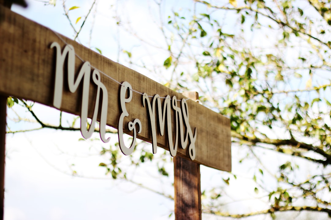
- Bickham Script Pro (Formal Script)
- Why it works: Luxurious and ornate, this script reads as classic calligraphy.
- Best uses: Couple’s names, titles, and formal headings.
- Pair with: A restrained serif or sans-serif to maintain readability.
- Lora (Transitional Serif)
- Why it works: Modern yet warm, Lora works well on both screen and print, suiting contemporary romantic themes.
- Best uses: Longer copy like vows or reception menu descriptions.
- Pair with: A simple sans-serif or minimalist script for contrast.
- Great Vibes (Flowing Script)
- Why it works: Modern script with good flow and legibility; great for feminine, boho, or garden weddings.
- Best uses: Heading names, RSVP headlines, short quotes.
- Pair with: An understated serif for body text.
Font pairing principles that actually work
Choosing two or three fonts that harmonize is more effective than using many different fonts. Here are pairing principles that help wedding visuals feel intentional:
- Contrast, not clash: Pair a script or display font with a neutral serif or sans-serif. The contrast highlights names and headings while keeping body text readable.
- Limit your palette: Use one type for headlines/monograms, one for body text, and an optional accent for small decorative elements. Three is the practical maximum for stationery suites.
- Respect scale and hierarchy: Larger sizes and heavier weights should be reserved for names and venue details; smaller, lighter weights for RSVP instructions and accommodation info.
- Consider legibility: Fancy scripts look beautiful but can be hard to read at small sizes. Use them for names and headings, not for block text.
- Maintain theme cohesion: Match font mood with wedding themes — rustic weddings benefit from warmer serifs and hand-lettered scripts; modern weddings favor geometric sans-serifs and minimal scripts.
Designing invitations: layout, spacing, and color
Typography works in concert with layout and color. Practical tips for invitation design:
- Start with hierarchy: Place the couple’s names most prominently, followed by date/time and venue. Secondary details like dress code and RSVP go in smaller text.
- Embrace white space: Let margins breathe. Crowded type looks cheap; elegant invites use space to convey luxury.
- Use typographic rhythm: Line spacing (leading) should be generous for scripts and tighter for small caps. Letterspacing (tracking) can be increased slightly for all-caps headlines.
- Choose accessible colors: Dark text on a light background is the most readable. For trendier color palettes (dusty rose, muted sage), test contrast ratios for legibility on print and screens.
- Match paper and print method: Letterpress favors high-contrast serifs; digital prints handle gradients and fine scripts better. Foil stamping works beautifully with minimal serif or script names.
Practical printing considerations
Your chosen font behaves differently in print than on screen. Before finalizing, account for:
- Pantone and CMYK color matching: Ensure consistent color across materials for envelopes and inserts.
- Minimum readable sizes: Scripts should typically be 10–12 pt for names; body text should be no smaller than 9–10 pt depending on the font.
- Printing processes: Letterpress and foil need heavier paper stock; digital printing can accommodate lighter stock and intricate color.
- Bleed and trim: Set proper margins so none of the text sits within trim danger zones.
- Proofs: Always order physical proofs to check spacing, ink saturation, and readability.
How wedding planners and designers use fonts.wedding and design services
At our firm, we blend expert wedding design with practical consulting — including font selection, brand identity creation for couples, and production management. We often begin by developing a visual moodboard: color palette, textures, and three typographic choices (primary, secondary, accent). Using fonts.wedding, we curate typefaces that match the theme and license needs, then generate proofs for digital and print. We also advise on monogram and wedding logo development so the couple has a consistent identity across invitations, signage, and social media.
Using AI to speed selection and ensure consistency
AI tools can accelerate font pairing and mockup creation. Our consulting process uses AI to:
- Generate multiple, on-theme invitation layouts using the chosen fonts.
- Test readability and accessibility across devices.
- Automatically resize and adapt typography for save-the-date emails, Instagram stories, and printed signage.
This reduces time-to-decision and ensures consistent application of the wedding’s visual identity across channels.
Actionable checklist for designing elegant wedding invitations
- Choose a dominant font for names/headings and a neutral font for body text.
- Limit font count to two or three.
- Test scripts at final print size for legibility.
- Match paper weight and print method to your fonts and aesthetic (e.g., letterpress for thick, high-contrast serifs).
- Order a physical proof before final printing.
- Confirm color matches between envelope, insert, and ink.
- Create digital versions sized for email and social (consider GIF or subtle animation for online invites).
- Save font licenses and usage notes for vendors and future projects.
Practical takeaways for women
- Keep readability top of mind: If you love an ornate script for your names, ensure any essential details (time, venue, RSVP) are in a clear serif or sans-serif that guests of all ages can read.
- Use fonts to reflect your personal style: For a boho bride, pair Great Vibes with a warm serif; for a modern bride, try Futura with a soft script.
- Invest in a high-quality proof: Seeing and touching a printed sample will help you avoid costly mistakes.
- Coordinate with stationery vendors early: Provide them with font files or links (e.g., from fonts.wedding) to avoid substitutions that change your look.
- Keep accessibility in mind: Upsize text for elderly guests on programs and maps; avoid low-contrast color combinations.
- Think beyond invitations: Choose fonts that will also work for signage, menus, and a wedding website for a cohesive guest experience.
How fonts influence other wedding services we offer
Typography extends into many aspects of wedding planning. Our services include:
- Branding workshops: We create wedding logos and monograms that can be used on invitation suites and reception signage.
- Print management: From selecting paper stock to coordinating printers, we ensure fonts render correctly and consistently.
- Venue signage design: Large-scale fonts require different weights and spacing than print; we adapt designs for readability and aesthetics at scale.
- Digital design: We provide web-friendly font pairings and export settings for your wedding website and email campaigns.
- Day-of coordination: Our teams ensure printed materials are delivered, staged, and displayed as intended so typography supports the overall atmosphere.
Examples by theme: quick pairings and color ideas
- Elegant wedding (ballroom/black tie): Didot + Garamond; color palette: ivory, gold, deep navy.
- Rustic wedding (barn/farm): Caslon + hand-lettered script; color palette: kraft, sage, cream.
- Boho wedding (outdoor/garden): Great Vibes + Lora; color palette: terracotta, mustard, eucalyptus.
- Modern wedding (loft/industrial): Futura + Helvetica; color palette: charcoal, blush, metallic silver.
- Vintage wedding (heritage/home): Sabon + casual script; color palette: muted mauve, antique gold, cream.
Example mockup workflow (for planners and designers)
- Client brief: Gather theme, venue, guest list size, and desired tone.
- Moodboard: Collect images, colors, textures, and initial font inspirations.
- Typeface selection: Choose primary and secondary fonts and confirm licenses.
- Layouts: Produce 3–5 digital mockups for invitation flat, RSVP, and envelope.
- Proofing: Print physical proof of preferred layout; adjust spacing, color, and size.
- Final production: Approve final print run and coordinate delivery.
- Day-of: Confirm signage and program typography match printed suite.
[Related video]
Conclusion
Typography is a subtle but powerful element of wedding design. The right choice of fonts can communicate formality, personality, and theme long before guests arrive. By focusing on legibility, pairing contrast, and cohesion across print and digital channels, couples and planners can create invitation suites that feel intentionally designed and timeless.
Explore our services and download premium fonts and invitation designs
Ready to refine your wedding’s visual identity? Explore our full range of wedding design and consulting services, or download curated fonts and templates at https://fonts.wedding to start building your perfect invitation suite today. Whether you need expert pairing advice, AI-accelerated mockups, or end-to-end print management, we’ll help you transform typography into an unforgettable first impression.
FAQ
- What makes a font timeless? Timeless fonts tend to be versatile, legible, and carry a sense of elegance that adapts well across various themes and styles.
- How do I pair fonts for my invitations? Start by choosing one font for the headings and another for the body text. Consider contrast and readability when pairing.
- Are there specific font sizes I should use? Typically, body text should be 9–12 pt for readability, while headings can be larger based on your aesthetic preference.
- Do I need to license my font choices? Yes, it is essential to check licensing requirements, especially if you plan to use them for commercial purposes.
- How can I ensure my printed invitations look good? Always order a physical proof to verify color accuracy, font legibility, and overall design coherence before the final print run.