Wedding Branding Crafting Your Unique Style

Your Perfect Day Wedding Planner Book and Organizer
The Complete Wedding Planner - Our 132 page wedding planning book and organizer is designed for American weddings, with lots of helpful pointers, tips and budget savvy advice.
Buy NowThe Art of Wedding Branding: How Wedding Visual Designs and Wedding Fonts Elevate Your Celebration
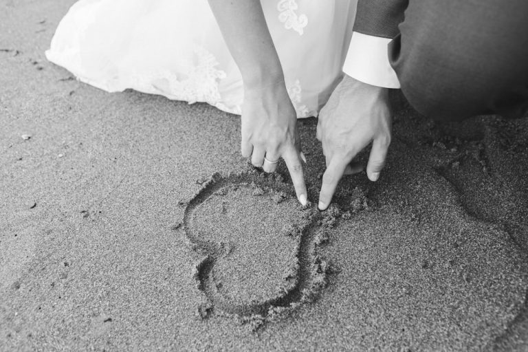
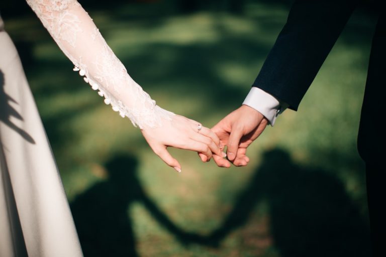
- Your wedding is your personal brand.
- Typography has emotional weight and sets expectations.
- Custom wedding logos add a personal touch.
- Pay attention to color contrasts for readability.
- Details matter—don’t overlook micro-branding moments.
The Psychology of Typography in Wedding Planning
Designing Your Wedding Logo: The Ultimate Personal Touch
Integrating Wedding Themes with Visual Consistency
Practical Takeaways for Your Wedding Branding Journey
The Expert’s Guide to Wedding Stationery and Signage
Why Customization Beats Templates
Overcoming Challenges in Wedding Design
The Role of Color in Visual Designs
Elevate Your Wedding with the Perfect Typography
Final Thoughts on Wedding Branding
Mastering the Aesthetics: The Role of Wedding Visual Designs and Wedding Fonts
When we talk about wedding visual designs, we are referring to the cohesive look and feel that ties every element of your wedding together. This includes everything from the color palette and the logo to the textures of the paper and the layout of the seating chart. However, one of the most underrated yet powerful tools in a designer’s arsenal is the selection of wedding fonts. Typography is the silent narrator of your wedding. It can evoke feelings of timeless elegance with a classic serif, or it can signal a relaxed, whimsical party with a modern hand-lettered script.
Incorporating professional-grade wedding fonts into your wedding visual designs early on ensures that your aesthetic remains consistent. Imagine receiving a Save-the-Date that features a sleek, minimalist design, only to receive a formal invitation months later that looks like a Victorian heirloom. This disconnect can confuse the guest experience. By establishing a “brand guide” for your wedding, you create a sense of harmony that begins the moment the first invitation is mailed and continues until the last “Thank You” card is sent.
The Psychology of Typography in Wedding Planning
Why do we obsess over the curve of a “C” or the swash of a “T”? Because typography carries emotional weight. In the United States wedding industry, we see trends shifting toward “Quiet Luxury”—a style that relies heavily on high-quality materials and sophisticated wedding visual designs rather than over-the-top decor.
In this context, your choice of wedding fonts becomes a primary decor element. A romantic, flowing calligraphy font suggests a formal evening affair filled with candlelight and soft music. Conversely, a bold, sans-serif font might suggest a contemporary city loft wedding with a high-energy reception. When you choose your visual assets, you are setting expectations.
Watch this video for more insights!
Designing Your Wedding Logo: The Ultimate Personal Touch
One of the top wedding tips for modern couples is to create a custom wedding logo or monogram. This isn’t just for royal weddings anymore. A wedding logo acts as a signature for your event. It can be embossed on your stationery, projected onto the dance floor, or even used as a wax seal for your invitations.
To create an effective logo, you must experiment with various wedding fonts to see how your initials interact. Some fonts have beautiful ligatures (the way two letters connect), which can symbolize the union of two people. If you are aiming for a boho wedding theme, you might look for fonts with organic, slightly imperfect lines. For those leaning toward a modern luxury wedding, a clean and structured monogram is the way to go.
Integrating Wedding Themes with Visual Consistency
Whether you are dreaming of a rustic barn celebration or a black-tie gala in New York City, your wedding visual designs must reflect the theme. Let’s look at how fonts and designs play into popular US wedding themes:
- The Modern Minimalist: This theme relies on white space, clean lines, and a “less is more” approach. The wedding fonts used here are often thin sans-serifs or very structured serifs. The visual design focuses on layout and high-quality paper stocks rather than illustrations.
- The Garden Romantic: Think floral illustrations, watercolor accents, and soft pastel color palettes. For this theme, wedding visual designs often incorporate botanical sketches. The fonts should be airy, perhaps a delicate copperplate script that feels like a handwritten letter.
- The Vintage Glamour: Inspired by the 1920s or 50s, this theme uses bold geometric shapes or ornate borders. Strong, Art Deco-inspired fonts work perfectly here, providing a sense of history and grandeur.
Practical Takeaways for Your Wedding Branding Journey
Navigating the world of graphic design can be overwhelming for brides and wedding planners alike. Here are some actionable steps to ensure your wedding visual designs and wedding fonts are executed flawlessly:
- Start with a Mood Board: Before looking at fonts, gather images that represent the “vibe” of your wedding. Are you inspired by nature, architecture, or fashion?
- Limit Your Font Palette: A common mistake is using too many different fonts. Stick to a “Font Pair”—usually one decorative script font for names and headers, and one clean, legible font for the body text and details.
- Test for Legibility: While a highly stylized script might look beautiful on a wedding font preview, make sure your guests can actually read the date, time, and location. This is especially important for older guests.
- Think Beyond Paper: Your wedding visual designs should extend to digital platforms. Ensure your wedding website uses the same or similar fonts and colors as your physical stationery.
- Don’t Forget the Details: Use your chosen wedding fonts on small details like cocktail napkins, favor tags, and the bar menu. These “micro-branding” moments are what guests remember most.
The Expert’s Guide to Wedding Stationery and Signage
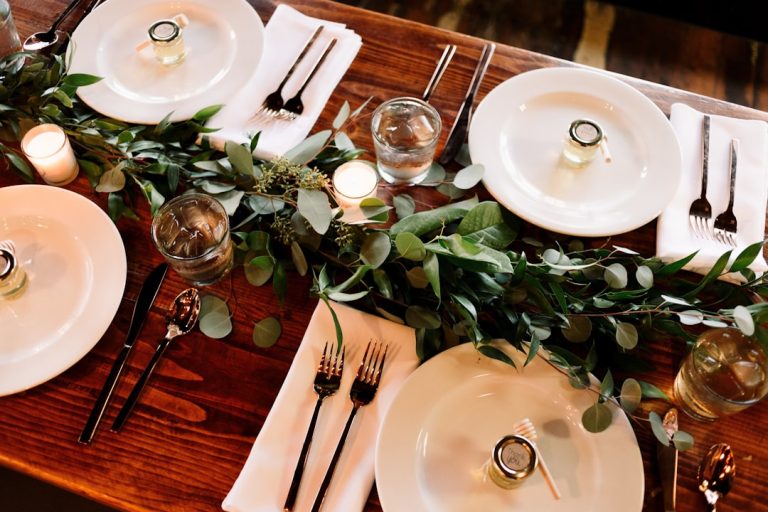
In our experience as wedding industry authorities, we have seen how the right design can transform a standard venue into a personalized sanctuary. Wedding planners often emphasize that the “day-of” stationery is just as important as the invitation. This includes your ceremony programs, place cards, and the increasingly popular “large-format” signage, such as welcome boards and seating charts.
When designing large-format signs, your wedding visual designs must be bold enough to be seen from a distance. This is where your wedding fonts need to be chosen with scale in mind. A thin, spindly script might get lost on a large wooden board, whereas a medium-weight serif will stand out beautifully.
Why Customization Beats Templates
In the age of DIY, many couples are tempted to use standard templates found on massive marketplace websites. However, to truly position your wedding as a high-end event, customization is key. Utilizing unique assets allows you to avoid the “cookie-cutter” look. By sourcing high-quality fonts and design elements, you ensure that no other bride will have the exact same look as you.
This is where the expertise of professional designers and curated font libraries becomes invaluable. Accessing a dedicated resource for wedding-specific typography allows you to find hidden gems that haven’t been overused in the mainstream market.
Overcoming Challenges in Wedding Design
One of the biggest challenges in the wedding industry today is the “Pinterest Fatigue.” Couples are inundated with images, making it hard to settle on a single vision. Our advice? Find one element you love—perhaps a specific wedding font or a particular color palette—and build everything around that.
Another challenge is budget management. High-end wedding visual designs don’t always require a five-figure stationery budget. By investing in the right digital assets, such as professional fonts and logos, you can elevate affordable paper options to look like custom-commissioned work. It is all about how you use the tools at your disposal.
The Role of Color in Visual Designs
Color works hand-in-hand with typography. In the US, we are currently seeing a move away from all-white weddings toward “moody” palettes (emerald green, navy, burgundy) or “earthy” tones (terracotta, sage, sand). When choosing your wedding fonts, consider how they will look when printed in metallic foils or white ink on dark cardstock. The contrast is a vital part of the visual design.
For example, a gold foil stamped serif font on a navy blue invitation screams “luxury” and “evening elegance.” The same font in black on a white background feels more “traditional” and “classic.”
Elevate Your Wedding with the Perfect Typography
As you move forward with your wedding planning, remember that your visual choices are the “wrapper” of your celebration. They tell your guests how to feel, what to wear, and what to expect. By prioritizing high-quality wedding visual designs and carefully selected wedding fonts, you are investing in the atmosphere of your day.
Typography is an art form, and your wedding is the perfect gallery to showcase it. Whether you are looking for that perfect romantic script or a modern serif that exudes sophistication, the right choice is out there.
If you are ready to take your wedding branding to the next level, we invite you to explore a world of specialized design. Your invitation is the first glimpse your guests will have of your new life together—make it unforgettable.
Final Thoughts on Wedding Branding
The wedding industry in the United States continues to evolve, but the desire for a beautiful, cohesive celebration remains constant. By focusing on the details of wedding visual designs and the character of wedding fonts, you create a timeless aesthetic that will look as beautiful in your photo album fifty years from now as it does on your wedding day. Happy planning, and may your wedding be as beautiful as the love it celebrates!
Frequently Asked Questions
Q: What should I prioritize when designing my wedding branding?
A: Focus on cohesive visual designs and carefully chosen wedding fonts to establish your wedding’s identity.
Q: Can I use multiple fonts for my wedding materials?
A: It is recommended to limit your font palette to avoid confusion and maintain readability.
Q: How can I ensure my wedding colors and typography match?
A: Create a mood board to visualize color schemes and fonts together before finalizing your choices.
Q: Is it necessary to hire a professional designer?
A: While it can be helpful, many DIY resources are available to assist you in making high-quality design choices.
Q: How can I make my wedding unique?
A: Customize elements such as fonts, logos, and color schemes to create a look that reflects your personal style.