Wedding Typography How It Shapes Guest Experience

The Psychology of Wedding Typography: How Visual Design Shapes Guest Experience
Estimated reading time: 5 minutes
- Typography influences guest perception – Fonts convey your wedding’s tone.
- Understanding font types – Choose wisely between Serifs, Sans Serifs, and Scripts.
- Focus on consistency – Create a cohesive visual narrative across all materials.
- Limit your fonts – Stick to three to avoid chaos.
- Tech meets design – Utilize tools to find your perfect typography.
Table of Contents
- The Psychology of Wedding Typography
- The Three Pillars of Wedding Fonts
- Creating a Cohesive Visual Narrative
- The Rise of the Wedding Monogram
- Practical Takeaways for the Modern Bride
- Technology and Personalization
- Challenges in the Wedding Industry: The Copycat Culture
- Your Wedding, Your Typeface
- Ready to Design Your Dream Aesthetic?
- FAQ
The Psychology of Wedding Typography
When you close your eyes and picture your dream wedding, what do you see? Most brides immediately visualize the floral arrangements, the silhouette of the dress, or the specific shade of dusty rose for the bridesmaid gowns. These are the visual pillars of the wedding industry, and for good reason. However, as experts in wedding design consulting, we have analyzed data from thousands of successful events across the US, and there is a hidden influencer that often goes unnoticed until it is missing or mishandled: Typography.
Today, we are diving deep into The Psychology of Wedding Typography: How Visual Design Shapes Guest Experience. While color sets the mood, text sets the voice. It is the silent ambassador of your event, speaking to your guests from the moment the save-the-date lands in their mailbox until the final thank-you note is sealed.
The Three Pillars of Wedding Fonts
To master your wedding aesthetic, you don’t need a degree in graphic design, but you do need to understand the three main categories of bridal fonts and the psychological weight they carry.
1. Serifs: The Voice of Tradition and Luxury
Serif fonts have small decorative lines or “feet” at the ends of character strokes. Think of the fonts used in Vogue or high-end fashion houses. They exude reliability, history, and elegance.
- Best for: Formal church ceremonies, ballroom receptions, and couples who want a timeless look that will never date.
- The Vibe: “We are hosting an event of significance.”
2. Sans Serifs: The Modern Minimalist
These fonts lack the decorative feet, offering a clean, geometric, and straightforward look. They are incredibly popular in current modern wedding themes, particularly for city weddings, gallery spaces, or industrial-chic venues.
- Best for: Contemporary couples, rooftop weddings, and design-forward aesthetics.
- The Vibe: “We are chic, current, and uncomplicated.”
3. Scripts and Calligraphy: The Romantic Touch
This is the most diverse category, ranging from illegible, messy artistic scrawls to disciplined copperplate flourishes. Calligraphy styles inject humanity and intimacy into the design.
- Best for: Adding softness to names on invitations, vows, and signage.
- The Vibe: “This is a personal, intimate celebration of love.”
Creating a Cohesive Visual Narrative
One of the biggest challenges in the wedding industry today is the “Pinterest effect.” Brides are inundated with millions of disjointed ideas. You might love a rustic wooden sign, a modern acrylic menu, and a vintage letterpress invitation. However, combining these indiscriminately leads to a confused aesthetic.
Your goal is to create a “Design Thread” that weaves through every touchpoint of the guest experience.
The Invitation Suite: The First Impression
Your invitation is the trailer for the movie that is your wedding. This is where your chosen typography makes its debut. If you are leaning towards a luxury wedding planning aesthetic, consider mixing a strong Serif font for the body text with a delicate, custom script for your names. This contrast creates visual hierarchy, guiding the eye to the most important information while retaining elegance.
Day-Of Stationery: Continuing the Story
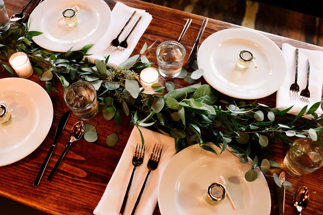
Many couples blow their budget on invites and neglect the day-of details. This is a mistake. Your ceremony programs, menus, and place cards are tactile elements your guests will hold and interact with.
- Menus: Use the same font hierarchy as your invites. If you used a specific Sans Serif for the RSVP card, use it for the menu descriptions.
- Place Cards: This is a great place to utilize calligraphy styles to make every guest feel personally welcomed.
Signage: Functional Art
Wedding reception signage has exploded in popularity. From “Welcome” signs to “Unplugged Ceremony” warnings and signature cocktail lists, these are large-format opportunities to showcase your brand. Because these are read from a distance, legibility is paramount.
- Consulting Tip: Avoid heavy scripts for directional signage (like “Restrooms this way”). Use your primary serif or sans-serif font for clarity, and save the script for emotional headers like “Better Together.”
The Rise of the Wedding Monogram
In the world of high-end consulting, customization is the ultimate luxury. Nothing says “custom” quite like a bespoke wedding monogram design. A monogram is more than just your initials combined; it is a logo for your new family unit.
A well-designed monogram can be the anchor for your entire wedding aesthetic. Once designed, it can be applied to:
- The wax seal on your envelopes.
- The top of your ceremony programs.
- Cocktail napkins at the reception.
- A custom lighting gobo projected onto the dance floor.
- Embroidered onto the hem of your veil or the groom’s cuffs.
When designing a monogram, the interplay of fonts is critical. Intertwining script initials suggests romance and entanglement, while side-by-side serif initials separated by a clean line suggests strength and partnership.
Practical Takeaways for the Modern Bride
Navigating the world of design can be overwhelming, especially when you are balancing budgets and family expectations. Here is actionable advice to ensure your wedding typography hits the mark.
1. The “Rule of Three” Limit
Never use more than three fonts in your wedding brand.
- Font A: The Star (Usually a script or display font for names/headers).
- Font B: The Support (A readable serif or sans-serif for body text).
- Font C: The Accent (Optional, for small details or captions).
Using more than three creates visual chaos and cheapens the look of your design.
2. Readability Trumps Aesthetics
We have seen countless beautiful invitations that end up frustrating guests because the date or venue address is in an unreadable script. Always print a test copy. Tape it to a wall and step back five feet. Can you read the date? If not, change the font. Your grandmother needs to read this, not just your graphic designer friends.
3. Match the Era
If your venue is a 1920s Art Deco hotel, look for fonts with geometric lines and high waists (Gatsby style). If your venue is a Victorian garden, look for florid, romantic scripts. Contextual relevance creates that subconscious feeling of “rightness” for your guests.
Technology and Personalization
As we move through 2024 and into 2025, the intersection of technology and weddings is becoming more pronounced. In our consulting work, we see couples using digital tools to visualize their weddings before spending a dime. AI-driven design tools can help you test different font pairings instantly, showing you how a save the dates card looks with ten different font combinations in seconds.
However, technology should assist, not replace, the human touch. The warmth of a wedding comes from the personal choices you make. While an algorithm can suggest a font pairing, only you know if it feels like you.
Challenges in the Wedding Industry: The Copycat Culture
One of the significant challenges currently facing the wedding industry is the homogenization of design. Because of social media algorithms, brides are often fed the same five font styles repeatedly. This leads to a sea of weddings that look identical.
To break free from this, you need access to unique, high-quality design assets that aren’t just the default options in a basic word processor. Exploring vast libraries of typography allows you to find that hidden gem—a font that perfectly captures your quirky, elegant, or bold personality—that no one else in your friend group has used.
Your Wedding, Your Typeface
Your wedding is a story. It has a beginning (the engagement), a middle (the ceremony), and a happily ever after. Like any good book, the typeface in which the story is written matters. It influences how the reader—your guest—interprets the tale.
By paying attention to The Psychology of Wedding Typography, you are doing more than picking pretty letters. You are curating an atmosphere. You are guiding your guests emotionally through the event. You are ensuring that when they look back at the photos of your welcome sign or hold onto your invitation as a keepsake, they remember exactly how the day felt.
Don’t let your wedding design be an afterthought. Elevate your event from a simple gathering to a branded experience that resonates with luxury and intention.
Ready to Design Your Dream Aesthetic?
Finding the perfect font is the first step toward a cohesive wedding design. Whether you are looking for a romantic script for your vows, a sturdy serif for your invitations, or a unique display font for your bar menu, having the right tools is essential.
Stop scrolling through generic options and start creating a visual identity that is uniquely yours. We have curated a massive collection of premium typography specifically tailored for the modern bride.
Discover the perfect typeface for your big day. Browse our exclusive collection of wedding fonts and design assets at https://fonts.wedding.
Start designing today and turn your wedding vision into a beautiful reality.
FAQ
What is wedding typography?
Wedding typography refers to the style in which text is designed and presented throughout the wedding materials, including invitations, signage, and programs.
Why is it important?
Typography plays a crucial role in shaping the overall aesthetic and emotion of the event, influencing how guests perceive and remember the wedding.
How do I choose the right fonts for my wedding?
Consider your wedding theme, venue, and personal style. Aim for a cohesive look by using a limited number of font styles that complement each other.
Can technology help in choosing fonts?
Yes! Many digital tools and AI-driven design platforms can assist in visualizing font pairings and layouts before making final decisions.
What are some common mistakes to avoid?
Avoid using more than three fonts, prioritize readability, and ensure your font choices align with your wedding theme and venue.