Elegant Wedding Font Pairings Guide and Tips for 2026


Elegant Wedding Font Pairings for 2026
Estimated reading time: 6 minutes
- Choose one decorative font for focal text and one readable font for details.
- Match pairing to venue and tone: formal, modern, rustic, or vintage.
- Test print proofs early for size, weight, and legibility—scripts can change with press methods.
- Confirm licensing and communicate fonts to all vendors for consistent branding.
- Keep accessibility in mind: contrast, size, and clarity benefit all guests.
Table of Contents
- How to Choose Elegant Wedding Font Pairings
- 12 Elegant Font Pairings That Work in 2026
- Design Tips for Print and Digital
- Practical Planning Advice
- Expert Insights
- Real Wedding Inspiration
- Branding: Logos, Typography, Invitations, and Signage
- FAQ
How to Choose Elegant Wedding Font Pairings
Start with hierarchy
Decide which words need emphasis: couple names, venue, date. Use a decorative or script font for those focal elements and a simpler serif or sans-serif for body text (details, addresses, RSVP instructions).
Match mood to venue and style
- Classic/formal: high-contrast serif + ornate script (think ballroom, cathedral).
- Modern/minimal: geometric sans-serif + soft serif or light script.
- Rustic/boho: hand-lettered script + humanist serif or rounded sans.
- Vintage/glam: slab serif or Didone + calligraphic script.
Prioritize readability and contrast
Scripts are beautiful but can be hard to read at small sizes or in low contrast. Reserve them for names and headings; use legible fonts (16–12 pt equivalent for print body text) for essential details.
12 Elegant Font Pairings That Work in 2026
Below are pairing examples with suggested uses (invitations, signage, day-of paper).
- Great Vibes (script) + Playfair Display (serif)
Use: Formal invitations, ceremony programs.
Why: High flourish script for names, classic high-contrast serif for details. - Bickham-style script + Didot
Use: Luxury stationery, evening wedding invites.
Why: Couture elegance; pronounced contrast makes names pop. - Allura (script) + Lora (serif)
Use: Romantic garden weddings, menus.
Why: Soft script with warm, readable serif. - Alex Brush + Merriweather
Use: Church or traditional venue.
Why: Elegant script with robust serif for legibility. - Montserrat (sans) + Playfair Display
Use: Modern, minimalist designs and signage.
Why: Clean sans for headings paired with a refined serif for accents. - Josefin Sans + Lora
Use: Scandinavian/minimal weddings.
Why: Geometric charm with humanist readability. - Quicksand + Georgia
Use: Casual daytime weddings.
Why: Friendly rounded sans with a familiar, readable serif. - Futura + Bodoni/Didone
Use: Art-deco or glam events.
Why: Architectural sans meets high-contrast display serif for drama. - Raleway + Lato
Use: Contemporary suites and websites.
Why: Elegant sans pair that keeps stationery airy and modern. - Tangerine + Cinzel
Use: Destination or Mediterranean weddings.
Why: Calligraphic accents with a classical all-caps display. - Sacramento + Cardo
Use: Vintage-inspired menus and escort cards.
Why: Narrow script complements old-style serif. - Handwritten script + Slab serif (e.g., Arvo)
Use: Rustic chic signage and table numbers.
Why: Warmth from script, stability from slab.
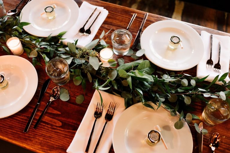
Design Tips for Print and Digital
- Limit to two type families: a decorative headline font and a body font. Add a third sparingly (e.g., a display for numbers).
- Scale intentionally: Names large (36–72 pt depending on format), details smaller (10–14 pt). Test actual print sizes.
- Track and kern: Slightly loosen letter-spacing on uppercase display fonts; tighten pairings where strokes collide.
- Consider paper and print method: Foil and letterpress emphasize thin strokes—avoid fragile scripts for important reads.
- Use color contrast: Dark ink on light paper for readability; if using colored paper, test legibility in proofs.
Practical Planning Advice
Testing and proofs
Order hard-copy proofs early. Scripts can appear bolder or thinner depending on printing and paper grain.
Licensing and files
Check font licenses for commercial printing and web use. Purchase high-quality OpenType fonts when possible. Provide printers with vector (PDF) files or outlined text if requested.
Work with vendors
Share font pairings and hierarchy with calligraphers, signage makers, and your stationer. Provide color codes (Pantone or CMYK/HEX) to ensure consistency.
Timeline
Finalize fonts before sending stationery to print. Allow 3–4 weeks for printing, faster for small runs, and extra time for custom calligraphy.
Expert Insights (from senior wedding editors and designers)
- Use scripts sparingly: “A single script element is enough to add romance,” says a senior designer. Too many scripts create visual clutter.
- Accessibility matters: guests with visual impairments benefit from higher contrast and larger sizes—consider an alternate readable layout for digital invites.
- Brand consistency: carry font pairings through website, signage, and printed materials for a cohesive guest experience.
Real Wedding Inspiration
Example 1: Urban rooftop elopement
Couple used Montserrat for headings and Playfair Display for names and details. Clean, monochrome palette with foil accents. Result: modern, editorial stationery that photographed well against city lights.
Example 2: Vineyard weekend
Pairing: Allura + Lora. Soft watercolor invites with printed maps and day-of signage in Lora ensured readability; Allura used only for couple names and menu headings.
Branding: Logos, Typography, Invitations, and Signage
Typography is a core part of wedding branding. A consistent logo, chosen typefaces, invitation suite, and signage create a unified guest experience from save-the-dates to thank-you cards. When designing a wedding monogram or logo, consider how your chosen script will scale across applications—from a tiny RSVP stamp to a large welcome sign. Explore wedding typography resources and curated font collections at fonts.wedding to discover pairings and licensing guidance that match your theme. Coordinate fonts across digital invites, wedding websites, and printed materials to maintain visual continuity.
FAQ
Q: What fonts work best for wedding invitations?
A: Pair a decorative script or display font for names with a classic serif or clean sans-serif for details. Examples: Great Vibes + Playfair Display; Montserrat + Playfair Display.
Q: How do you choose fonts for a wedding brand?
A: Start with mood and venue, select a focal script or display, then choose a complementary body font for legibility. Keep to two or three type families and apply them consistently across all materials.
Q: Are calligraphy fonts better than modern sans-serifs?
A: They serve different purposes. Calligraphy adds romance and formality; sans-serifs feel modern and minimal. Use calligraphy sparingly and combine with sans-serifs for balance.
Q: What wedding typography trends are popular in 2026?
A: Expect refined scripts paired with modern serifs and clean sans-serifs, minimalist suites with strong typographic hierarchy, and sustainable choices (textured papers and simple type to reduce print waste).
Q: How big should invitation text be for readability?
A: Main names: typically 36–72 pt depending on layout. Body details: 10–14 pt in print. Always order a printed proof to confirm.