Modern Wedding Color Palettes 2026 for Timeless Style


Modern Wedding Color Palettes for 2026: Timeless & Trendy Combinations
Estimated reading time: 8 minutes
- Modern color palettes favor warm neutrals, jewel tones, and moody romantic combinations.
- Use the 60-30-10 rule to ensure a balanced palette.
- Consider season, venue lighting, and photography conditions when finalizing colors.
- Ensure color cohesion across all wedding elements.
- Choose colors that feel authentic rather than following trends.
Table of Contents
- Why Wedding Color Palettes Matter
- Current Wedding Color Trends for 2026
- The 60-30-10 Rule for Wedding Color Selection
- Seasonal Color Palette Recommendations
- Design Tips for Implementing Your Color Palette
- Wedding Branding and Color Cohesion
- Expert Tips From Wedding Designers
- Key Takeaways for Brides
- Frequently Asked Questions
Why Wedding Color Palettes Matter
Your wedding color palette isn’t just aesthetic—it’s the foundation of your entire brand as a couple. Colors evoke emotions, set moods, and create lasting impressions in guests’ memories. A well-chosen palette unifies every element of your wedding, from the invitation suite to table linens, bouquets, and even bridesmaid dresses.
The right color combination tells your story and reflects your personal style. Whether you’re drawn to moody jewel tones, soft pastels, or bold statement colors, your palette should feel authentic to you while complementing your venue and season.
Current Wedding Color Trends for 2026
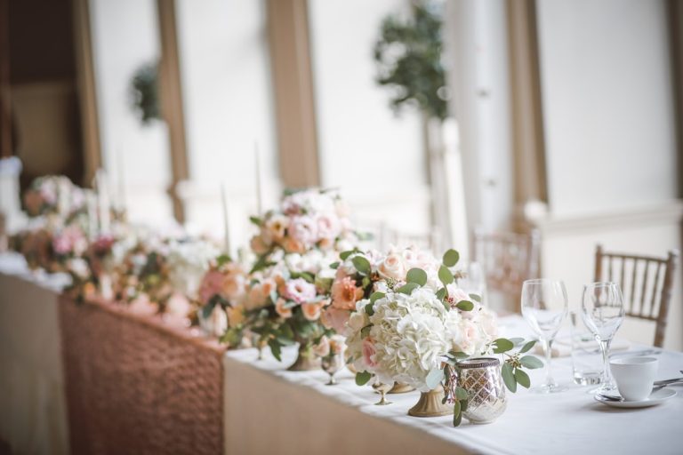
Warm Neutrals With Depth
Warm neutrals continue to dominate modern weddings, but 2026 brings richer, more sophisticated variations. Instead of basic beige, we’re seeing warm taupe, creamy ivory, and soft terracotta paired together. These colors work beautifully with metallic accents like champagne gold or brushed copper.
Why it works: Warm neutrals photograph beautifully in all lighting conditions and create an approachable elegance that feels current rather than dated.
Deep Jewel Tones
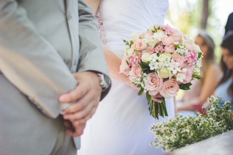
Emerald green, sapphire blue, and burgundy remain popular choices for couples seeking drama and sophistication. In 2026, the trend shifts toward pairing jewel tones with cream or soft white rather than contrasting them with black.
Why it works: Jewel tones feel luxurious and celebratory while maintaining an understated elegance when balanced with lighter neutrals.
Moody Romantics
Combining dusty rose, sage green, and soft gray creates a romantic yet modern aesthetic. This palette appeals to couples who want femininity without being overly traditional.
Why it works: Moody romantic palettes photograph exceptionally well and feel cohesive across both indoor and outdoor venues.
Bold Earth Tones
Burnt orange, ochre yellow, and terracotta paired with cream or ivory create a warm, inviting atmosphere. This palette is particularly striking for fall and summer weddings.
Why it works: Earth tones feel grounded and natural while creating visual interest without requiring multiple accent colors.
The 60-30-10 Rule for Wedding Color Selection
Professional wedding designers often follow the 60-30-10 color rule when creating palettes:
- 60% Primary Color — Your dominant color, typically a neutral like cream, ivory, or warm gray
- 30% Secondary Color — A supporting color that adds personality (jewel tone, soft blush, or muted green)
- 10% Accent Color — A bold or metallic color used sparingly for visual pop
This formula creates balance and prevents your wedding from feeling chaotic or overwhelming.
Seasonal Color Palette Recommendations
Spring Weddings
- Blush pink + sage green + cream + gold
- Lavender + ivory + soft gray + silver
- Pale yellow + white + soft green + rose gold
Summer Weddings
- Coral + navy + cream + gold
- Terracotta + cream + soft green + bronze
- Teal + white + peachy pink + copper
Fall Weddings
- Burgundy + cream + sage green + gold
- Burnt orange + ivory + deep green + copper
- Deep plum + warm gray + blush + champagne
Winter Weddings
- Navy + white + gold + icy blue
- Deep green + cream + burgundy + silver
- Charcoal + white + emerald + champagne

Design Tips for Implementing Your Color Palette
Create a Digital Mood Board
Before finalizing your palette, gather inspiration images that feature your chosen colors. Use tools like Pinterest or Canva to create a visual reference that you and your wedding planner can reference consistently. This ensures every vendor—florist, stationer, decorator—understands your vision.
Consider Your Venue
Your venue’s existing colors significantly impact how your palette appears. A historic brick building suits different colors than a modern white venue. Walk through your space at different times of day and with different lighting before committing to colors.
Test Colors in Different Lighting
Colors appear differently under natural daylight, soft indoor lighting, and artificial flash photography. Request fabric swatches or paint samples and view them throughout your venue in various conditions.
Balance Bold and Neutral
If you choose one bold color, balance it with neutrals. Too many saturated colors create visual chaos; too many neutrals feel bland. Aim for one or two bold choices and build around them.
Think Beyond Florals
Your color palette extends beyond flowers. Consider:
- Invitation paper stock and ink colors
- Bridesmaid dress shades
- Groomsmen tie or pocket square choices
- Table linen and runner colors
- Lighting and uplighting tints
- Signage and calligraphy colors
- Reception details like napkins and menu cards
Wedding Branding and Color Cohesion
A strong wedding color palette is the foundation of your overall wedding brand. When every element—from your wedding website to your invitation suite to your ceremony décor—shares a cohesive color story, guests experience a polished, intentional event.
Consider how your color palette extends to your wedding logo and monogram, if you’re using one. The typefaces, colors, and graphic elements should work harmoniously. Your invitations, signage, and printed materials should all reflect your chosen palette and visual identity. This unified approach creates a memorable brand experience that elevates every aspect of your wedding, from the first glimpse of your invitation to the final thank-you card.
Couples seeking professional guidance on developing a complete visual identity—including typography, color, and design cohesion—can explore comprehensive wedding branding resources at https://fonts.wedding, which offers curated tools and inspiration for creating a unified wedding aesthetic.

Expert Tips From Wedding Designers
- Invest in a color-matching service: Professional color consultants can analyze your skin tone, hair color, and personal style to recommend palettes that truly flatter you and your fiancé in photographs.
- Avoid trendy color combinations: A color palette you love will photograph better and feel more genuine than a trendy combination that doesn’t resonate with you personally.
- Request color-matched samples: Florists, caterers, and decorators may interpret “blush pink” differently. Always request actual samples in your chosen shade.
- Build in flexibility: Choose colors that work with a range of seasonal blooms. If your florist can’t source your preferred flower in your exact color, complementary options should be readily available.
Key Takeaways for Brides
- Modern wedding color palettes in 2026 favor warm neutrals, jewel tones, and moody romantic combinations over bright or cold colors.
- Use the 60-30-10 rule to ensure your palette feels balanced and intentional.
- Consider your season, venue lighting, and photography conditions when finalizing colors.
- Extend your color palette across all wedding elements—invitations, signage, florals, textiles, and décor—for maximum cohesion.
- Test colors in various lighting conditions and request samples from vendors to ensure consistency.
- Choose colors that feel authentic to you rather than following trends blindly.
Frequently Asked Questions
What are the most popular wedding colors for 2026?
Warm neutrals (taupe, cream, terracotta), jewel tones (emerald, sapphire, burgundy), and moody romantic combinations (dusty rose, sage, gray) are trending in 2026. However, the “best” color palette is one that reflects your personal style and complements your venue.
How do I choose a wedding color palette if I’m undecided?
Start by gathering inspiration images that appeal to you across Pinterest, Instagram, and wedding blogs.