Wedding Color Palettes 2026 Best Combinations Guide


Wedding Color Palettes for 2026: The Most Beautiful Combinations for Your Big Day
Estimated reading time: 7 minutes
- Start with feeling. Choose colors based on the emotional atmosphere you want to create, not just what’s trending.
- Let your venue guide your base tones. Work with the existing colors in your space, not against them.
- Build a full tonal range. Include primary colors, accents, neutrals, and a metallic finish for a layered, cohesive look.
- Consider every touchpoint. Your palette should flow from your first save-the-date to your final thank-you note.
- Pair your colors with intentional typography. Font choices amplify your color palette’s personality and contribute to a unified wedding brand.
- Test everything under real lighting. Fabrics, florals, and stationery can look very different under venue lighting versus daylight.
Table of Contents
- Why Your Wedding Color Palette Matters More Than You Think
- The Top Wedding Color Palettes for 2026
- How to Choose the Right Wedding Color Palette for You
- Wedding Branding: Bringing Your Palette to Life Across Every Detail
- Expert Insight: What Wedding Designers Are Saying for 2026
- Frequently Asked Questions
Why Your Wedding Color Palette Matters More Than You Think
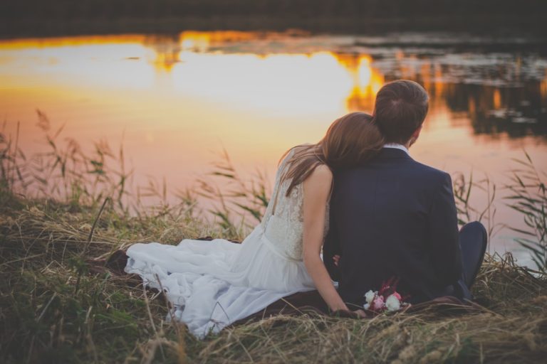
Your color palette is the invisible thread that ties your entire wedding together. Guests may not consciously notice it, but they will absolutely feel it. A cohesive palette creates a sense of harmony and intention — the difference between a wedding that looks beautifully curated and one that feels scattered.
Beyond aesthetics, colors carry emotional weight. Soft dusty rose evokes romance and nostalgia. Deep emerald signals luxury and confidence. Warm terracotta feels grounded and intimate. Choosing colors that align with the feeling you want your wedding to create is just as important as choosing ones that photograph well.
In 2026, couples are moving away from safe, predictable color combinations and leaning into pairings that feel surprising, layered, and genuinely reflective of their personalities.
The Top Wedding Color Palettes for 2026
1. Warm Terracotta, Rust, and Dusty Gold
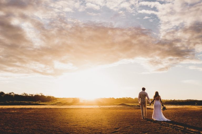
Earthy warmth continues to dominate the wedding landscape in 2026. This palette pairs burnt terracotta with muted rust tones and soft dusty gold accents for a result that feels both romantic and grounded. It works beautifully for outdoor ceremonies, garden weddings, and vineyard receptions.
How to use it:
- Velvet bridesmaids’ dresses in rust or terracotta
- Dried pampas grass, marigolds, and dahlias in floral arrangements
- Gold or aged brass hardware on table settings
- Warm ivory linens to soften the look
This palette photographs exceptionally well during golden hour and pairs naturally with exposed stone, wooden beams, and candlelight.
2. Sage Green, Warm White, and Champagne
One of the most enduring palettes in modern weddings, sage and warm white remains a top choice in 2026 — but with a champagne upgrade. Adding soft champagne tones gives this classic combination new depth and a quietly luxurious edge.
How to use it:
- Sage green bridesmaid gowns with champagne accessories
- White garden roses, eucalyptus, and greenery florals
- Champagne-toned stationery with sage calligraphy accents
- Linen tablecloths with sage ribbon details
This palette suits almost any venue — from rustic barns to sleek modern spaces — and feels equally at home in spring, summer, or autumn.
3. Midnight Blue, Blush, and Pearl
For couples planning an evening wedding or a black-tie affair, midnight blue paired with blush and pearl accents creates an atmosphere of dramatic elegance. This palette leans into contrast — the depth of navy or midnight blue balanced by the softness of blush and the luminosity of pearl or silver.
How to use it:
- Deep blue velvet table runners against white tablecloths
- Blush roses and white peonies in floral centerpieces
- Pearl-toned stationery with navy or midnight blue ink
- Candles in mercury glass holders for a subtle shimmer
This combination works particularly well in ballrooms, historic estates, and urban rooftop venues.
4. Lavender, Lilac, and Soft Butter Yellow
Unexpected and utterly charming, the lavender and butter yellow pairing is one of 2026’s most talked-about emerging trends. It feels whimsical without being childish, and cheerful without being loud. This palette is ideal for spring and early summer weddings.
How to use it:
- Mix lavender and lilac blooms with soft yellow wildflowers
- Butter yellow linens with lavender napkin ties
- Watercolor-style invitations featuring both hues
- Ribbon-wrapped bouquets in alternating lavender and yellow
Typography and stationery play a significant role in this palette — delicate serif or script typefaces in lilac on cream paper make for stunning wedding stationery suites.
5. Rich Plum, Burgundy, and Antique Gold
Deep jewel tones are making a confident return in 2026. Plum and burgundy with antique gold accents create a palette that feels opulent, moody, and deeply romantic — perfect for autumn and winter weddings.
How to use it:
- Dramatic floral arrangements featuring deep plum dahlias, burgundy roses, and dried botanicals
- Antique gold candelabras and tableware
- Velvet menus and programs in deep plum
- Stationery with foil printing in antique gold
This palette pairs beautifully with dark hardwood venues, stone churches, and dimly lit reception halls.
How to Choose the Right Wedding Color Palette for You
Start With a Feeling, Not a Pinterest Board
Before you begin collecting images, ask yourself: How do I want my wedding to feel? Dreamy and romantic? Bold and celebratory? Intimate and earthy? Your emotional answer will point you toward a natural color family.
Consider Your Venue First
Your venue is a major color element in itself. If you’re marrying in a space with exposed brick and warm wood tones, a cool, icy palette may feel disconnected. Let the bones of your venue guide your base tones, then build your palette on top of them.
Think in Layers, Not Just Hues
A great wedding color palette isn’t just two or three colors — it’s a full tonal range. Think about your primary colors, your accent tones, your neutrals, and your metallic finish. A palette with depth gives your design team more to work with and creates visual interest across all your wedding elements.
Test Colors in Different Lighting
Wedding venues change dramatically under different lighting conditions. Always check fabric swatches, stationery samples, and floral mock-ups under your venue’s actual lighting — both natural and artificial — before committing.
Wedding Branding: Bringing Your Palette to Life Across Every Detail
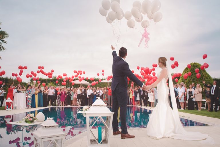
In 2026, more couples are approaching their wedding with a unified brand identity — and color palette is at the heart of that. Your chosen hues should flow consistently through every touchpoint: your save-the-dates, invitation suite, ceremony programs, signage, menus, table numbers, and thank-you cards.
Typography plays an equal role alongside color in creating that cohesion. The fonts you choose for your stationery and signage should complement your palette’s personality. A plum and antique gold palette calls for an ornate serif or calligraphy script. A sage and champagne palette suits a clean, airy combination of a delicate serif and a minimal sans-serif.
Couples and wedding designers who want to explore how typography interacts with their color choices can find curated wedding font resources at fonts.wedding, which offers a thoughtful collection of typefaces suited to a wide range of wedding aesthetics.
Investing time in wedding branding — logo monograms, consistent typography, and cohesive color application — elevates the entire experience for guests and creates a lasting visual identity for your wedding photography and albums.
Expert Insight: What Wedding Designers Are Saying for 2026
Leading wedding designers are noting a clear shift away from the ultra-minimal all-white aesthetic that dominated the early 2020s. In its place, couples are embracing color with confidence — but with a more curated, considered approach than the maximalist moments of previous decades.
The focus in 2026 is on meaningful layering: palettes that tell a story, reference the couple’s heritage or favourite season, or simply reflect who they are as individuals. Designers are also noting increased interest in unexpected color combinations — pairings that surprise guests and feel genuinely original rather than derivative of what everyone else is doing.
The most successful wedding palettes in 2026 aren’t necessarily the most popular ones. They’re the ones that feel most authentically you.
Frequently Asked Questions
What are the most popular wedding color palettes for 2026?
In 2026, the most popular wedding color palettes include warm terracotta and dusty gold, sage green and champagne, midnight blue and blush, lavender and butter yellow, and rich plum with antique gold. Each palette suits different seasons, venues, and wedding styles.
How many colors should a wedding color palette have?
Most wedding designers recommend a palette of three to five colors: one or two primary hues, one or two accent tones, and a neutral base. Adding a metallic finish — gold, silver, rose gold, or antique brass — gives you a fifth dimension without overwhelming the overall look.
How do I apply my wedding color palette consistently?
Apply your palette across every visual element of your wedding: stationery, florals, table linens, candles, bridesmaid attire, signage, cake, and even the ribbon on your bouquet. Using the same color swatches when briefing each vendor helps maintain consistency.
What wedding colors photograph best?
Rich, warm tones like terracotta, burgundy, sage green, and blush tend to photograph beautifully in natural light. Jewel tones such as deep navy and plum look stunning in indoor, candlelit settings. Pale or washed-out palettes can sometimes lose definition in photography, so it’s worth discussing your palette with your photographer during the planning process.
How does typography relate to wedding color palettes?
Typography and color work together to define the visual personality of your wedding. Ornate script fonts complement deep jewel-toned palettes, while clean serifs pair naturally with soft, minimal color schemes. Ensuring your font choices align with your colors creates a seamlessly branded wedding experience across all printed and digital materials.