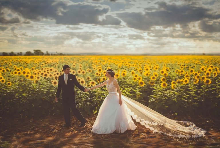
Wedding Color Palettes 2026 Guide with Ideas and Tips


Wedding Color Palettes 2026: Selecting and Applying Sophisticated Color Combinations for Maximum Impact
Estimated reading time: 18 minutes
Key takeaways:
- Wedding color palettes in 2026 focus on intentional, sophisticated combinations that reflect couple identity, venue architecture, season, and guest experience.
- Use a primary, secondary, accent, and neutral framework to create a cohesive palette that works across stationery, florals, linens, and décor.
- Lighting and photography dramatically affect how colors appear, so test samples in the actual venue before finalizing decisions.
- Contemporary palettes for 2026 favor jewel tones, refined neutrals, and botanical combinations that feel timeless and visually rich.
- Precise color communication using hex, RGB, CMYK, and Pantone values helps vendors deliver consistent results across all wedding elements.
Table of contents
- Understanding Color Psychology in Wedding Design
- Strategic Color Palette Development
- Contemporary Color Palette Trends for 2026
- Color Application Across Wedding Elements
- Color Coordination with Lighting Conditions
- Color Seasonal and Temporal Considerations
- Testing and Confirming Color Selections
- Common Color Selection Mistakes
- Digital Color Specification and Communication
- Conclusion: Color as Celebration’s Visual Heart
- FAQ
Understanding Color Psychology in Wedding Design
Color transcends decoration to influence emotional experience and celebration atmosphere.
Emotional Impact of Color Choices
Blue communicates calm, trust, and stability. Cool blue tones create serene, peaceful atmospheres. Deep navy conveys formality and sophistication. Light sky blue creates approachable, friendly feeling. Blue pairs beautifully with warm accents (gold, cream, blush) preventing cold appearance.
Green represents nature, growth, and renewal. Soft sage green communicates contemporary sophistication. Deep forest green conveys luxury and formality. Botanical greens feel grounded, natural, and peaceful. Green works beautifully with gold, cream, or warm neutrals.
Blush and Rose communicate romance, femininity, and tenderness. Pale blush creates ethereal, romantic atmosphere. Deeper mauve-rose communicates sophistication and complexity. Rose tones pair beautifully with gold, navy, or white.
Gold and Warm Metallics represent luxury, celebration, and warmth. Gold communicates elegance and timelessness. Warm tones elevate celebrations feeling special and celebratory. Gold pairs beautifully with virtually all colors, particularly white, navy, blush, and green.
White and Cream represent purity, simplicity, and elegance. Pure white feels contemporary and clean. Cream communicates warmth and softness. Whites and creams provide foundation allowing other colors to stand out.
Gray and Charcoal represent sophistication, modernity, and neutrality. Soft gray creates contemporary, understated aesthetic. Charcoal conveys formality and drama. Gray pairs beautifully with virtually all colors, providing sophisticated foundation.
Burgundy and Deep Wine represent luxury, passion, and depth. Deep wine communicates sophisticated formality. Burgundy feels rich and romantic. These dramatic colors work beautifully as accent colors or primary colors for formal celebrations.
Black represents formality, drama, and sophistication. Pure black creates high contrast and contemporary feel. Black pairs dramatically with metallics, white, or jewel tones. Use intentionally—too much black feels somber; balanced application creates sophistication.
Strategic Color Palette Development
Effective palettes begin with intentional selection rather than trend-following.
Primary, Secondary, and Accent Color Framework
Primary Color is your signature color appearing most prominently. This color should resonate emotionally and feel personally meaningful:
- Appears in larger design elements (linens, primary flowers, dominant stationery color)
- Should feel beautiful in substantial quantities without becoming overwhelming
- Communicates primary celebration personality
- Examples: blush, navy, sage green, burgundy
Secondary Color is a supporting color providing balance and visual interest:
- Appears in supporting design elements (some florals, stationery accents, some linens)
- Should complement rather than compete with primary color
- Creates visual complexity without overwhelming
- Examples: white (with any primary), gold (with navy or blush), cream (with any primary)
Accent Color is a metallic or small-quantity color adding sophistication and visual pop:
- Appears sparingly (foil on invitations, jewelry, small floral elements)
- Should elevate rather than distract
- Creates luxury perception through strategic application
- Examples: rose gold, champagne, copper, bronze
Neutral Tones are supporting neutrals (black, white, gray, cream) enabling readable communication:
- Provide foundation allowing primary colors to stand out
- Ensure text readability on varied backgrounds
- Create breathing room preventing visual overwhelm
- Essential for sophisticated, intentional designs
Palette Development Process
Personal Preference Gathering – Collect images, materials, and references resonating with you:
- Pinterest boards
- Interior design inspiration
- Fashion and clothing references
- Nature photography
- Travel photography
- Magazine clippings
Analyze collected references identifying recurring colors and color combinations. Patterns reveal authentic preferences.
Seasonal Consideration – Account for celebration season:
Spring Palettes – Light, fresh colors (pale pinks, soft greens, whites, light blues, pastels). Spring seasons support soft, romantic palettes.
Summer Palettes – Vibrant, saturated colors (coral, bright blue, warm gold, white, jewel tones). Vibrant colors complement bright summer light and outdoor settings.
Fall Palettes – Warm, earthy colors (burgundy, gold, burnt orange, cream, deep green). Seasonal colors align naturally with fall scenery.
Winter Palettes – Cool, jeweled colors (navy, emerald, silver, white, burgundy). Jewel tones create warmth and richness during cold season.
Venue Architecture Consideration – Select colors complementing venue:
- White or light-colored venues benefit from saturated primary colors creating visual interest
- Dark venues benefit from light secondary colors creating brightness
- Historic venues benefit from traditional color palettes respecting architectural character
- Modern venues benefit from contemporary color selections emphasizing design direction
Lighting Condition Assessment – Consider how colors appear in actual celebration lighting:
- Natural daylight creates different color appearance than evening candlelight
- Warm tungsten lighting shifts cool tones, making them appear warmer
- Soft pink appears completely different under natural light versus candlelight
- Test color selections in actual venue lighting before finalizing
Photography Consideration – Select colors photographing beautifully:
- Saturated colors photograph beautifully in natural light
- Pastel colors require careful lighting to photograph well
- Metallics and whites photograph with complexity—slight adjustment needed
- Test prospective colors in actual photography to ensure camera translation

Contemporary Color Palette Trends for 2026
Modern celebrations increasingly embrace sophisticated, intentional color combinations.
Jewel Tone Elegance
Deep, saturated jewel tones create luxury and drama:
- Emerald Green with Gold and Cream – Sophisticated, luxurious combination working beautifully for formal celebrations. Emerald depth creates opulent feeling.
- Sapphire Blue with Blush and Gold – Contemporary luxury palette combining cool and warm tones. Creates balanced, sophisticated aesthetic.
- Burgundy with Navy and Gold – Deep, formal palette communicating luxury and elegance. Works beautifully for winter celebrations.
- Sapphire with Rose Gold and White – Modern luxury palette bridging cool and warm tones. Contemporary while feeling timeless.
Jewel tone palettes photograph beautifully, create dramatic impact, and feel intentionally curated rather than trend-following.
Sophisticated Neutrals with Accent
Neutral-forward palettes emphasizing texture over color:
- White with Taupe and Rose Gold – Minimalist palette creating sophisticated backdrop allowing other elements to shine. Rose gold adds warmth without color saturation.
- Cream with Sage and Warm Gold – Soft, sophisticated palette creating calm, serene atmosphere. Natural, botanical feeling.
- Gray with Blush and Copper – Contemporary palette balancing cool and warm tones. Feels modern while remaining elegant.
- White with Charcoal and Champagne – High-contrast palette creating contemporary, dramatic feeling. Sophisticated and striking.
Botanical and Nature-Inspired
Color palettes inspired by natural elements:
- Sage Green with Blush and White – Soft, romantic palette reflecting garden setting. Works beautifully for outdoor celebrations.
- Forest Green with Cream and Rose Gold – Earthy palette inspired by woodland settings. Creates grounded, natural aesthetic.
- Dusty Blue with Soft Yellow and White – Inspired by natural landscapes, creates peaceful, approachable atmosphere.
- Mauve with Green and Cream – Inspired by flower garden, creates romantic, botanical feeling.
Color Application Across Wedding Elements
Strategic color application ensures consistency and maximizes impact.
Invitation and Stationery Color Strategy
Background/Foundation – Invitation cardstock color establishes primary visual impression:
- White or cream cardstock provides neutral foundation allowing other colors to stand out
- Colored cardstock (blush, light blue, pale green) makes color statement immediately
- Dark cardstock (navy, charcoal) requires careful text color selection for readability
Text Color – Typography color impacts readability and color impression:
- Dark text (black, charcoal, navy) on light cardstock creates highest contrast and readability
- Light text (white, cream) on dark cardstock creates dramatic effect but requires careful color selection
- Metallic text creates luxury perception while potentially reducing readability
Accent Color Introduction – Secondary and accent colors appear through:
- Metallic foiling (gold, rose gold, silver)
- Colored borders or accents
- Decorative elements or illustrations
- Envelope liner colors
- Complementary colored cardstock for response card
Consistency Across Suite – All stationery pieces should reflect established palette:
- Invitations, response cards, direction cards, menu cards, place cards maintain color consistency
- Variation acceptable (varying saturation, secondary color emphasis) but palette consistency essential
- Envelope addressing and styling should coordinate with selected palette
Floral and Botanical Color Expression
Flowers represent significant palette expression opportunity.
Primary Color Through Florals – Feature flowers in primary palette color:
- All-white celebrations through white flowers exclusively
- Blush celebrations through blush and cream roses
- Blue celebrations through blue hydrangeas and delphiniums
- Green celebrations through unusual greenery-focused designs
Secondary and Accent Colors in Floral Design – Introduce supporting colors through botanical selection:
- Greenery provides secondary color in most arrangements
- Accent colors might appear through occasional unusual blooms or decorative elements
- Metallic elements (gold, copper wire) can introduce accent colors
Monochromatic Floral Approach – Single-color or closely-related floral palette creates sophisticated cohesion:
- All-white flowers with varied textures
- Blush to deep rose gradient
- Green-to-burgundy progression
Complementary Color Approach – Pairing complementary colors creates visual drama:
- Blush and green combination
- Blue and gold combination
- Burgundy and green combination
Linens and Textile Color Coordination
Table linens significantly impact color impression.
Monochromatic Linens – Single-color linens in primary or neutral color:
- White linens provide clean foundation allowing other colors to stand out
- Colored linens (blush, navy, sage) make bold color statement
- Metallic sheen linens add sophistication without color alteration
Contrasting Linens – Varied linen colors creating visual interest:
- Blush linens at some tables, white at others (requires intentional placement for balanced appearance)
- Navy tablecloths with white napkins
- Cream linens with colored overlays
Textural Variation – Varied finishes in single color create visual interest while maintaining cohesion:
- Matte and satin finishes in same color
- Varied weaves (damask, ribbed, smooth) in coordinated colors
Layering Approach – Multiple linen layers creating depth:
- Foundation linen plus overlay in coordinating or complementary color
- Creates visual interest while maintaining intentional coordination

Signage and Décor Color Consistency
All signage and décor should reflect established palette.
Welcome and Statement Signage – Primary signage communicates color palette prominently:
- Feature primary color through background, text color, or design elements
- Introduce secondary and accent colors creating visual interest
- Ensure color choices photograph beautifully and create strong visual impression
Directional and Functional Signage – Even practical signage reflects brand colors:
- Consistent text color across all signage (black, navy, or primary color)
- Background colors coordinating with palette
- Unified approach across welcome, directional, and exit signage
Table Numbers and Place Cards – Small elements reflecting palette:
- Text color consistent with other signage
- Perhaps slight color variation (primary color, secondary color) across tables
- Consider metallic accents introducing accent color
Color Coordination with Lighting Conditions
Lighting dramatically impacts color appearance—essential consideration in color selection.
Daylight Considerations
Warm Golden Hour Light (late afternoon) flatters warm tones beautifully:
- Blush, gold, cream, and warm metallics appear luminous
- Cool tones (blue, navy) may appear grayed in warm light
- Test color selections in late afternoon light
Bright Midday Light reveals true colors with high contrast:
- Saturated colors photograph beautifully in bright daylight
- Pastels may appear washed out in bright light
- Metallics may create glare in bright sunlight
Overcast Daylight diffuses light creating soft appearance:
- All colors photograph beautifully in overcast light
- Soft pastels and metallics work particularly well
- Most forgiving lighting condition for color selection
Evening and Artificial Lighting
Warm Tungsten Lighting (traditional incandescent) shifts colors toward warmth:
- Warm tones become more saturated and dramatic
- Cool tones (blue, green) shift toward warmer hue
- Test colors under actual reception lighting
Candlelight creates warm, intimate lighting and romantic atmosphere:
- Warm colors (gold, blush, cream) appear luminous and romantic
- Cool colors may appear muted or grayed
- Candlelight particularly flatters jewel tones
LED and Cool Lighting provides contemporary lighting with adjustable color temperature:
- Allows color temperature adjustment for optimal color appearance
- Cool-temperature LED can make colors appear more vibrant
- Coordinate with lighting design for optimal color expression
Color Seasonal and Temporal Considerations
Season and time of day influence ideal color selection.
Spring Celebrations
Ideal Palettes – Light, fresh combinations:
- Pale pink with white and soft green
- Lavender with white and sage
- Soft blue with blush and white
- Pastel combinations reflecting spring renewal
Challenges – Pastel colors require careful lighting consideration. Overcast spring days may muffle soft pastels; bright spring light may wash them out.
Summer Celebrations
Ideal Palettes – Vibrant, saturated colors:
- Coral with gold and white
- Bright blue with gold and white
- Jewel tones (emerald, sapphire, ruby)
- Saturated colors complement bright summer light
Considerations – Vibrant colors may feel overwhelming in very bright light. Consider depth to prevent harsh appearance.
Fall Celebrations
Ideal Palettes – Warm, earthy tones:
- Burgundy with gold and cream
- Burnt orange with navy and white
- Deep green with warm gold
- Colors coordinating with natural fall foliage
Advantages – Seasonal colors align naturally with venue appearance and season context.
Winter Celebrations
Ideal Palettes – Cool, jeweled tones:
- Navy with silver and white
- Emerald with gold and cream
- Burgundy with gold and white
- Deep colors creating warmth and richness during cold season
Lighting Consideration – Evening winter celebrations benefit from warm lighting creating cozy atmosphere. Metallic accents create sparkle and celebration feeling.
Testing and Confirming Color Selections
Strategic color selection requires careful verification before commitment.
Swatch and Material Testing
Physical Sample Collection – Gather actual fabric and paper samples in prospective colors:
- Request fabric swatches from linen rental companies
- Order cardstock samples from paper suppliers
- Collect flower samples from florist
- Gather paint samples if considering venue color coordination
Lighting Assessment – View samples in actual celebration venue under actual lighting:
- Natural daylight appearance
- Evening lighting appearance
- Candlelit appearance
- Under venue’s architectural lighting
Scale Consideration – View samples at scale:
- Small swatch looks different than large linens
- Single flower looks different than full arrangement
- Test samples by viewing small swatches at distance
Photography Testing
Color Photography – Commission photographer to capture color combinations:
- Photograph fabric swatches, floral samples, and color combinations
- Assess how colors appear in photographs
- Ensure camera captures colors accurately reflecting your vision
Mockup Creation – Create simple mockups showing color combinations:
- Flat lay mockups with invitation, fabric, flowers, and metallic accents
- Photography of complete color palette application
- Multiple angles and lighting conditions
Vendor Communication and Approval
Explicit Color Specification – Provide precise color information to vendors:
- Hex codes or RGB values for digital applications
- Pantone numbers for print production
- Physical samples (fabric, paper, flowers)
- Photographs of intended color appearance
Mockup Review – Request mockups before final production:
- Florist provides floral design mockups
- Caterer provides plated food presentation
- Stationer provides proofing before production
- Photographer provides sample images reflecting color direction
Common Color Selection Mistakes
Trend Obsession Over Personal Preference
Don’t select colors primarily because they’re trendy. Trend-following results in celebrations feeling dated when viewed years later. Select colors resonating with authentic preferences.
Inadequate Lighting Consideration
Never finalize colors without testing under actual celebration lighting. Colors appearing beautiful in showroom may look completely different in actual celebration lighting.
Insufficient Color Contrast
Ensure adequate contrast between text and background colors. Light gray text on white background may look beautiful but becomes unreadable from distance. Verify readability before production.
Monochromatic Monotony
While monochromatic palettes are beautiful, ensure sufficient variation preventing boring appearance. Textural variation, metallic accents, and varied saturation levels create interest within limited color palette.
Overuse of Multiple Colors
Resist using too many colors fragmenting visual coherence. Stick to three-color framework (primary, secondary, accent) maintaining sophistication and intentionality.
Ignoring Venue Existing Colors
Consider existing venue colors preventing jarring contrast. Coordinate with—not against—existing architectural colors and surroundings.

Digital Color Specification and Communication
Modern wedding planning requires precise color communication across digital and print applications.
Color Code Documentation
Hex Codes – Six-digit codes for digital applications:
- Format: #FFFFFF (white), #000000 (black)
- Used for web design, digital graphics, digital invitations
- Precise, easily communicated specification
RGB Values – Red, Green, Blue values for screen display:
- Format: RGB (255, 255, 255) for white
- Standard for digital design applications
- Used for photography editing and digital media
CMYK Values – Cyan, Magenta, Yellow, Black values for print production:
- Format: CMYK (0%, 0%, 0%, 0%) for white
- Essential for accurate print color reproduction
- Differs from RGB—must convert for print production
Pantone Numbers – Standardized color matching system:
- Format: Pantone 294 C (Navy Blue)
- Professional standard for precise color matching
- Essential for consistent color across print applications
Documentation and Communication
Brand Guidelines Document – Create comprehensive color guidelines:
- Primary, secondary, and accent color specifications
- Multiple color code formats (hex, RGB, CMYK, Pantone)
- Acceptable color variations
- Applications for each color
Vendor Communication – Provide complete color specification to all vendors:
- Hex codes for digital applications
- Pantone numbers for print production
- RGB values for screen display
- Physical samples for reference
Consistency Verification – Review vendor mockups ensuring color accuracy:
- Compare mockup colors to specification
- Request adjustments if necessary
- Approve before proceeding to production
Conclusion: Color as Celebration’s Visual Heart
Wedding color palettes 2026 represent far more than aesthetic selection—they establish celebration’s emotional tone, communicate couple identity, and create lasting visual impression. By understanding color psychology, developing intentional palettes reflecting authentic preferences, considering seasonal and lighting contexts, and communicating precisely with vendors, you create cohesive, beautiful celebrations that photograph gorgeously while feeling genuinely yours.
Strategic color selection transforms individual elements into unified celebration communicating through consistent visual language. Your carefully selected color palette becomes celebration’s visual heart—a beautiful foundation elevating every detail and creating memorable impression lasting long after your celebration concludes.
FAQ
What is the best way to choose a wedding color palette for 2026?
Start with your personal preferences, then refine the palette using season, venue architecture, lighting, and photography considerations. A strong palette is intentional, not trend-driven.
How many colors should be in a wedding palette?
A sophisticated wedding palette usually works best with three color roles: primary, secondary, and accent, plus neutrals as needed for readability and balance.
Which wedding colors photograph best?
Saturated colors tend to photograph beautifully in natural light, while jewel tones, warm metallics, and well-balanced neutrals are especially reliable. Pastels can work well with the right lighting.
Should I test my colors at the venue?
Yes. Always test swatches, florals, stationery, and linens in the actual venue under daytime, evening, and candlelight conditions to see how colors truly appear.
How do I communicate wedding colors to vendors?
Provide clear specifications using hex codes, RGB values, CMYK values, Pantone numbers, and physical samples. Written guidelines help ensure color consistency across vendors.