Wedding Invitation Typography Trends and Font Pairing Ideas


Wedding Invitation Typography Trends for 2026: Elegant Fonts, Pairings, and Design Ideas
Estimated Reading Time: 5 minutes
- Choose fonts that match the wedding style, not just current trends.
- Keep invitation text legible at print size.
- Use no more than two or three font styles in one suite.
- Let spacing and hierarchy do some of the design work.
- Make sure the invitation typography carries through to signage and stationery.
Table of Contents
- Why Typography Matters in Wedding Invitation Design
- The Biggest Wedding Invitation Typography Trends for 2026
- Best Font Styles for Different Wedding Themes
- Design Tips for Beautiful Wedding Invitation Typography
- Practical Planning Advice for Couples and Designers
- Real Wedding Inspiration: Typography Styles That Feel Fresh in 2026
- Wedding Branding and Typography: Why It All Connects
- FAQ
Why Typography Matters in Wedding Invitation Design
Typography is often the first design element guests notice when they receive a wedding invitation. Before they read the details, they feel the tone of the event through the lettering style, spacing, and hierarchy.
A thoughtful type system can communicate:
- The formality of the wedding
- The couple’s personal style
- Whether the event feels classic, modern, romantic, or bold
- How polished and cohesive the full stationery suite will look
For planners, designers, and couples, wedding invitation typography is no longer just about choosing a pretty font. It is about creating an experience.
The Biggest Wedding Invitation Typography Trends for 2026
1. Soft Editorial Serif Fonts
One of the strongest trends for 2026 is the rise of elegant serif fonts that feel inspired by fashion magazines and luxury print design. These fonts create a refined, high-end look without feeling overly traditional.
They work especially well for:
- Black-tie weddings
- City weddings
- Luxury destination weddings
- Minimalist invitation suites
Look for serif fonts with balanced contrast and graceful curves. They pair beautifully with plenty of white space and restrained color palettes.
2. Modern Script Accents
Script fonts are not going away, but in 2026 they are being used more selectively. Instead of placing script everywhere, couples are using it as an accent for names, monograms, or key words.
This approach keeps the invitation from feeling too ornate.
Best uses for script fonts:
- Couple names
- The word “invite” or “celebrate”
- Envelope addressing
- Ceremony programs and signage accents
For a more polished result, pair script fonts with a clean serif or sans serif.
3. High-Contrast Pairings
Mixed typography remains a major design direction. The most successful wedding invitation layouts combine a statement font with a supporting font that balances it out.
Common pairings include:
- Elegant serif + minimal sans serif
- Romantic script + classic serif
- Editorial serif + subtle handwritten accent
The goal is contrast, not competition. If both fonts are highly decorative, the design can quickly feel cluttered.
4. Minimal Sans Serif Suites
For couples leaning modern, sans serif fonts are becoming a popular choice for entire invitation suites. Clean typography can feel surprisingly luxurious when paired with strong layout structure, subtle textures, and premium paper.
This trend suits:
- Minimalist weddings
- Contemporary venues
- Neutral color palettes
- Design-forward couples
A well-chosen sans serif can communicate confidence and sophistication without relying on ornamentation.
5. Custom-Looking Lettering
In 2026, many couples want wedding stationery that feels personal and distinctive. That has led to increased demand for custom lettering, bespoke monograms, and font combinations that look one-of-a-kind.
This does not always mean fully custom type design. Sometimes it simply means:
- A unique monogram
- Hand-drawn flourishes
- Customized spacing and alignment
- Creative use of typography hierarchy
Even small adjustments can make invitation suites feel more exclusive.
Best Font Styles for Different Wedding Themes
Classic Weddings
For traditional celebrations, choose fonts that feel timeless and formal.
Good options include:
- High-contrast serif fonts
- Refined calligraphy scripts
- Small caps for supporting text
These styles work well with ivory paper, letterpress printing, and formal wording.
Modern Weddings
Modern weddings benefit from clean lines and reduced visual noise.
Try:
- Geometric sans serifs
- Sophisticated serif fonts with minimal ornament
- Bold name styling paired with restrained details
This style looks especially strong with monochrome or muted color palettes.
Romantic Weddings
Romantic typography tends to be softer and more expressive.
Use:
- Flowing scripts in moderation
- Transitional serif fonts
- Delicate italic accents
This approach pairs beautifully with floral artwork, blush tones, and soft texture.
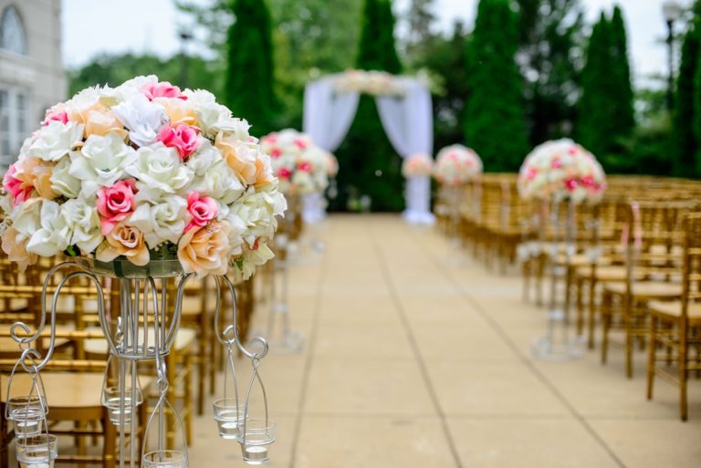
Garden and Outdoor Weddings
Outdoor weddings often call for a more organic feel.
Consider:
- Lightweight serif fonts
- Handwritten-style accents
- Relaxed spacing and airy layouts
These choices echo the natural setting without becoming overly rustic.

Design Tips for Beautiful Wedding Invitation Typography
Prioritize Readability
A wedding invitation should be elegant, but it must also be easy to read. If guests struggle to decode names, dates, or locations, the design is not doing its job.
Keep these principles in mind:
- Avoid using too many decorative fonts
- Make sure date and venue details are clear
- Test the design at actual print size
- Check contrast against the paper color
If a font looks beautiful but becomes illegible when printed small, it is not the right choice for body copy.
Create a Clear Hierarchy
Typography hierarchy helps guide the eye through the invitation.
A strong hierarchy usually includes:
- Couple names
- Event wording
- Date and time
- Venue and location
- Additional details
Each level should feel intentionally styled so the invitation reads smoothly.
Use Spacing as a Design Tool
Kerning, tracking, and line spacing are just as important as font choice. Luxury invitation design often relies on generous spacing to create calm and elegance.
Try:
- Slightly increased letter spacing for uppercase text
- More breathing room around names or monograms
- Balanced margins and centered layouts
Spacing can make even simple typography look elevated.
Match Typography to the Print Method
Different print methods affect how fonts appear.
For example:
- Letterpress often suits serif fonts and bold strokes
- Foil stamping works well with clean, confident letterforms
- Digital printing allows more flexibility but still requires clarity
- Embossing and debossing benefit from simpler shapes
Choose fonts that support the printing technique rather than fight against it.
Practical Planning Advice for Couples and Designers
Start With the Wedding Mood
Before choosing a font, define the wedding atmosphere. Is it formal, relaxed, fashion-forward, romantic, or minimalist? Typography should follow the mood, not lead it.
A useful planning sequence is:
- Decide the overall wedding style
- Pick the invitation color palette
- Choose paper and print method
- Select primary and secondary fonts
- Build the full suite from there
This helps avoid last-minute mismatches.
Build a Typeface Palette, Not Just a Single Font
Most successful invitation suites use a small type system rather than one font everywhere.
A simple formula:
- One display font for names or key words
- One supporting font for details
- Optional accent font used sparingly
Limiting the number of fonts keeps the design cohesive and polished.
Test Typography Across the Full Stationery Suite
Typography should work consistently across all wedding paper goods, including:
- Save-the-dates
- Invitations
- RSVP cards
- Seating charts
- Ceremony programs
- Menu cards
- Welcome signs
What looks stunning on an invitation may not scale well for signage, so it is important to plan for multiple formats.
Real Wedding Inspiration: Typography Styles That Feel Fresh in 2026
A few visual directions are emerging in real weddings and styled shoots:
- Luxury monochrome suites with bold serif names and minimalist details
- Romantic floral invitations with script accents and soft italic body text
- Editorial city weddings featuring all-caps sans serif layouts and sharp spacing
- Old-world inspired stationery with classic serif fonts and formal phrasing
- Artful contemporary suites using mixed case typography and monogram-led branding
What these designs have in common is clarity. Even when the typography is decorative, the message remains easy to understand.
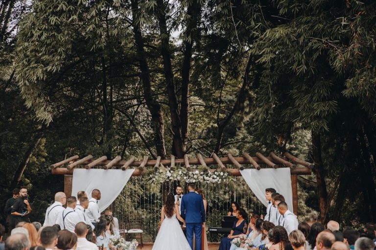
Wedding Branding and Typography: Why It All Connects
Wedding branding is becoming more important for modern couples who want a cohesive celebration experience. Logos, typography, invitations, and signage all work together to create a consistent visual identity across the event.
A well-designed monogram can appear on:
- Invitations
- Envelope liners
- Ceremony signage
- Reception menus
- Cocktail napkins
- Favors and thank-you cards
Typography plays a central role in that system. The right fonts make the branding feel intentional and elegant, while the wrong choices can make everything feel disconnected. Couples and designers exploring wedding typography resources can find inspiration and style direction at https://fonts.wedding.
When these branding elements are aligned, the wedding feels more polished and memorable from the first save-the-date to the last thank-you card.
FAQ
What fonts work best for wedding invitations?
Elegant serif fonts, refined scripts, and clean sans serifs work best for wedding invitations. The ideal choice depends on the wedding style, but readability should always come first.
How many fonts should I use on a wedding invitation?
Usually two fonts are enough, and three is the maximum for most designs. One font should lead, one should support, and any third font should be used sparingly.
What wedding typography trends are popular in 2026?
Popular trends include editorial serif fonts, selective script accents, minimalist sans serifs, and custom-looking monograms. High-contrast font pairings are also very popular.
How do I choose wedding typography that matches my theme?
Start with your wedding mood and venue, then choose fonts that reflect that atmosphere. Formal weddings often suit classic serifs, while modern weddings benefit from clean sans serifs.
Should invitation typography match wedding signage?
Yes, it should feel visually connected. Matching typography across invitations and signage helps create a cohesive wedding brand and makes the event look more polished.