Wedding Typography Trends 2026 Ideas and Tips


Wedding Typography Trends 2026: Elegant Font Ideas for Invitations, Branding, and Signage
Estimated reading time: 5 minutes
- Choose typography that matches the overall wedding style.
- Prioritize readability as well as beauty.
- Use no more than two or three fonts in most designs.
- Keep font choices consistent across invitations, signage, and branding.
- Spacing, hierarchy, and contrast are just as important as the font itself.
- Custom monograms and wordmarks can make wedding branding feel more personal.
Table of Contents
- Why Typography Matters in Wedding Design
- The Role of Typography in a Wedding Aesthetic
- Wedding Typography Trends in 2026
- How to Choose the Right Wedding Fonts
- Design Tips for Beautiful Wedding Typography
- Practical Planning Advice for Couples and Planners
- Expert Insights: What Makes Wedding Typography Feel Expensive
- Real Wedding Inspiration
- Branding Section: Logos, Typography, Invitations, and Signage
- Key Takeaways for Brides
- Image Ideas for This Topic
- FAQ
Why Typography Matters in Wedding Design
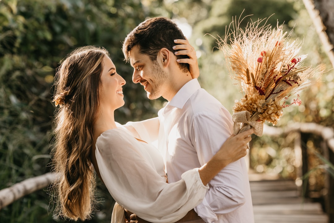
Typography is one of the first design elements guests notice, even before they read the details. The right font choice helps define the mood of the celebration, whether the wedding is modern, romantic, formal, minimalist, or editorial.
In 2026, typography is doing more than communicating information. It is helping couples create a visual identity that carries through the entire wedding experience.
The Role of Typography in a Wedding Aesthetic
Typography influences:
- Invitation first impressions
- The tone of wedding branding
- Readability on signage and menus
- Consistency across print and digital pieces
- How luxurious or casual a wedding feels
When chosen well, fonts can make even simple stationery look elevated and thoughtfully designed.
Wedding Typography Trends in 2026
The strongest wedding typography trends for 2026 combine elegance with readability. Designers are moving away from overly ornate combinations and focusing on clear hierarchy, softer contrast, and more personalized styling.
1. Serif Fonts with Editorial Character
Classic serif fonts remain popular, but in 2026 they are being used with a more fashion-forward, editorial feel. These fonts are ideal for couples who want a refined look that feels current rather than overly traditional.
Best for:
- Formal weddings
- Luxury invitations
- Printed programs
- Monogram design
2. Modern Script Accents
Script fonts are still being used, but more sparingly. Instead of using script for every line of text, designers are pairing it with clean sans serif or serif fonts for balance.
This approach works especially well for:
- Couple names
- Header text
- Monograms
- Accent words on invitations
3. Minimal Sans Serif Typography
Minimalist weddings continue to influence typography trends. Clean sans serif fonts are especially popular for modern couples who want a crisp, uncluttered look.
- Save-the-dates
- Wedding websites
- Event signage
- Contemporary invitation suites
4. High-Contrast Font Pairings
Pairing a bold serif with a light sans serif, or a script with a geometric typeface, creates visual interest without overwhelming the design. This trend is especially effective in premium wedding branding.
5. Custom Lettering and Monograms
More couples are investing in custom typographic details, including:
- Personalized monograms
- Hand-drawn names
- Unique initials
- Logo-style wedding marks
These pieces add a branded feel to the entire celebration and make the stationery feel one of a kind.
How to Choose the Right Wedding Fonts
Choosing wedding fonts is not only about what looks pretty. It is also about what works well across different materials, sizes, and lighting conditions.
Start with Your Wedding Style
The font should reflect the overall aesthetic of the wedding.
- Classic wedding: serif fonts, formal scripts
- Modern wedding: clean sans serifs, structured pairings
- Romantic wedding: flowing scripts, soft serif fonts
- Minimalist wedding: simple, balanced typography
- Luxury wedding: high-contrast fonts, elegant spacing
Think About Readability First
A font may look beautiful in a styled mockup but fail in real-world use if it is too thin, too decorative, or too compressed. Readability matters most for:
- Ceremony signage
- Seating charts
- Directional signs
- Dinner menus
- RSVP details
Limit the Number of Fonts
Most wedding designs look best with two to three fonts total. A simple typographic system usually includes:
- One display font for names or headings
- One body font for details
- One accent font if needed
This keeps the design cohesive and prevents it from feeling crowded.
Match the Font to the Medium
Some fonts are better for print, while others work well on screens. For example:
- Thin scripts may look beautiful on invitations but disappear on signage
- Compact sans serifs may work well for websites but feel too plain in luxury print pieces
- Decorative fonts can be great for logos but hard to read in long text blocks
Design Tips for Beautiful Wedding Typography
Typography decisions become stronger when supported by good design principles. These practical tips help couples and planners create polished results.
Create Contrast with Intention
Use contrast to guide the eye. For example:
- Pair a bold name treatment with a lighter detail font
- Use uppercase headings with lowercase body text
- Combine script with a structured serif or sans serif
Contrast makes the design feel more dynamic and easier to navigate.
Pay Attention to Spacing
Spacing is one of the most overlooked parts of wedding typography. Good spacing improves elegance and clarity.
Watch for:
- Letter spacing
- Line spacing
- Margins around names and headings
- Balance between text blocks
In luxury wedding design, spacing often matters as much as the font itself.
Use Font Weight Strategically
Different font weights can create hierarchy without introducing additional typefaces. A single font family may offer light, regular, semi-bold, and bold versions that work beautifully together.
This is especially useful for:
- Modern wedding invitations
- Editorial-style layouts
- Wedding websites
- Minimalist signage
Test Typography in Real Conditions
Always review your typography in the format it will actually appear in.
Ask yourself:
- Does it still look elegant at small sizes?
- Can guests read it in low light?
- Does it print clearly on textured paper?
- Does it photograph well in detail shots?
These practical tests help avoid last-minute design problems.
Practical Planning Advice for Couples and Planners
Typography choices should happen early in the wedding planning process, ideally before invitations and signage are finalized. That way, every visual element feels connected.
Build the Design System Before Ordering Stationery
Before sending anything to print, define:
- Font pairings
- Name styling
- Color palette
- Logo or monogram use
- Signage hierarchy
This creates a strong foundation for all wedding materials.
Coordinate Typography Across All Guest Touchpoints
Typography should feel consistent from start to finish. Use the same visual language across:
- Save-the-dates
- Invitations
- Wedding website
- Welcome signs
- Table numbers
- Place cards
- Favor tags
This consistency makes the event feel intentional and professionally designed.
Think About the Guest Experience
Typography should support the guest experience, not distract from it. Elegant design is only successful when it is also functional.
For example:
- Ceremony signs should be easy to read from a distance
- Escort cards should be legible in a crowded reception area
- Menu typography should suit the formality of the meal
Aesthetic and usability should work together.
Expert Insights: What Makes Wedding Typography Feel Expensive
One of the biggest questions couples ask is how to make wedding design feel luxurious without overspending. Typography is often the answer.
Less is Usually More
Luxury typography rarely relies on too many effects. Instead, it uses restraint:
- Fewer fonts
- More whitespace
- Better alignment
- Stronger hierarchy
A simple design with excellent typography often feels more expensive than one with too many decorative elements.
Consistency Signals Quality
When typography stays consistent across every detail, the event feels more polished. This includes:
- Matching name treatments
- Repeating the same serif or sans serif family
- Using consistent capitalization styles
- Carrying the same logo or monogram across pieces
Customization Adds Value
Even one custom typographic element can elevate an entire wedding identity. This might be a monogram, an initial mark, or a custom wordmark created just for the couple.
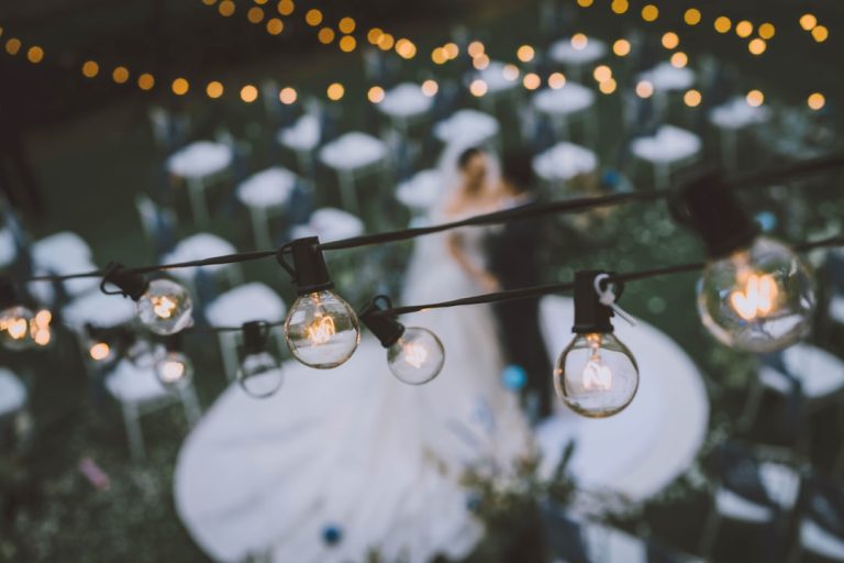
Real Wedding Inspiration
Typography trends are easier to understand when seen in real-world styles. Here are a few wedding design directions that reflect what couples are choosing in 2026.
Modern Black-and-Ivory Wedding
A black serif title paired with a clean sans serif detail font creates a striking, editorial look. This style works beautifully for city weddings, rooftop receptions, and contemporary venues.
Romantic Garden Wedding
Flowing script names paired with soft serif body text create a warm, romantic feel. This combination is ideal for floral-heavy celebrations, outdoor ceremonies, and spring or summer weddings.
Minimalist Destination Wedding
Simple sans serif typography with generous spacing feels airy and modern. It works well for beach weddings, destination weekends, and couples who want a relaxed but elevated tone.
Luxury Ballroom Wedding
High-contrast serif fonts with refined uppercase details can create a glamorous, timeless effect. Add a monogram or crest for an additional layer of sophistication.
Branding Section: Logos, Typography, Invitations, and Signage
Wedding branding has become an important part of modern celebrations, especially for couples who want a cohesive visual identity across every detail. Logos, typography, invitations, and signage work together to create a recognizable wedding aesthetic.
A wedding logo or monogram can appear on invitations, menus, welcome signs, favors, ceremony programs, and even the wedding website. Typography is the foundation of that branding, because the font choices determine whether the look feels formal, whimsical, modern, or romantic.
Invitations set the tone first, while signage reinforces it throughout the day. When these pieces share the same type treatment, the event feels polished and carefully planned.
For couples and designers exploring type inspiration, wedding typography resources at https://fonts.wedding can be a helpful starting point for discovering styles that align with the overall celebration design.
Key Takeaways for Brides
- Choose typography that matches the overall wedding style.
- Prioritize readability as well as beauty.
- Use no more than two or three fonts in most designs.
- Keep font choices consistent across invitations, signage, and branding.
- Spacing, hierarchy, and contrast are just as important as the font itself.
- Custom monograms and wordmarks can make wedding branding feel more personal.
Image Ideas for This Topic
Video Placeholder
FAQ
What fonts work best for wedding invitations?
The best fonts are usually elegant serif fonts, readable sans serifs, or refined script accents. The ideal choice depends on the wedding style and how much text needs to fit on the invitation.
How do I choose wedding typography?
Start with your wedding aesthetic, then select fonts that are readable, balanced, and appropriate for both print and digital use. Limit your design to a small number of font families.
What wedding design trends are popular in 2026?
Popular 2026 trends include editorial serif fonts, minimal sans serifs, custom monograms, subtle script accents, and high-contrast typography pairings.
Should wedding invitations and signage use the same fonts?
They do not need to be identical, but they should feel connected. Using the same font family or a consistent pairing helps create a cohesive wedding brand.
How many fonts should a wedding brand use?
Most wedding designs look best with two or three fonts. That is enough to create hierarchy without making the design feel busy.