Modern Wedding Fonts and Branding Guide 2026


Custom Wedding Fonts and Branding Guide 2026
Estimated reading time: 7 minutes
- Why wedding branding matters in 2026 and how it affects guest experience
- A practical 7-step planning checklist to build a custom wedding brand
- Design elements to prioritize: fonts, monograms, color, texture, and hierarchy
- Budget ranges, vendor coordination tips, and timelines
- Common mistakes and fixes, plus short FAQ and real examples
Table of contents:
- Introduction
- Why this matters in 2026
- Trends shaping wedding branding in 2026
- Practical planning: 7-step checklist to build your brand
- Design & branding elements that matter
- Budget realities and vendor coordination
- Practical examples
- Design dos and don’ts
- Numbered timeline for a 6-month planning schedule
- Typography specifics for accessibility and modern performance
- How wedding branding improves guest experience
- Common mistakes and how to fix them
- Short FAQ
- Final checklist before you print
- Conclusion
Introduction — direct answer up front
Custom wedding fonts and branding guide 2026 shows you how to create a cohesive, modern wedding identity using tailored typography, a clear color system, and consistent assets that elevate every touchpoint from save-the-dates to signage and favors. Done right, branding makes logistics feel intentional, helps vendors deliver consistent design, and turns arrival moments into emotional experiences that guests remember.
Why this matters in 2026
In 2026 couples want meaningful celebrations that reflect values—sustainability, inclusivity, and authentic luxury—while keeping planning efficient. Strong wedding branding:
- Reduces decision fatigue by creating rules vendors can follow
- Signals the event’s tone to guests (formal, intimate, playful)
- Improves ROI on printed pieces by making them keepsakes
- Supports accessible design and multilingual needs for diverse guest lists
Trends shaping wedding branding in 2026
- Modern luxury minimalism: Less ornament, more curated materiality (handmade papers, letterpress textures).
- Variable fonts and micro-typography: Responsive type systems for print and web.
- Sustainable print choices: PCR paper, soy inks, compostable signage.
- Digital-first suites: QR-enabled RSVPs, hosted micro-sites with typography that matches printed pieces.
- Inclusive design: High-contrast type, readable sizes, bilingual materials.
Practical planning: 7-step checklist to build your brand
- Define the emotional tone (2 weeks)
- Choose three descriptive words: e.g., “quiet luxury,” “garden joy,” “modern vintage.”
- Set non-negotiables (1 week)
- Guest experience priorities (accessibility, bilingual signage, low-waste).
- Choose a lead font + supporting fonts (1–2 weeks)
- Pick one display (for logos/monograms) and one or two text fonts (body, captions).
- Build a palette + material list (1 week)
- Primary, secondary, accent colors; recommended papers and finishes.
- Create core assets (2–3 weeks)
- Monogram, invitation suite templates, ceremony program, seating map, social media tiles.
- Vendor handoff and mockups (2 weeks)
- Print proofs, signage mockups, and digital style guide for calligrapher/florist/stationer.
- Finalize production schedule (ongoing)
- Deadlines for invites, printing, signage, and on-site vendor delivery.
Design & branding elements that matter (with examples)
- Typography: Choose readability first. For invitations, a refined serif or modern sharp humanist display works well; pair with a neutral sans for body copy. Example: A high-contrast Didone display for names + a geometric sans for details.
- Custom monogram: Design a simple monogram that scales. Use it on envelopes, napkins, and digital headers. Monograms should work in one color and as an outline for large-format signage.
- Color system: Limit to 3–4 colors. Use neutrals for hierarchy, one signature color for accents, and one unexpected texture or metallic for focal details.
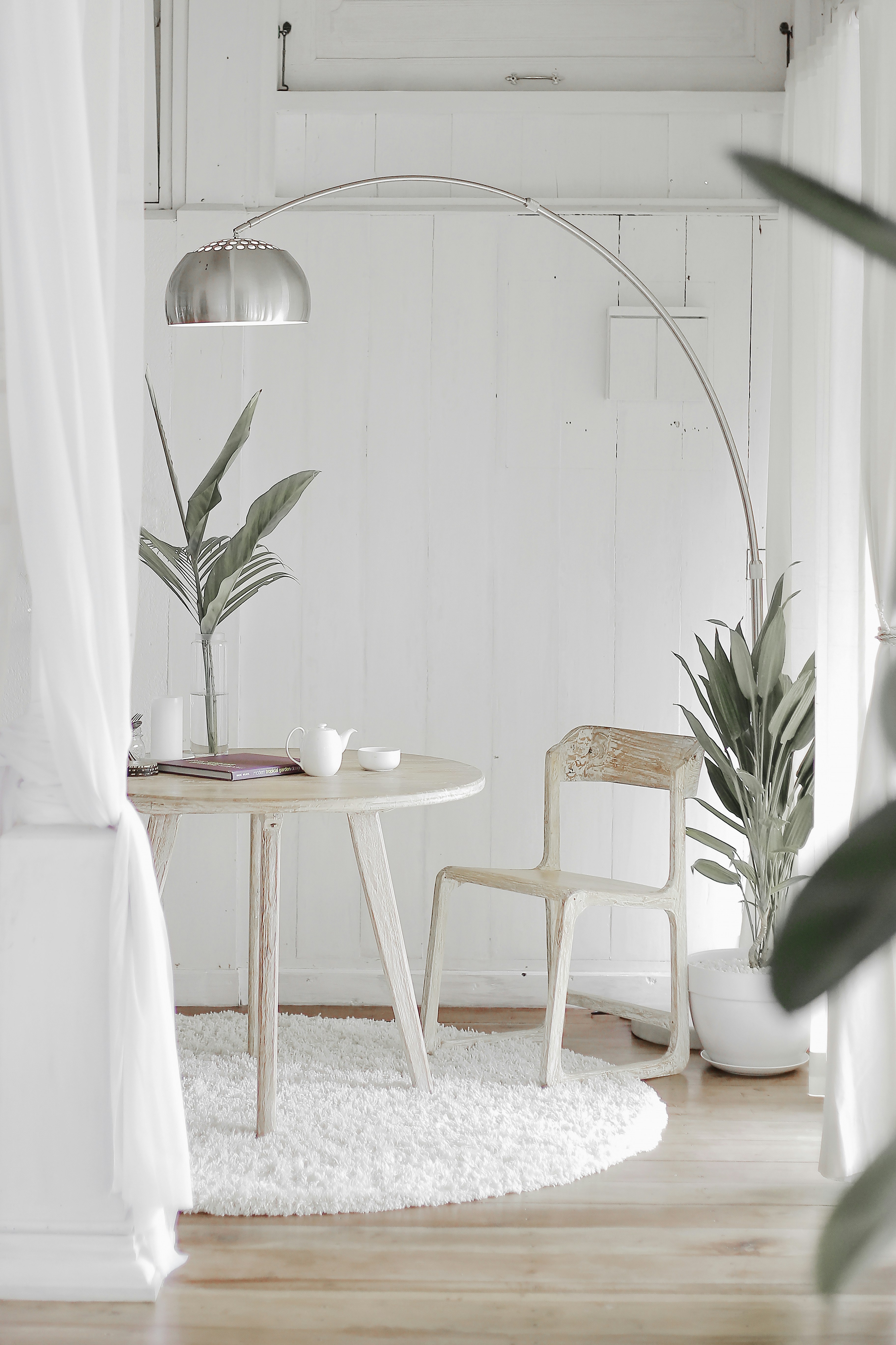
- Texture & materials: Letterpress, soft-touch coatings, uncoated recycled stock, and silk ribbons have high perceived value. For sustainability, specify recycled or FSC-certified papers and water-based inks.
- Scale & hierarchy: Define typographic sizes for invitation titles, names, addresses, and small print. Create a micro-style guide that vendor partners can use to match type scale across elements.
Budget realities and vendor coordination
Budget ranges (U.S., 2026 averages)
- DIY/simple digital suite: $150–$600
- Custom fonts + basic templates + printing: $800–$2,500
- Full custom branding (monogram, custom type tweaks, printed luxury suite, signage): $2,500–$12,000
Where the money goes
- Design (freelance designer or branding studio): 20–40%
- Printing & materials: 30–50%
- Custom type licensing or variable font work: 5–15%
- Signage and on-site production: 10–20%
Coordinating vendors
- Share a one-page style guide: fonts (or closest web-safe alternatives), color hex codes/Pantones, logo files in SVG and print-ready PDF, and paper/finish notes.
- Provide proof approval deadlines and a single point of contact—typically the planner or lead partner.
- Ask stationers or printers for digital mockups and print swatches early. Approve physical proofs at least 6–8 weeks before production.
- Align signage with venue restrictions (frame sizes, mounting methods, weather concerns).
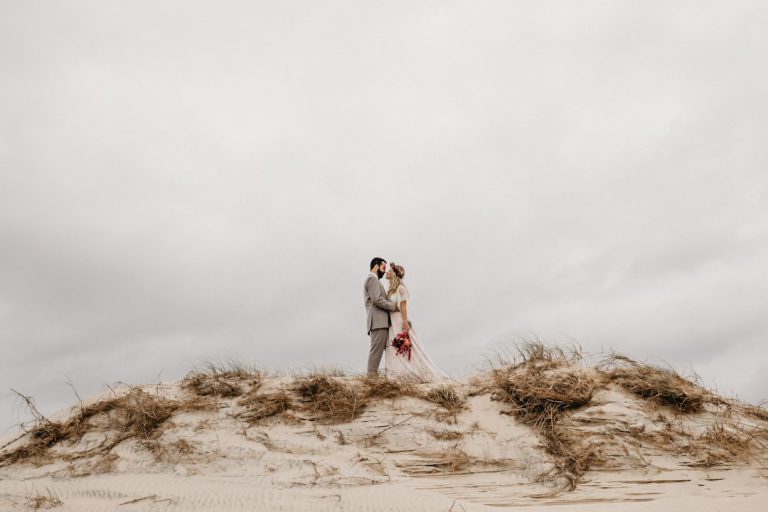
Practical examples (real-world scenarios)
Example A: Urban loft micro-wedding (80 guests)
- Tone: “Quiet modern”
- Fonts: Minimal sans display for headings + warm serif for body
- Materials: Cotton fiber invites, matte black signage, neon RSVP QR card
- Outcome: Cohesive arrival moments; guests found directions and seating easy to read, leading to a calm ceremony start.
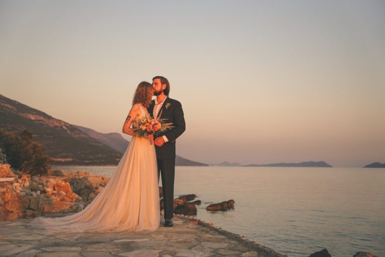
Example B: Garden estate (200 guests)
- Tone: “Timeless romantic with sustainable edge”
- Fonts: Custom calligraphic display for names + high-contrast serif for details
- Materials: Recycled paper invitation, seed-paper escort cards, wooden table numbers with monogram laser-etched
- Outcome: Branded elements doubled as keepsakes; sustainable materials reinforced the couple’s values.
Design dos and don’ts
Dos:
- Do prioritize legibility for key details (time, date, address).
- Do enforce a clear typographic hierarchy across print and web.
- Do test fonts at actual sizes before final print.
- Do keep the monogram scalable and simple.
Don’ts:
- Don’t use more than three display styles—too many display fonts dilute brand cohesion.
- Don’t rely only on color to communicate information (consider color-blind accessibility).
- Don’t skip physical proofs; screens can misrepresent texture and ink density.
Numbered timeline for a 6-month planning schedule (example)
- 24 weeks out — Define tone and gather inspiration.
- 20 weeks out — Hire designer/stationer; choose fonts and palette.
- 16 weeks out — Create monogram and invitation layout.
- 12 weeks out — Approve final proofs and place print order.
- 8 weeks out — Design signage and day-of materials; order rentals with branding specs.
- 2–4 weeks out — Assemble welcome bags and printed programs; coordinate vendor deliveries.
Typography specifics for accessibility and modern performance
- Minimum readable sizes: invitations 9–12 pt for body copy; signage 24–30 pt for directional text depending on viewing distance.
- Contrast ratios: Aim for WCAG AA where possible; dark text on light backgrounds is safest.
- Variable fonts: Use variable fonts to keep a consistent brand voice across screen sizes (weight axis for headings vs. body).
- Licensing: Confirm commercial use for any purchased fonts and secure webfont licenses for your wedding site.
How wedding branding improves guest experience
- Less confusion: Clear signage and consistent language reduce questions for staff.
- Emotional cues: Typography and material choices set expectations—luxury paper signals formality; playful type signals a casual vibe.
- Keepsakes: Thoughtful branded items (monogram napkins, high-quality invitations) become mementos that extend joy after the event.
Common mistakes and how to fix them
- Mistake: Using display fonts for long text. Fix: Reserve display for headings; use a readable serif/sans for paragraphs.
- Mistake: No vendor style guide. Fix: Create a one-page PDF with essential assets and distribute to all vendors.
- Mistake: Choosing trendy but unreadable fonts. Fix: Test at real sizes and in poor lighting conditions.
- Mistake: Overdecorated invitations that hide key info. Fix: Rework hierarchy; make date/time/address prominent.
Short FAQ
- Q: How early should I finalize my wedding branding?
A: Aim to finalize fonts, palette, and core assets 12–16 weeks before printing; start concepting 4–6 months out. - Q: Can I use a different font on my wedding website than on printed invites?
A: You can, but keep visual consistency. Use web-safe equivalents or licensed webfonts that match your print fonts’ tone. - Q: Are custom fonts expensive?
A: Custom-created type can be pricey ($1,500+), but many designers customize existing licensed fonts affordably. Variable font licenses are more cost-effective for web use. - Q: How do I ensure my branded signage meets venue rules?
A: Ask the venue for mounting specs and weight limits early. Provide mockups and exact dimensions for approval. - Q: Where can I preview curated wedding fonts and templates?
A: Explore collections and inspiration at https://fonts.wedding for examples of modern, wedding-ready typefaces and templates.
Final checklist before you print
- Double-checked spelling and RSVP details.
- Physical proofs approved for color and texture.
- Vendor style guide distributed and acknowledged.
- Signage mockups sized and venue-approved.
- Accessibility checks: readable sizes and clear contrasts.
Conclusion
Custom wedding fonts and branding guide 2026 shows how a small set of intentional choices—type, color, monogram, and materials—creates a coherent guest experience, reduces vendor confusion, and elevates your wedding’s emotional impact. Start with tone, lock in a lead font and a clear hierarchy, and coordinate early with vendors to keep budget and timeline on track. For curated type selections and templates that fit modern wedding design, explore resources like https://fonts.wedding to test pairings and download samples as you plan.