Wedding Typography Trends 2026 with Font Ideas


Wedding Typography Trends in 2026: Elegant Fonts, Pairings, and Design Ideas
Estimated reading time: 8 minutes
- Choose typography that reflects the overall mood of the wedding.
- Limit yourself to one or two font families for a cohesive look.
- Make readability a priority, especially for invitations and signage.
- Match fonts to materials, venues, and print formats.
- Use typography as part of a larger wedding branding system.
Table of Contents
- Why Wedding Typography Matters in 2026
- The Biggest Wedding Typography Trends for 2026
- Best Wedding Fonts for Invitations and Stationery
- Design Tips for Beautiful Wedding Typography
- Practical Planning Advice for Couples and Planners
- Expert Insights: What Makes Typography Feel Truly Luxurious
- Real Wedding Inspiration: How Typography Shapes the Mood
- Branding Elements That Tie Everything Together
- Key Takeaways for Brides
- FAQ: Wedding Typography Trends 2026
Why Wedding Typography Matters in 2026
Typography is one of the most important design decisions in a wedding suite. It shapes the first impression of the event, influences the tone of the celebration, and helps tie every printed and digital detail together.
A beautifully chosen font can communicate:
- Modern minimalism
- Classic romance
- Editorial sophistication
- Destination-wedding glamour
- Soft, handmade charm
In 2026, couples are looking for typography that feels more customized and less templated. That means thoughtful font pairing, strong hierarchy, and a balance between decorative and functional type.
The Biggest Wedding Typography Trends for 2026
1. Serif Fonts Are Leading the Way
Classic serif typefaces are becoming a favorite for couples who want a timeless yet contemporary look. Their elegant structure makes them ideal for formal invitations, monograms, and wedding branding elements.
In 2026, designers are pairing refined serifs with minimal layouts to create a high-end editorial feel. This trend works especially well for luxury weddings, black-tie celebrations, and destination events.
Why it works:
- Feels sophisticated and polished
- Offers strong readability
- Pairs beautifully with foil, embossing, and letterpress
2. Soft Script Fonts Are Being Used More Sparingly
Script fonts for weddings are still popular, but the trend has shifted away from overly ornate calligraphy. Instead, couples are choosing softer, more restrained scripts that add personality without overwhelming the design.
A script font can work well for:
- Couple names
- Monograms
- Welcome signage
- Signature details on invitations
The key in 2026 is restraint. A single script accent is often more effective than using script throughout the entire suite.
3. Minimalist Typography Is Getting More Luxurious
Minimalist wedding typography is no longer plain or sparse. In 2026, it is becoming more elevated, using spacing, proportion, and premium font choices to create quiet luxury.
This style often features:
- Clean sans-serif headings
- Generous white space
- Strong alignment
- Subtle contrast between type weights
It is especially effective for couples who want modern wedding typography that feels tasteful and uncluttered.
4. Editorial Font Pairings Are in Demand
One of the strongest wedding typography trends this year is the editorial pairing of serif and sans-serif fonts. This combination creates balance: one font brings elegance, the other brings clarity.
Popular elegant wedding font pairings include:
- High-contrast serif + simple sans-serif
- Modern serif + narrow uppercase sans
- Script accent + clean serif body text
These combinations are excellent for wedding invitation design, day-of signage, and branding systems that need to feel cohesive across multiple touchpoints.
5. Custom Typography Is Becoming a Signature Detail
More couples are requesting custom lettering or bespoke monograms to make their wedding brand feel unique. This approach is especially popular for couples who want their stationery, signage, and website design to feel curated rather than generic.
Custom typography may include:
- Personalized initials
- Hand-lettered names
- Tailored logo marks
- Unique ligatures or wordmarks
This trend supports a stronger overall wedding identity and works beautifully in both print and digital formats.
Best Wedding Fonts for Invitations and Stationery
Choosing the right wedding fonts for invitations depends on the mood you want to create. The ideal font should look beautiful, but it also needs to remain legible at different sizes and print finishes.
For Classic and Formal Weddings
Choose traditional serif fonts with refined details. These are perfect for:
- Black-tie weddings
- Church ceremonies
- Formal ballroom receptions
Look for fonts with:
- Balanced letterforms
- High readability
- Elegant contrast between thick and thin strokes
For Modern and Minimal Weddings
Opt for sleek sans-serif or contemporary serif fonts. These styles are ideal for:
- City weddings
- Art-gallery venues
- Minimalist stationery suites
They help create a clean, current look without sacrificing style.
For Romantic and Soft Weddings
Choose script fonts as accents, paired with a neutral serif or sans-serif. This style works well for:
- Garden weddings
- Spring and summer celebrations
- Floral-inspired stationery
Avoid using overly decorative scripts for body text, as they can be difficult to read.
Design Tips for Beautiful Wedding Typography
Typography should feel intentional across every element of the wedding experience. Here are some practical design tips that planners, brides, and creatives can use right away.
Keep Hierarchy Clear
The most important information should stand out first. For invitations, that usually means:
- Couple names
- Event type
- Date and location
- Additional details
Use size, weight, and spacing to organize the layout rather than relying on too many different fonts.
Limit Font Combinations
Using too many fonts can make a design feel chaotic. In most cases, two fonts are enough:
- One display font for names or headings
- One supporting font for details
This approach keeps the design polished and easy to read.
Think About Print and Materials
Typography looks different depending on the surface. Letterpress, foil, vellum, acrylic, and textured paper all affect how a font appears.
For example:
- Thin fonts may disappear on dark or textured materials
- Bold fonts work well for signage and menus
- Script fonts may need more spacing for print clarity
Always test fonts in the actual format before finalizing the design.
Match Typography to the Venue
A wedding at a vineyard, historic estate, rooftop, or coastal resort will each call for a different typographic mood. The venue should influence the font direction just as much as the color palette does.
A good typography choice should feel like a natural extension of the space.
Practical Planning Advice for Couples and Planners
Typography is not just a visual decision. It also affects the flow of communication and the guest experience.
Start with the Core Stationery Pieces
Before choosing fonts for every item, begin with the essentials:
- Save the date
- Invitation suite
- RSVP card
- Welcome sign
- Menu
- Seating chart
- Thank-you card
This helps create consistency from the beginning and prevents mismatched details later.
Build a Flexible Typography System
A strong wedding typography system should work across:
- Print invitations
- Wedding website
- Signage
- Social graphics
- Day-of paper goods
Choose fonts that remain effective in both small and large sizes. This is especially important for wedding signage fonts, where readability matters at a distance.
Coordinate with the Designer Early
If you are working with a stationer, planner, or brand designer, share your typography preferences early. It helps the creative team build a cohesive visual direction that supports the rest of the wedding design.
Consider the Guest Experience
Typography should guide guests smoothly through the event. Clear fonts make it easier to read schedules, navigate the venue, and understand seating arrangements.
This is where practical design meets good hospitality.

Expert Insights: What Makes Typography Feel Truly Luxurious
Luxury wedding branding ideas often start with typography. The most premium-looking designs are rarely the most complex. Instead, they rely on precision and restraint.
What Expert Designers Focus On
- Consistent spacing
- Strong alignment
- Font contrast with purpose
- High-quality materials
- Visual balance across all pieces
Luxury is not about using the fanciest font available. It is about using the right font in the right way.
Common Typography Mistakes to Avoid
- Using too many decorative scripts
- Choosing fonts that are hard to read
- Ignoring the venue or wedding theme
- Mixing styles without a clear hierarchy
- Forgetting how fonts will look in print
When typography is handled well, it can make even a simple invitation feel elevated.
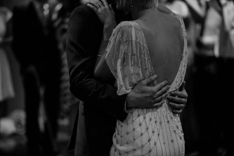
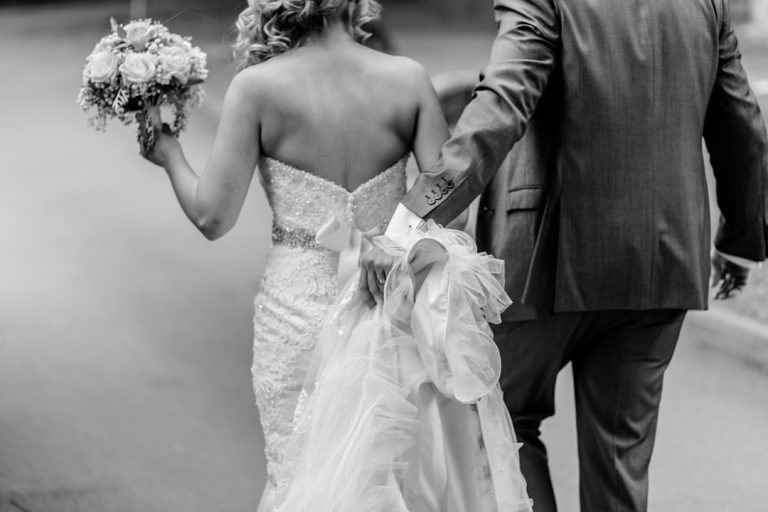
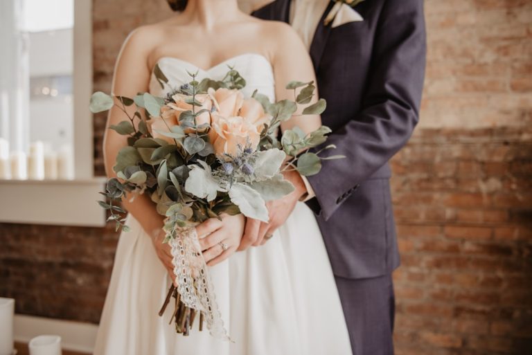
Real Wedding Inspiration: How Typography Shapes the Mood
One reason typography is so powerful is that it can completely change the emotional tone of a wedding.
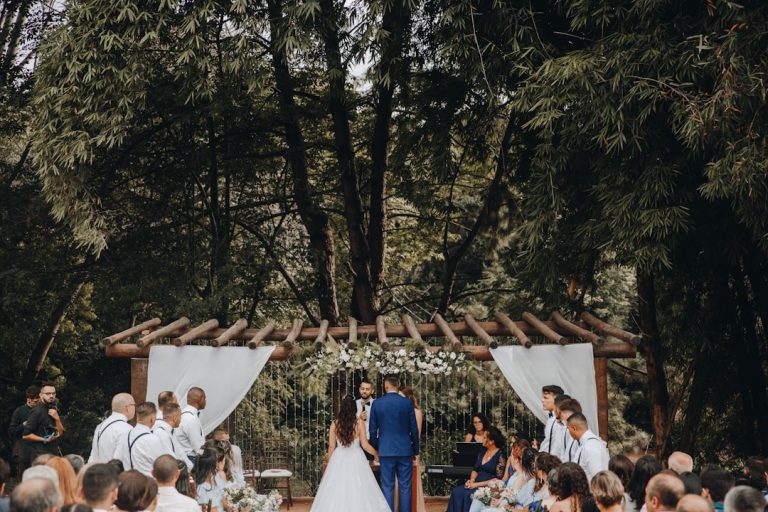
Example 1: Romantic Garden Wedding
A couple planning a floral outdoor ceremony may choose a delicate serif paired with a light script for their monogram. This creates softness and romance while still keeping the details legible.
Example 2: Modern City Wedding
For an urban celebration, a minimalist sans-serif with a refined serif accent can create a crisp, editorial look. This is especially effective on acrylic signage and clean invitation layouts.
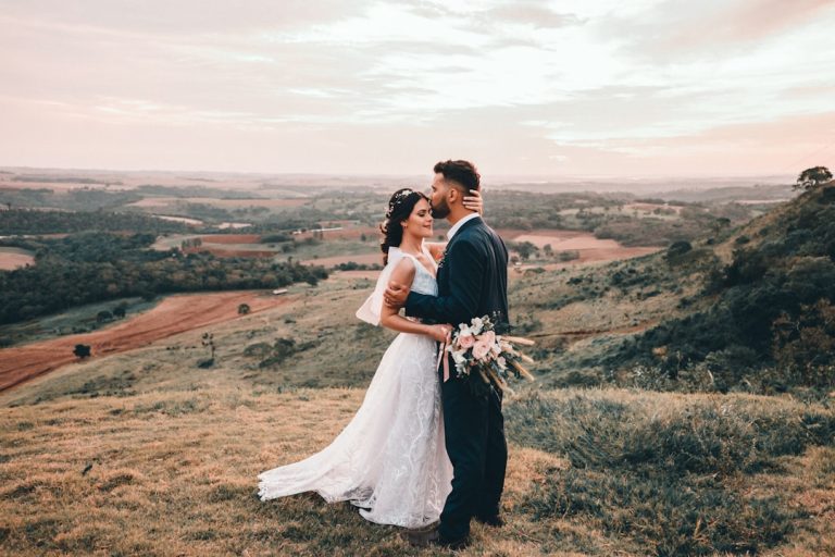
Example 3: Destination Resort Wedding
A destination wedding often benefits from warm, elegant typography with a relaxed feel. A balanced serif paired with a subtle handwritten style can evoke both sophistication and ease.
These examples show how typography can reflect the energy of the celebration before guests even arrive.
Branding Elements That Tie Everything Together
Wedding branding is becoming increasingly important for couples who want a cohesive and memorable visual identity. Typography is at the center of that branding system.
Key Branding Elements to Consider
- Logos: A custom monogram or wordmark can appear on stationery, signage, and favors.
- Typography: The font family sets the tone for the full design experience.
- Invitations: The invitation suite introduces the wedding’s visual personality.
- Signage: Directional and welcome signs should remain readable while matching the overall style.
When these elements work together, the wedding feels more polished and intentional.
For couples and designers looking to explore wedding typography resources, fonts.wedding is a useful place to browse style inspiration and font ideas that suit modern wedding branding.
Key Takeaways for Brides
- Choose typography that reflects the overall mood of the wedding.
- Limit yourself to one or two font families for a cohesive look.
- Make readability a priority, especially for invitations and signage.
- Match fonts to materials, venues, and print formats.
- Use typography as part of a larger wedding branding system.
FAQ: Wedding Typography Trends 2026
What fonts work best for wedding invitations?
The best wedding fonts for invitations are usually elegant serifs, clean sans-serifs, or soft scripts used sparingly. Choose fonts that are readable, balanced, and suited to the formality of your event.
How do I choose wedding typography?
Start with your wedding style, venue, and color palette. Then choose fonts that match the tone you want—romantic, modern, classic, or luxurious. Keep the number of fonts limited for a polished result.
What wedding typography trends are popular in 2026?
The most popular trends in 2026 include refined serif fonts, minimal luxury layouts, restrained script accents, editorial font pairings, and custom monograms.
Are script fonts still in style for weddings?
Yes, but they are being used more selectively in 2026. Soft, elegant scripts are still popular for names and accents, but they work best when paired with more readable supporting fonts.
How can typography improve wedding branding?
Typography helps create consistency across invitations, signage, logos, and wedding websites. It gives the entire celebration a unified look and makes the design feel more intentional and memorable.