Wedding Color Palettes 2026 Guide with Top Ideas


Wedding Color Palettes for 2026: The Definitive Guide to This Year’s Most Beautiful Combinations
Estimated Reading Time: 7 minutes
- Start with one anchor color you genuinely love before building outward
- 2026 palettes are richer and more layered than the cool neutrals of recent years
- Earthy tones, dusty botanicals, and deep jewel tones are dominating the year
- Apply the 60-30-10 rule to maintain visual balance across all wedding elements
- Typography and color work together — your font choices should complement your palette’s mood
Table of Contents
- Why Your Wedding Color Palette Matters More Than You Think
- The Top Wedding Color Palettes for 2026
- How to Build a Wedding Color Palette from Scratch
- The Role of Typography and Branding in Your Color Palette
- FAQ: Wedding Color Palettes
Why Your Wedding Color Palette Matters More Than You Think
Color is the invisible thread that ties every element of your wedding together. It influences the mood guests feel when they walk into your ceremony, the way your photos look in years to come, and the impression your wedding leaves behind.
A cohesive color palette connects your:
- Invitation suite and paper goods
- Florals and centerpieces
- Wedding party attire
- Table linens and rentals
- Signage and stationery
- Cake design and dessert table
- Lighting choices
Getting your palette right from the beginning saves hours of second-guessing and ensures your wedding feels intentional rather than assembled. The couples whose weddings photograph most beautifully — the ones that circulate endlessly on Pinterest and wedding blogs — almost always started with a strong, deliberate color story.
The Top Wedding Color Palettes for 2026
1. Dusty Sage, Warm Ivory, and Antique Gold
This palette has quietly replaced the all-white, cool-gray aesthetic that dominated the previous decade. In 2026, it’s reached full maturity as a sophisticated and versatile combination that works across all seasons and venue types.
Why it works: Dusty sage reads as elegant without being cold. Paired with warm ivory rather than stark white, the result feels organic and timeless. Antique gold adds warmth and a sense of heritage.
How to use it:
- Sage velvet ribbon on ivory invitation suites
- Dried pampas grass and eucalyptus arrangements with warm white garden roses
- Gold candlestick holders and amber glassware
- Bridesmaids in sage or warm champagne
This combination translates beautifully into wedding typography as well. Pair a delicate italic serif with an earthy, botanical typeface, both rendered in antique gold or deep olive ink. Couples exploring curated typeface options for this look will find a wealth of inspiration at fonts.wedding, where typography choices are organized by mood and style.
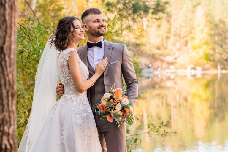
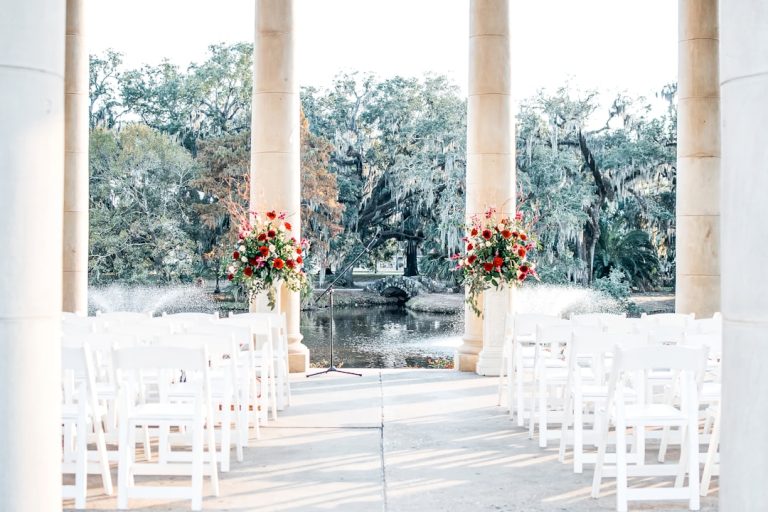
2. Deep Terracotta, Rust, and Burnt Sienna
Earthy, sun-warmed palettes continue to grow in popularity heading into 2026, particularly for outdoor, desert, and vineyard weddings. This combination draws from Southwestern landscape photography, Italian countryside aesthetics, and mid-century ceramics.
Why it works: Terracotta tones are inherently romantic and photograph exceptionally well in golden hour light. They’re also unusually flexible — they can feel rustic in a barn setting and genuinely luxurious in a candlelit ballroom.
How to use it:
- Terracotta linen tablecloths with hand-thrown ceramic place settings
- Deep rust dahlias, burnt orange marigolds, and cognac-colored dried grasses
- Leather stationery accents and kraft paper invitation suites
- Bridesmaids in rust, clay, or cinnamon tones
For couples choosing this palette, bold, slightly imperfect lettering styles — calligraphic or hand-stamped — feel completely at home. The typography should feel warm and crafted rather than sleek.
3. Midnight Navy, Champagne, and Soft Blush
For couples planning formal evening receptions or black-tie celebrations in 2026, this palette delivers drama with refinement. Deep navy grounds the design, while champagne and blush soften it beautifully.
Why it works: Navy is one of the most reliable wedding colors — it photographs crisply, flatters nearly every skin tone on bridesmaids and groomsmen, and feels polished in every season.
How to use it:
- Navy velvet table runners with champagne taper candles
- White and blush florals with touches of deep plum or dusty mauve
- Gold foil letterpress invitations on navy or cream card stock
- Groomsmen in navy suits, bridesmaids in champagne or blush
Typography for this palette should lean toward refined luxury. Consider pairing an elegant serif headline font with a delicate copperplate or hairline script. These choices set the tone from the first moment guests open their envelopes.
4. Lavender, Lilac, and Soft Platinum
Floral purples have been slowly reestablishing themselves in the wedding world, and in 2026, lavender and lilac tones are fully having their moment — especially among couples who want something feminine and romantic without leaning on traditional pinks.
Why it works: Lavender feels dreamlike and nostalgic, evoking both English garden parties and Provençal countryside estates. Paired with soft platinum rather than harsh silver, it maintains a softness that feels genuinely bridal.
How to use it:
- Lavender sweet pea arrangements with pale lilac ranunculus
- Platinum metallic stationery details with violet ink
- Sheer, flowing fabric installations in lilac and ivory
- Velvet ribbon in deep plum as an accent for place settings
The typography choices for lavender palettes should echo their delicacy. Flowing script fonts with graceful loops and fine strokes complement the softness of the palette without overpowering it.
5. Warm Chocolate, Caramel, and Ivory Cream
One of the most interesting palette shifts for 2026 is the embrace of rich, deep brown tones — specifically warm chocolates and toffees that feel sophisticated rather than rustic. This palette is particularly popular for autumn weddings and for couples who want their celebration to feel enveloping and cozy.
Why it works: Brown is having a genuine moment across fashion, interior design, and branding. In weddings, warm chocolate tones photograph richly and pair beautifully with candlelight.
How to use it:
- Chocolate linen napkins tied with ivory ribbon
- Deep caramel orchids and espresso calla lilies
- Wooden stationery elements with cream engraved lettering
- Bridesmaids in toffee, caramel, or warm taupe
How to Build a Wedding Color Palette from Scratch
Start with One Anchor Color
Choose one color you feel deeply drawn to — ideally one that has meaning to you as a couple. This becomes your anchor. Everything else radiates outward from this single choice.
Add Depth with a Contrasting Tone
Your anchor color needs contrast to come alive. If your anchor is soft (blush, ivory, lavender), introduce something with more depth (navy, forest green, deep plum). If your anchor is rich (navy, terracotta, chocolate), balance it with something lighter and airier.
Choose a Metallic Accent
Almost every wedding palette benefits from a metallic element. Gold reads warm and romantic. Silver reads cool and modern. Platinum sits between them. Rose gold, while still used, is beginning to feel dated in 2026 as couples shift toward more complex, layered metal tones.
Apply the 60-30-10 Rule
- 60% — your dominant color (usually a neutral or soft tone)
- 30% — your secondary color
- 10% — your accent (often your metallic or deepest tone)
This proportion creates visual balance without making any single color feel overwhelming.
The Role of Typography and Branding in Your Color Palette
Color doesn’t live in isolation — it works in partnership with typography, texture, and overall design language. The fonts you choose for your invitation suite, signage, menus, and place cards are just as much a part of your color story as your florals.
A lavender and platinum palette calls for a different typographic voice than a deep terracotta and rust combination. The first wants something light, flowing, and graceful; the second wants something with warmth, character, and a slightly imperfect hand.
When establishing your wedding’s visual identity — sometimes called wedding branding — it’s worth thinking of your typography as the voice of your color palette. Couples and designers building cohesive visual identities often explore typeface resources specifically curated for wedding aesthetics. The collection at fonts.wedding is built around this idea, offering typography that has been selected for its compatibility with wedding design moods and color stories.
Well-chosen typography elevates every element that carries your color palette: the envelope, the ceremony program, the welcome sign, the dessert table labels, and the thank-you notes guests receive weeks later.
FAQ: Wedding Color Palettes
What are the most popular wedding color palettes for 2026? The leading palettes for 2026 include dusty sage with antique gold, deep terracotta and rust, midnight navy with champagne and blush, lavender and soft platinum, and warm chocolate with ivory cream. These reflect a broader design movement toward richness, warmth, and layered complexity.
How many colors should a wedding palette include? Most designers recommend three to five colors: one dominant neutral or soft tone, one or two supporting colors, and one metallic or accent color. More than five colors can make a wedding feel visually busy; fewer than three can feel flat.
Can I use more than one metallic in my wedding color palette? Yes, but with care. Mixing gold and silver, for example, is now widely accepted as a sophisticated design choice rather than a mismatch. The key is intentionality — if you’re blending metals, do it consistently across all elements rather than accidentally.
How do I make sure my wedding color palette photographs well? Talk to your photographer before finalizing your palette. Colors that appear beautiful in person can shift significantly under flash photography or in low light. Dusty, muted tones tend to photograph softly and romantically, while very saturated or neon tones can overpower an image.
When should I finalize my wedding color palette? Ideally within the first few months of planning, and before booking your florist, ordering stationery, or choosing bridesmaid dresses. Many wedding vendors — particularly florists and stationers — need your palette confirmed well in advance to source materials and coordinate their work.