Wedding Invitation Typography Guide and Font Pairings 2026


Modern Wedding Invitation Typography: Fonts That Create Lasting First Impressions in 2026
Estimated reading time: 7 minutes
- Choosing the right typography sets the tone for your wedding.
- Pairing fonts effectively adds visual hierarchy to your invitations.
- Fonts communicate emotional undertones and reflect your personalities.
- Modern trends focus on personalized and authentic typography choices.
- Typography should be consistent across all wedding branding touchpoints.
Table of contents
- Introduction
- Why Typography Matters for Wedding Invitations
- The Best Font Pairing Strategy for 2026
- Top Wedding Invitation Fonts for 2026
- Design Tips for Implementing Wedding Invitation Typography
- Wedding Branding Beyond Invitations
- Real Wedding Inspiration: Typography in Action
- FAQ
Introduction
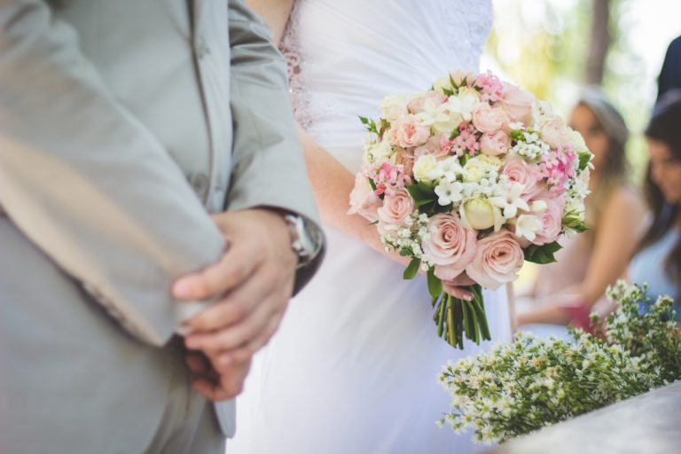
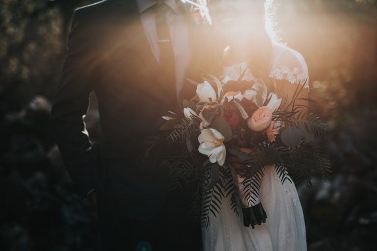
Your wedding invitation is often the first tangible experience guests have of your celebration. Before they arrive at the venue, before they see your flowers or taste your menu, they hold your invitation in their hands. The typography you choose sets the tone for everything that follows—whether your wedding feels formal and timeless, creative and contemporary, or intimate and personal.
Selecting the right fonts for wedding invitations isn’t simply about aesthetics. Typography communicates emotion, establishes your wedding’s visual identity, and ensures readability across different mediums, from printed cards to digital saves-the-dates. In 2026, wedding typography is moving beyond traditional serif-script combinations into more nuanced, personalized pairings that reflect modern couples’ desire for authenticity and individuality.
This guide will help you understand how to select, pair, and implement typography that transforms your invitations from paper into a reflection of your wedding’s unique story.
Why Typography Matters for Wedding Invitations
Typography is often the most underestimated element of wedding design. While couples invest heavily in flowers, photography, and venue selection, the written word—how it’s presented—rarely receives the same attention.
Yet your invitation typography does crucial work:
- Creates emotional connection: Elegant script fonts evoke romance and tradition, while geometric sans-serifs feel modern and sophisticated.
- Establishes brand identity: Your typography choices create visual consistency across all wedding materials—from save-the-dates to menus to thank-you cards.
- Ensures legibility: Poor font choices result in difficult-to-read invitations that frustrate guests.
- Reflects your personality: Typography is one of the few design elements entirely within your control, making it deeply personal.
When guests receive your invitation, the fonts they see tell them whether your wedding will be black-tie formal, garden-casual, bohemian, or minimalist. Typography whispers what your celebration is about before anyone reads a single word.
The Best Font Pairing Strategy for 2026
Modern wedding invitation design has moved away from the single “wedding font” approach. Instead, designers and couples are experimenting with intentional pairings that create visual hierarchy and personality.
The Classic Serif + Script Combination
This remains the gold standard for formal and traditional weddings. An elegant serif font (like Garamond or Baskerville) for body text paired with a flowing script for the couple’s names creates sophistication without feeling outdated.
Why it works: Serif fonts are highly legible, especially in smaller print sizes. Script fonts add romance without overwhelming the design.
The Sans-Serif + Modern Script Pairing
For couples seeking contemporary elegance, pairing a clean sans-serif (Montserrat, Raleway, or Futura) with a modern, less-ornate script creates visual interest while maintaining readability. This combination works exceptionally well for digital invitations and minimalist designs.
Why it works: The contrast between geometric and flowing letterforms creates dynamic visual tension without feeling chaotic.
The Serif + Serif Method
Two different serif fonts—one decorative for headlines, one readable for body text—can create a sophisticated, editorial feel. This approach works beautifully for couples with literary or intellectual interests.
Why it works: Serif-on-serif pairings feel curated and intentional, suggesting that every detail has been thoughtfully considered.
The Monospace + Script Approach
Ultra-modern couples are experimenting with monospace fonts (like Courier or IBM Plex Mono) paired with delicate scripts. This creates an unexpected, fashion-forward aesthetic that photographs beautifully and stands out in a guest’s mailbox.
Why it works: The contrast feels intentional and fashion-forward, perfect for design-conscious couples.
Top Wedding Invitation Fonts for 2026
Script and Flourish Fonts
- Brush Script: Organic, handwritten feel that suggests personalization and care. Perfect for informal or bohemian celebrations.
- Elegant Italic Script: Flowing and refined without excessive flourishes. Works for formal weddings where readability matters.
- Modern Connected Script: Less ornate than traditional wedding scripts, these fonts maintain elegance while improving legibility on printed invitations.
Serif Fonts Perfect for Body Text
- Garamond: Timeless and universally available. Works for every wedding style from traditional to contemporary.
- Baskerville: Slightly more substantial than Garamond, adding weight and formality. Excellent for luxury wedding invitations.
- Lora: A modern serif with generous spacing, designed specifically for screen and print legibility.
Contemporary Sans-Serif Fonts
- Montserrat: Clean, geometric, and versatile. Works for everything from minimalist to eclectic designs.
- Raleway: Elegant and refined without feeling cold. Particularly effective for modern luxury weddings.
- Poppins: Friendly yet sophisticated, with excellent readability across sizes.
Design Tips for Implementing Wedding Invitation Typography
Establish Clear Visual Hierarchy
Your invitation should guide the guest’s eye to the most important information in this order: couple’s names, date, location, and action required (RSVP). Use font size, weight, and color to create this hierarchy. Your script font might be largest for names, while body text remains smaller and in a more legible font.
Consider Your Printing Method
Certain fonts work better with specific printing techniques:
- Letterpress: Serif and script fonts with clean lines work beautifully. Avoid thin, delicate fonts that may break during printing.
- Digital printing: Any font works, but ornate scripts may become muddy at smaller sizes.
- Foil stamping: Use elegant, clean fonts with adequate spacing. Intricate details may not transfer cleanly.
- Thermography: Works well with script and serif fonts; avoid extremely thin letterforms.
Maintain Adequate Spacing
Wedding typography should feel luxurious, which means breathing room. Avoid cramming text together. Generous letter spacing and line height make invitations feel premium and ensure readability.
Test at Actual Size
Never approve wedding invitation fonts on a screen. Print samples at actual size and read them in natural light. How do they look from arm’s length? Can elderly guests read them comfortably? This practical step prevents costly reprinting mistakes.
Use Color Thoughtfully
While black text on white is classic for a reason, modern invitations often explore subtle color combinations. Navy text, copper foiling, or layered colors can enhance typography without compromising readability. Ensure contrast ratios meet accessibility standards—dark text on light backgrounds or vice versa.
Wedding Branding Beyond Invitations
Your invitation typography shouldn’t exist in isolation. Modern wedding branding integrates typography across multiple touchpoints, creating a cohesive visual experience that extends from the save-the-date through the thank-you card.
Consider how your primary fonts will appear on:
- Wedding signage: Large-format signage requires different considerations than small invitation text. Script fonts that work beautifully on invitations may become illegible at 24-point size on signage.
- Wedding logos: If you’re creating a monogram or wedding logo, your typography choices must work at various sizes, from favors to ceremony programs to digital sharing.
- Menu cards and programs: These should echo your invitation typography, creating visual continuity.
- Digital materials: Save-the-dates, wedding websites, and Instagram posts should use the same typography system for brand recognition.
When selecting wedding typography, think of it as the foundation of your entire visual identity. Couples and designers exploring comprehensive wedding typography resources can find inspiration and practical guidance at https://fonts.wedding, where curated collections help translate invitation typography into a full branding system.
Real Wedding Inspiration: Typography in Action
The Literary Romance
Sarah and James, married in a historic library, selected Garamond for their invitations paired with a custom script for their names inspired by vintage bookplates. The typography choice became the hero of their design, with no additional graphic elements needed. Their wedding materials became conversation starters—guests were captivated by the typographic elegance alone.
The Modern Minimalist
Priya and Marcus chose a single sans-serif font (Montserrat) in two weights for their entire invitation suite. By using only font weight variation and generous whitespace, they created a design that felt contemporary, intentional, and unmistakably theirs. The simplicity allowed the text itself to become the design.
The Bohemian Narrative
Emma and David used three complementary fonts—a hand-drawn script for names, a modern serif for body text, and a consistent aesthetic that reflected their artistic lifestyle. This choice tied their paper materials back to the handcrafted elements present throughout their wedding.
FAQ
What is typography?
Typography refers to the style, arrangement, and appearance of text. In the context of wedding invitations, it encompasses font style, size, spacing, and overall presentation, which together create an emotional tone and visual identity for the wedding.
How do I choose fonts for my wedding invitation?
Consider your wedding theme, the emotional tone you want to convey, and the readability of the fonts you select. Experiment with different combinations to find pairings that complement each other and reflect your personalities.
Where can I find fonts for wedding invitations?
You can find a variety of fonts on websites such as fonts.wedding, Google Fonts, and professional font marketplaces like Creative Market.
Should I test my font choices?
Absolutely! Always print samples of your invitations at actual size to see how your fonts look in real-world conditions. This will help you assess readability and overall design before finalizing your choices.