Wedding Typography Trends 2026 Guide for Invitations


Wedding Typography Trends 2026: Elegant Font Ideas for Invitations, Branding, and Signage
Estimated reading time: 6 minutes
- Choose fonts that match the overall mood of the wedding.
- Use no more than two or three font families for a polished result.
- Prioritize readability for both print and digital formats.
- Keep typography consistent across invitations, signage, and branding.
- Test fonts at actual size before finalizing any design.
- Use accent scripts sparingly for a more luxurious feel.
Table of Contents:
- Why Wedding Typography Matters in 2026
- The Biggest Wedding Typography Trends for 2026
- Design Tips for Choosing Wedding Fonts
- Practical Planning Advice for Couples and Planners
- Expert Insights: What Makes Typography Feel Luxurious?
- Real Wedding Inspiration: Typography Styles That Work Beautifully
- Branding Elements That Tie the Wedding Together
- Key Takeaways for Brides
- FAQ: Wedding Typography Trends 2026
Why Wedding Typography Matters in 2026
Typography is often the first design detail guests notice, even before the color palette or floral style. In 2026, couples are using type more intentionally to create a cohesive visual identity across the entire wedding experience. From monogrammed invitations to welcome signs and table numbers, typography helps tie everything together.
The most successful wedding designs today balance beauty and clarity. That means choosing fonts that feel elegant but remain easy to read in print and on screen.
The Biggest Wedding Typography Trends for 2026
1. Editorial Serif Fonts
Editorial-style serifs are one of the strongest typography trends for weddings in 2026. These fonts feel polished, timeless, and fashion-forward. They work especially well for luxury weddings, black-tie celebrations, and couples who want a refined printed look.
A serif font can anchor the entire stationery suite, especially when paired with delicate spacing and clean layouts.
2. Soft, Minimal Sans Serifs
Minimal sans serif fonts are still popular because they create a calm, modern aesthetic. They are especially effective for destination weddings, micro weddings, and minimalist branding.
These fonts work beautifully for:
- ceremony programs
- reception menus
- digital invitations
- seating charts
3. Handwritten Accent Fonts
Handwritten fonts continue to be used as accent details rather than the main typeface. In 2026, couples are using them sparingly for names, monograms, or short phrases to create a personal touch without sacrificing readability.
A handwritten script can add warmth to a formal design, but it should always be balanced with a simpler body font.
4. High-Contrast Pairings
One of the most noticeable wedding typography trends is the use of contrast. Designers are pairing bold serif headings with delicate sans serif body copy, or elegant scripts with structured uppercase fonts.
This creates visual interest and helps important details stand out.
5. Vintage-Inspired Type with a Modern Finish
Classic letterforms are making a comeback, but with cleaner spacing and more contemporary layouts. This trend is especially popular for romantic garden weddings and old-world-inspired celebrations.
Design Tips for Choosing Wedding Fonts
Start with the Mood of the Wedding
Before choosing fonts, define the style of the event.
Ask:
- Is the wedding formal or relaxed?
- Is the setting traditional, coastal, garden-inspired, or urban?
- Should the stationery feel romantic, fashion-led, or understated?
A luxury ballroom wedding may call for a different font style than a seaside elopement or boho outdoor ceremony.
Limit the Number of Fonts
For a polished result, use two or at most three fonts across all wedding materials. Too many typefaces can make the design feel disconnected.
A strong formula is:
- one font for headings
- one font for body text
- one accent font for names or monograms
Prioritize Readability
Some fonts look beautiful in a mockup but become difficult to read in real-world use. This matters most for:
- seating charts
- welcome signs
- ceremony programs
- menus
- place cards
Test fonts at actual print size before finalizing the suite.
Think About Spacing
Letter spacing can completely change the feel of a font. Elegant wedding typography often uses slightly increased tracking for a more refined, airy look. This is especially effective on invitation titles and signage headers.
Match Fonts to Materials
Typography should work with the paper and printing method. A delicate script may look beautiful on thick cotton paper, but could lose clarity on textured surfaces or small signage. Foil stamping, embossing, and letterpress all influence how fonts appear.
Practical Planning Advice for Couples and Planners
Build a Typography System Early
Typography should be decided early in the planning process because it affects nearly every printed and digital element. Once the fonts are chosen, it becomes easier to design the invitation suite, wedding website, escort cards, and day-of details.
Create Consistency Across All Touchpoints
Consistency is what makes wedding branding feel elevated. If the invitation uses one font family, the signage and menus should echo that same design language. This creates a seamless guest experience and helps the wedding feel more intentional.
Consider Both Print and Digital Use
Many couples now use the same visual identity for printed invitations and wedding websites. A font that looks elegant in print should also display well on mobile screens. This is especially important for digital RSVP pages, schedules, and welcome sites.
Work With Your Stationery Designer
A professional designer can help refine the font hierarchy and pairings. They understand how fonts behave in different weights, sizes, and print finishes. If you are creating a custom suite, share inspiration images, venue photos, and any branding references you love.
Expert Insights: What Makes Typography Feel Luxurious?
Luxury typography is rarely about using the fanciest font. Instead, it comes from restraint, balance, and detail.
What premium wedding typography usually includes:
- clean alignment
- intentional spacing
- refined contrast
- limited color use
- well-balanced font pairings
- consistent styling across all pieces
The most elegant wedding designs often feel simple at first glance, but every typographic detail has been carefully considered.
Avoid These Common Mistakes
- using too many decorative fonts
- choosing a script that is hard to read
- ignoring spacing and line height
- mixing font styles that compete with one another
- failing to test fonts in print before ordering
A font that looks romantic online may feel cluttered on signage if scaled too small or paired with heavy ornamentation.
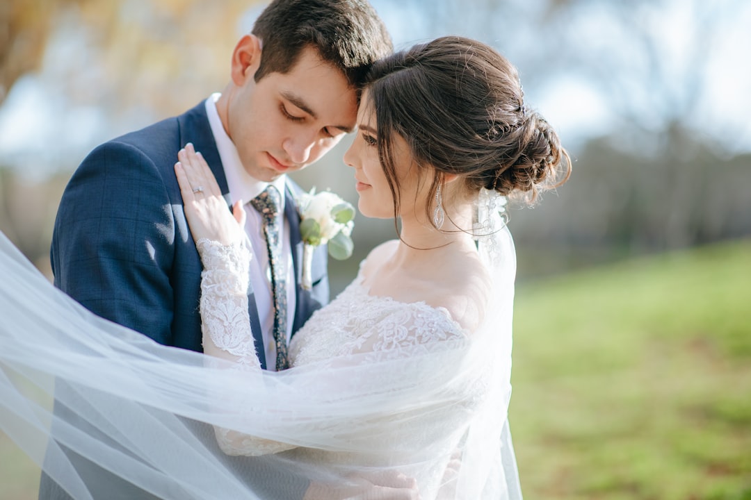
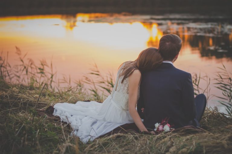
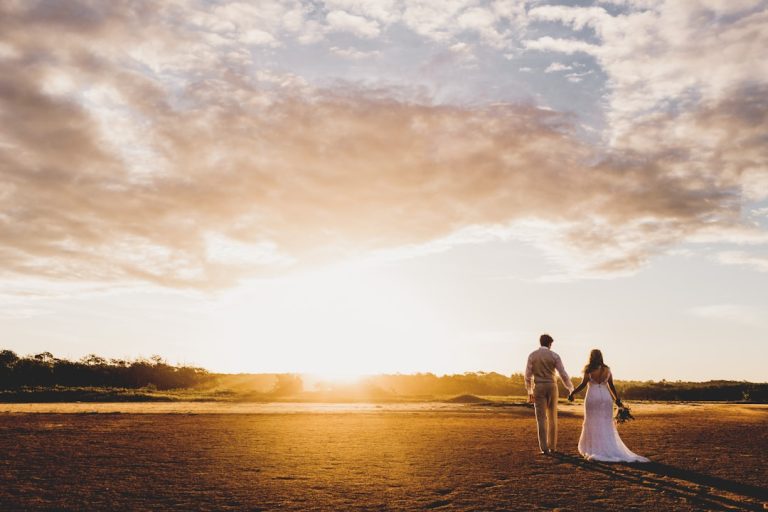
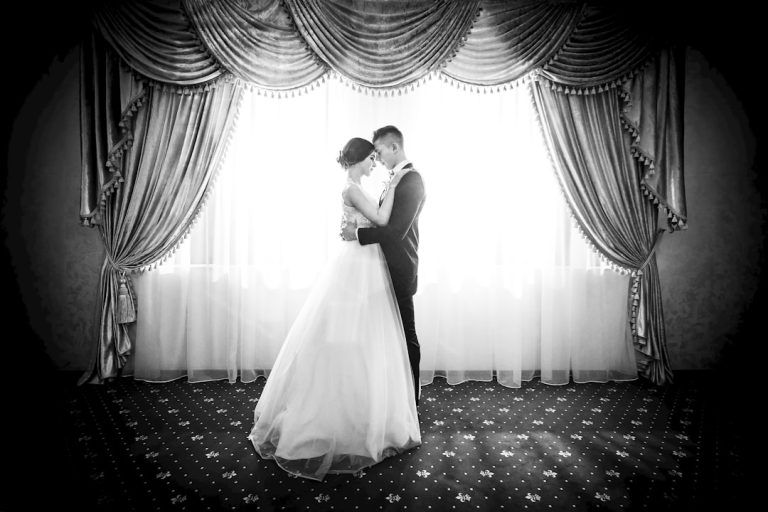
Real Wedding Inspiration: Typography Styles That Work Beautifully
Classic Black-Tie Wedding
For a formal celebration, pair a high-contrast serif with a clean sans serif. Use elegant uppercase names on the invitation and keep the body text minimal.
This style works beautifully for:
- ballroom weddings
- city hotel weddings
- evening receptions
Romantic Garden Wedding
A soft serif paired with a graceful script accent can feel airy and romantic. Use the script only for names or a short phrase like “Together With Their Families.”
This is ideal for:
- floral weddings
- outdoor ceremonies
- pastel color palettes
Modern Minimal Wedding
For a modern look, use a geometric sans serif with a subtle serif accent. Keep layouts spacious and let the typography feel quiet and intentional.
This style suits:
- gallery venues
- industrial spaces
- contemporary city weddings
Vintage-Inspired Wedding
Choose a serif with old-world character and pair it with a delicate script or small caps. This gives the suite a timeless, heritage-inspired feel without looking outdated.
Visual Inspiration
Branding Elements That Tie the Wedding Together
Typography is one of the core elements of wedding branding, but it works best when it supports the full visual system.
Logos and Monograms
A custom monogram or wedding logo can appear on invitations, wax seals, cocktail napkins, and thank-you cards. Typography often forms the foundation of that mark, especially when the couple wants a distinctive identity.
Invitations
The invitation suite sets the tone for the entire celebration. Fonts should reflect the overall wedding style while remaining readable and elegant. This is where hierarchy matters most.
Signage
Welcome signs, seating charts, bar menus, and ceremony signs all benefit from clear, consistent typography. A strong font system ensures everything feels cohesive from the moment guests arrive.
Typography Resources
Couples and designers looking to refine their font choices can explore wedding typography resources at fonts.wedding for inspiration, pairing ideas, and style direction.
Key Takeaways for Brides
- Choose fonts that match the overall mood of the wedding.
- Use no more than two or three font families for a polished result.
- Prioritize readability for both print and digital formats.
- Keep typography consistent across invitations, signage, and branding.
- Test fonts at actual size before finalizing any design.
- Use accent scripts sparingly for a more luxurious feel.
FAQ: Wedding Typography Trends 2026
What fonts work best for wedding invitations?
The best fonts for wedding invitations are usually elegant serif fonts, clean sans serifs, or refined scripts used as accents. The key is balancing beauty with readability.
How do I choose wedding typography?
Start by defining the wedding style, then choose fonts that reflect that mood. Consider venue, color palette, formality, and whether the typography will be used in print, digital, or both.
What wedding design trends are popular in 2026?
In 2026, popular wedding design trends include editorial serif fonts, minimalist sans serifs, soft handwritten accents, and high-contrast font pairings. Clean, cohesive branding is also a major focus.
Can I use script fonts for wedding signage?
Yes, but only if the script remains easy to read from a distance. Script fonts work best as accents, while the main information should be set in a clearer font.
How many fonts should a wedding design use?
Most wedding designs look best with two fonts, or three at most. This keeps the stationery suite cohesive and prevents the design from feeling crowded.