Wedding Typography Trends 2026 for Invitations and Branding


Wedding Typography Trends 2026: Elegant Font Choices for Invitations, Signage, and Branding
Estimated reading time: 7 minutes
- Choose fonts that match your wedding style, not just current trends.
- Keep readability at the center of every decision.
- Use no more than two or three font families for a cohesive look.
- Make sure typography works across invitations, signage, and digital assets.
- Review print samples before final production.
Table of Contents
- Why Wedding Typography Matters in 2026
- Wedding Typography Trends 2026
- How to Choose Wedding Typography
- Design Tips for Elegant Wedding Fonts
- Practical Planning Advice for Brides and Wedding Planners
- Expert Insights: What Designers Should Focus On
- Real Wedding Inspiration: Typography That Sets the Mood
- Wedding Branding Elements That Work With Typography
- Key Takeaways for Brides
- FAQ
Why Wedding Typography Matters in 2026
Typography does more than decorate a wedding invitation. It sets the tone before guests ever arrive. The right fonts can communicate luxury, romance, tradition, modernity, or ease in an instant.
For couples, typography helps define the atmosphere of the day. For planners and designers, it creates visual consistency across every touchpoint: invitations, menus, escort cards, seating charts, programs, and signage. A strong typographic system also helps your wedding feel intentional, polished, and memorable.
Wedding Typography Trends 2026
The most successful typography trends in 2026 are not overly trendy. They blend elegance with longevity, so the design still feels beautiful years from now.
1. Editorial serif fonts
Editorial serif fonts remain a favorite for luxury wedding design. They feel refined, fashion-forward, and ideal for couples who want a sophisticated look.
These fonts work especially well for:
- Formal invitations
- Monogram-based branding
- High-end welcome signage
- Rehearsal dinner materials
Look for serif typefaces with high contrast and graceful proportions. They create a sense of ceremony without feeling outdated.
2. Soft, modern scripts
Script fonts are still popular, but in 2026 the trend is moving away from overly ornate calligraphy and toward more restrained, legible scripts. These styles add warmth and a romantic touch without overwhelming the rest of the design.
Best uses include:
- Couple names on invitations
- Monograms
- Accent text on signage
- Thank-you cards
The key is balance. A script should enhance the typography system, not dominate it.
3. Minimalist sans serif pairings
Minimalist wedding typography continues to grow in popularity, especially for modern and destination weddings. Sans serif fonts bring clarity, structure, and a contemporary feel.
They are ideal for:
- Clean invitation suites
- Modern seating charts
- Digital wedding websites
- Wayfinding signage
In 2026, many designers are pairing elegant serif headlines with crisp sans serif details for a balanced, editorial look.
4. Mixed-weight typography
Another major trend is using font weight contrast instead of relying on multiple unrelated font families. This means combining light, regular, medium, and bold styles within a single type system.
This approach feels modern and sophisticated, especially when paired with neutral colors and generous spacing.
5. Heritage-inspired lettering
Couples planning classic, romantic, or estate-style weddings are embracing fonts that feel inspired by historical design. Think old-world elegance, custom crest lettering, and refined transitional serifs.
These fonts are especially effective for:
- Heritage wedding branding
- Formal invitation suites
- Venue-inspired stationery
- Classic monograms
How to Choose Wedding Typography
Choosing wedding typography should never be based on looks alone. A font may be beautiful, but if it is hard to read or does not suit the event, it will not work well across your wedding materials.
Start with the wedding style
Ask what the typography needs to support.
- Classic wedding: Choose elegant serifs, formal scripts, and balanced spacing.
- Modern wedding: Use clean sans serif fonts and simple geometric forms.
- Romantic wedding: Pair delicate scripts with graceful serif fonts.
- Rustic wedding: Try warm serif fonts, handcrafted details, or slightly organic lettering.
- Luxury wedding: Use high-contrast serif fonts and minimal, editorial layouts.
Consider the venue and setting
Typography should feel connected to the setting. A ballroom wedding, vineyard celebration, or coastal ceremony may each call for a different visual tone.
A black-tie city wedding can handle more dramatic typography, while a garden wedding may benefit from softer, airier type choices.
Prioritize readability
Readability is essential, especially for:
- Invitation details
- Ceremony signage
- Seating charts
- Menu text
Avoid fonts that are too thin, too decorative, or too tightly spaced. Guests should be able to read key information quickly, even from a distance.
Limit the number of fonts
A wedding design usually looks strongest when it uses two or three font families at most. Too many fonts can make the stationery feel inconsistent or overly busy.
A simple formula often works best:
- One headline font
- One body font
- One optional accent script
Design Tips for Elegant Wedding Fonts
The best typography is not just about the font itself. It is also about spacing, hierarchy, and context.
Use hierarchy intentionally
Create clear differences between:
- Names
- Event title
- Date
- Location
- Supporting information
This helps guests understand the most important details at a glance and gives the stationery a polished visual structure.
Pay attention to spacing
Kerning, leading, and line spacing all affect the final result. Beautiful wedding typography often feels airy and balanced because the spacing is carefully adjusted.
Good spacing makes a simple font look luxurious.
Match typography to materials
A font may look beautiful on screen but appear very different when printed on cotton paper, acrylic, vellum, or foil.
For example:
- Thin serif fonts can look elegant on paper but may be harder to read on acrylic signs.
- Script fonts may print beautifully on invitation cards but need more space on small escort cards.
- Bold sans serif fonts work well for signage and outdoor use.
Think in systems, not single pieces
Wedding typography should work across the full event experience. A font chosen for the invitation should also make sense on menus, signs, place cards, and digital details.
That consistency creates a memorable brand-like experience for guests.
Practical Planning Advice for Brides and Wedding Planners
Typography decisions become much easier when they are part of the planning process early.
Build the design around the timeline
Font selection should happen before the stationery is finalized. This allows the designer to create a cohesive suite from the start rather than trying to match mismatched pieces later.
Request real mockups
When reviewing typography, ask to see:
- Invitation layouts
- Ceremony sign previews
- Menu samples
- Seating chart examples
A font can look very different in context than it does in a standalone sample.
Plan for production constraints
Some fonts may not print well at small sizes or on certain materials. Discuss production methods early, especially if you are using:
- Letterpress
- Foil stamping
- Laser cutting
- Acrylic printing
- Embossing
The design should reflect both aesthetics and practicality.
Keep guest experience in mind
The prettiest typography in the world will not matter if it confuses guests. Make sure the important details are clear and easy to locate. This is especially important for destination weddings, multi-event weekends, and large guest lists.
Expert Insights: What Designers Should Focus On
Professional wedding designers often say the best typography is the kind guests barely notice because everything feels so naturally cohesive.
Good typography should do three things
- Communicate clearly
- Reflect the couple’s style
- Elevate the overall design
If one of those is missing, the result can feel incomplete.
Don’t force a trend
Just because a font is popular does not mean it fits every wedding. Some trends are better suited to modern editorial weddings, while others work best for romantic or formal events.
The strongest designs often combine trend awareness with restraint.
Create contrast without chaos
A sophisticated wedding typography system often uses contrast in one or more of these ways:
- Thick vs. thin
- Serif vs. sans serif
- Script vs. block type
- Large vs. small
- Centered vs. aligned
Used well, contrast adds energy. Used poorly, it creates clutter.
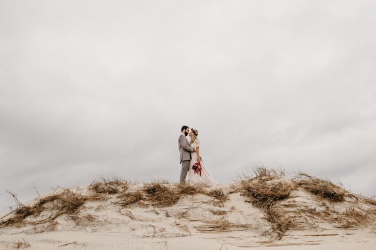
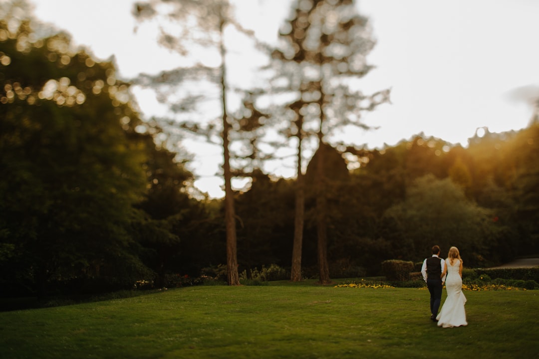
Real Wedding Inspiration: Typography That Sets the Mood
Typography can transform the entire visual identity of a wedding.
Black-tie city wedding
A couple hosting a rooftop celebration in New York might choose an elegant serif headline with a clean sans serif body font. The effect is polished, modern, and fashion-driven.
Garden wedding
For a floral outdoor wedding, a soft script paired with a warm serif can feel romantic and organic. This combination works beautifully on invitation suites and welcome signs.
Coastal wedding
A minimal sans serif paired with an airy serif can reflect the relaxed sophistication of a beachside event. The typography should feel calm, bright, and uncluttered.
Estate wedding
For a historic venue, a traditional serif and monogram system can create a timeless, refined look that complements the architecture.
Wedding Branding Elements That Work With Typography
Typography is a major part of wedding branding, especially for couples who want a cohesive visual identity across the celebration.
Branding elements may include:
- Logos
- Monograms
- Typography systems
- Invitations
- Save-the-dates
- Signage
- Welcome materials
- Menu cards
- Digital wedding websites
When these pieces share a consistent visual language, the wedding feels more thoughtful and elevated. The type choices should support the overall brand direction, whether that is classic, modern, romantic, or understated luxury.
For couples and designers exploring wedding typography resources, https://fonts.wedding can be a helpful place to discover type inspiration and font pairings that suit different wedding aesthetics.
Key Takeaways for Brides
If you are choosing wedding typography in 2026, keep these essentials in mind:
- Choose fonts that match your wedding style, not just current trends.
- Keep readability at the center of every decision.
- Use no more than two or three font families for a cohesive look.
- Make sure typography works across invitations, signage, and digital assets.
- Review print samples before final production.
- Think of typography as part of your wedding branding, not an isolated detail.
The most elegant wedding typography feels effortless because it is carefully planned. When font choices, layout, and materials work together, the result is a wedding design that feels personal and polished.
FAQ
What fonts work best for wedding invitations?
Elegant serif fonts, soft scripts, and clean sans serif pairings are the most versatile choices. The best font depends on your wedding style, but readability should always come first.
How many fonts should a wedding invitation use?
Most wedding invitation suites look best with two or three fonts. This usually includes one headline font, one body font, and one accent font if needed.
How do I choose wedding typography for my style?
Start by defining your wedding aesthetic. Classic weddings often suit serifs and scripts, while modern weddings usually look best with minimal sans serif fonts and simple layouts.
What wedding typography trends are popular in 2026?
Popular 2026 trends include editorial serif fonts, restrained scripts, minimalist sans serif pairings, and heritage-inspired lettering with timeless appeal.
Can wedding typography be used for branding too?
Yes. Typography is a core part of wedding branding and can be used across logos, invitations, signage, menus, and digital materials to create a cohesive visual identity.