Wedding Typography Trends 2026 Best Fonts and Design Ideas


Wedding Typography Trends 2026: Fonts, Styles, and Design Ideas for Modern Celebrations
Estimated reading time: 8 minutes
- Choose typography that reflects the tone of the wedding, not just current trends.
- Keep readability a top priority across all printed and digital pieces.
- Use two or three fonts max for a polished, cohesive look.
- Extend typography choices beyond invitations to signage, menus, and wedding websites.
- Test fonts in real layouts before final printing.
- Think of typography as part of the full wedding brand, not just decoration.
- What Wedding Typography Means in 2026
- Top Wedding Typography Trends for 2026
- Design Tips for Choosing the Right Wedding Fonts
- Practical Planning Advice for Brides and Wedding Designers
- Real Wedding Inspiration: Typography Styles That Work Beautifully
- Branding Elements That Make Wedding Typography Feel Complete
- Expert Insights: What Makes Wedding Typography Feel Premium
- Key Takeaways for Brides
- FAQ: Wedding Typography Trends 2026
What Wedding Typography Means in 2026
Typography is more than choosing a pretty font. In weddings, it shapes the entire visual voice of the celebration. The right typography can make a wedding feel formal, romantic, editorial, rustic, minimalist, or luxurious.
In 2026, couples are leaning toward wedding typography that feels:
- polished but not overly traditional
- personal without becoming hard to read
- visually cohesive across print and digital pieces
- elevated enough to create a memorable first impression
This is especially important because typography now appears everywhere: invitation suites, welcome signs, seating charts, menus, escort cards, wedding websites, and even social media graphics.
Top Wedding Typography Trends for 2026
1. Elegant Serif Fonts with Strong Character
Serif fonts remain a favorite for wedding invitations and branding because they bring instant sophistication. In 2026, designers are choosing serifs with high contrast, refined curves, and editorial influence.
These fonts work especially well for:
- luxury wedding invitations
- formal black-tie weddings
- classic monogram branding
- ceremony programs and place cards
The best serif styles feel timeless, not stiff. Look for fonts with graceful letterforms and enough spacing to stay readable in smaller sizes.
2. Soft Script Accents
Script fonts are still popular, but the trend is shifting away from overly ornate calligraphy. Instead, couples are selecting soft, modern scripts that add warmth without overwhelming the design.
Use script fonts for:
- names on wedding invitations
- couple monograms
- signature details on signage
- highlight words in a headline
A script font looks best when paired with a clean serif or sans serif. This creates contrast and helps the overall design feel polished.
3. Minimal Sans Serif Pairings
Minimalist weddings continue to favor sans serif fonts because they feel modern, clean, and versatile. In 2026, sans serif typography is often paired with more expressive display fonts to create a balanced look.
This style works beautifully for:
- modern wedding branding ideas
- contemporary invitation suites
- editorial wedding websites
- sleek table signs and menus
Sans serif fonts are especially useful when the wedding design includes a lot of white space or monochrome color palettes.
4. High-Contrast Luxury Typography
Luxury wedding typography is becoming more dramatic. High-contrast fonts with thin stems and bold strokes create a fashion-forward, editorial feel.
This trend suits:
- upscale destination weddings
- couture-inspired wedding branding
- statement invitation covers
- custom wedding logos
The key is to use these fonts sparingly. A dramatic typeface works best when paired with simple layouts and premium paper choices.
5. Mixed Font Systems
One of the strongest trends in 2026 is the use of layered font systems. Rather than relying on a single typeface, couples are mixing two or three complementary fonts to create hierarchy and visual interest.
A typical combination might include:
- one serif font for names or titles
- one sans serif font for details
- one script font for accents
This approach allows designers to create a wedding brand that feels custom and editorial without looking cluttered.
Design Tips for Choosing the Right Wedding Fonts
Prioritize readability first
A beautiful font is useless if guests cannot read the details. This matters especially for invitation information such as date, time, venue, and RSVP instructions.
Choose fonts that remain clear at smaller sizes, particularly for:
- invitation inserts
- menu cards
- table numbers
- wedding signage fonts
Match typography to the wedding mood
Typography should reflect the atmosphere of the celebration.
- Formal weddings: classic serif fonts, refined spacing, symmetry
- Modern weddings: minimal sans serifs, bold layouts, clean lines
- Romantic weddings: soft scripts, delicate serif pairings
- Rustic weddings: organic type, handwritten accents, relaxed structure
- Luxury weddings: high-contrast serif fonts, elegant spacing, editorial styling
Use contrast with intention
Good typography design depends on contrast. That may mean pairing:
- thick and thin letterforms
- serif and sans serif fonts
- uppercase and lowercase text
- script accents and simple body copy
Contrast creates hierarchy, which helps guests quickly understand the most important information.
Think beyond invitations
A font may look beautiful on paper but fail on signage or digital screens. Always consider how the typography will appear across the entire wedding experience.
Ask these questions:
- Does it work on a small mobile wedding website?
- Is it legible on a large welcome sign?
- Does it print cleanly on textured paper?
- Will it hold up in social media graphics?
Practical Planning Advice for Brides and Wedding Designers
Start with the invitation suite
The invitation suite usually sets the visual tone for the entire wedding. If the typography is elegant and cohesive here, it becomes much easier to extend that style into the rest of the event.
Build the suite around:
- a title font for names or the event name
- a detail font for logistics
- a complementary accent font for personality
Keep the font count limited
Too many fonts can make a wedding design feel inconsistent. In most cases, two or three fonts are enough.
A reliable formula is:
- 1 display font
- 1 supporting font
- 1 accent font, optional
This keeps the design polished and easier to execute across printed pieces.
Create a typography hierarchy
Not every element should be treated equally. Use font size, weight, spacing, and style to show what matters most.
For example:
- Couple names: large display font
- Wedding date: medium serif or sans serif
- Event details: smaller, clean type
- Notes and instructions: simple, highly readable font
This hierarchy helps both the design and the user experience.
Order samples before final printing
Typography can look very different in print than on a screen. Paper texture, ink color, and scale all affect the final result. Before approving a full print run, test the font styles in real layouts.
This is especially important for:
- letterpress invitations
- foil-stamped stationery
- signage on acrylic or mirrored surfaces
- menus printed on textured paper
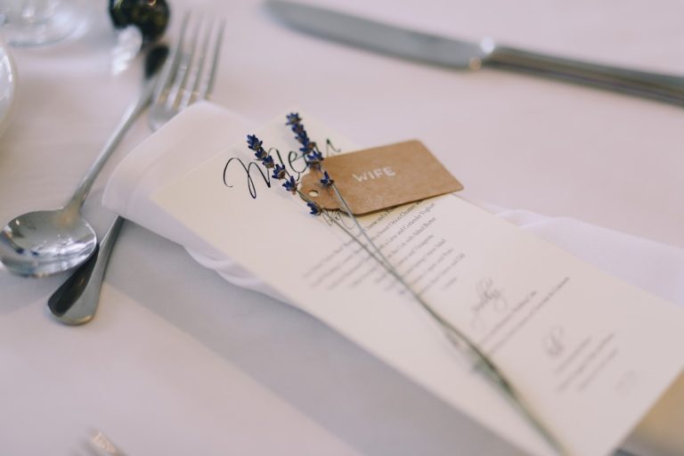
Real Wedding Inspiration: Typography Styles That Work Beautifully
Black-tie editorial wedding
A black-tie wedding often benefits from a high-contrast serif paired with a minimal sans serif. This combination feels sophisticated, timeless, and slightly dramatic.
Best uses:
- formal invitations
- ceremony programs
- table names
- escort wall typography
Garden romance wedding
For a garden or outdoor celebration, a softer script or handwritten accent can add warmth without feeling overly ornate. Pair it with a classic serif for balance.
Best uses:
- welcome signs
- vow books
- menu cards
- place settings
Minimal modern wedding
Minimal weddings often lean on typography to create visual interest. Since the design is stripped back, the font choice becomes more important.
Best uses:
- bold all-caps names
- clean sans serif body copy
- restrained monograms
- simple directional signage
Destination wedding branding
Destination weddings often combine relaxed elegance with a strong sense of place. Typography can echo that by using open spacing, natural movement, and slightly softer forms.
Best uses:
- passport-style invitation details
- hotel welcome notes
- itinerary cards
- digital wedding branding
Branding Elements That Make Wedding Typography Feel Complete
Wedding branding is no longer just for planners and luxury events. Many couples now create a visual identity for their celebration, and typography is one of the most important pieces.
The most effective branding elements include:
- logos: custom monograms or wordmarks for invitations, cocktail napkins, and signage
- typography: fonts that stay consistent across every touchpoint
- invitations: the first major expression of the wedding style
- signage: welcome signs, seating charts, and directional pieces that reinforce the look
When these elements work together, the wedding feels more cohesive and memorable. Typography often acts as the visual thread connecting everything from the save-the-date to the last thank-you card.
For couples and designers looking to explore more wedding typography resources, https://fonts.wedding offers a useful starting point for discovering styles that suit different wedding aesthetics.
Expert Insights: What Makes Wedding Typography Feel Premium
Premium wedding typography is rarely about using the fanciest font. It’s about how the typography is handled.
Here’s what elevates the final result:
- generous spacing
- carefully chosen line breaks
- strong alignment
- restrained color palettes
- consistency across all printed and digital materials
A beautiful font can still feel amateur if it is squeezed too tightly, overused, or paired with too many competing styles. Luxury design usually feels calm, intentional, and well edited.
Key Takeaways for Brides
- Choose typography that reflects the tone of the wedding, not just current trends.
- Keep readability a top priority across all printed and digital pieces.
- Use two or three fonts max for a polished, cohesive look.
- Extend typography choices beyond invitations to signage, menus, and wedding websites.
- Test fonts in real layouts before final printing.
- Think of typography as part of the full wedding brand, not just decoration.
FAQ: Wedding Typography Trends 2026
What fonts work best for wedding invitations?
Elegant serif fonts, soft scripts, and clean sans serifs are the most popular choices. The best font depends on the wedding style, but readability and balance should always come first.
How do I choose wedding typography?
Start by defining the overall wedding mood. Then choose fonts that match that tone, work well together, and remain easy to read across invitations, signage, and digital materials.
What wedding typography trends are popular in 2026?
In 2026, popular trends include high-contrast serif fonts, soft modern scripts, minimal sans serif pairings, and mixed font systems that create a refined editorial look.
How many fonts should a wedding design use?
Most wedding designs look best with two or three fonts. This keeps the branding cohesive and prevents the stationery from feeling busy.
Is typography important for wedding branding?
Yes. Typography helps shape the entire visual identity of the wedding and influences everything from invitations to signage, menus, and wedding websites.