Talent Acquisition Insights on Top 10 Wedding Fonts


Top 10 Wedding Font Pairings and Visual Design Tips for Modern Brides
Estimated reading time: 7 minutes
Key takeaways:
- Typography communicates your wedding’s personality.
- Pair fonts thoughtfully to create cohesive visuals.
- Legible fonts are crucial for essential information.
- Consider color palettes when choosing fonts.
- Start the design process early to avoid last-minute stress.
Table of contents:
- Why typography matters for weddings
- Top trends in wedding design and how fonts support them
- Top 10 wedding font pairings (and where to use them)
- How to choose fonts for different wedding items
- Typography and wedding color palettes
- Practical, step-by-step font selection process for brides
- Common mistakes and how to avoid them
- Working with a wedding planner or stationery designer
- Designing a wedding logo or monogram
- Budget-friendly tips for brides
- How our wedding services help
- Asset inspiration (images and resources)
- Video resource
- Final checklist for typography-ready wedding stationery
- Actionable takeaways for brides
- Bring your wedding visual identity to life
Why typography matters for weddings
A wedding’s visual design is the first impression many guests receive — often through save-the-dates and wedding invitations. Typography sets tone and expectation: script fonts feel romantic, serif fonts signal tradition, and clean sans-serifs read modern and minimal. Beyond aesthetics, readable typography on invitations, seating charts, and signage ensures your guests know where to be and when.
Strong typography also supports your wedding branding. If you’re creating a wedding logo, monogram, or cohesive wedding color palettes and stationery suite, the right font pairings will unify those elements across both print and digital touchpoints (invitations, wedding websites, signage, programs, and even favors).
Top trends in wedding design and how fonts support them
Current trends include:
- Modern wedding: Clean layouts, neutral palettes, and minimalist typography. Pair a geometric sans-serif with an elegant, restrained serif for contrast.
- Rustic wedding: Textures, kraft paper, and hand-lettered scripts. Use organic serif fonts and casual script or hand-drawn display fonts.
- Boho wedding: Earthy tones, botanical motifs, and flowing scripts. Combine soft calligraphic scripts with light sans-serifs.
- Classic/traditional: Timeless serifs and formal scripts, often in black, gold, or deep jewel tones.
- Romantic/glam: Ornate scripts and high-contrast serif pairings with metallic accents.
Top 10 wedding font pairings (and where to use them)
- 1) Elegant Script + Refined Serif
- Use for: Formal invitations, day-of programs, wedding logos.
- Why: Script adds romance; serif adds readability for details.
- Example pairing: A flowing calligraphic script for names + Garamond or Baskerville for body copy.
- 2) Hand-Lettered Script + Casual Sans-Serif
- Use for: Boho wedding invites, signage, welcome notes.
- Why: Feels personal and relaxed; sans provides balance.
- Example pairing: A textured brush script with a clean geometric sans like Futura.
- 3) Modern Sans-Serif + High-Contrast Serif
- Use for: Minimalist invitations, seating charts, menus.
- Why: Contrast creates visual hierarchy; modern vibes.
- Example pairing: Helvetica Neue with Abril Fatface.
- 4) Vintage Serif + Typewriter or Slab
- Use for: Rustic wedding invites, RSVP cards, envelopes.
- Why: Nostalgic feeling with grounded, sturdy accents.
- Example pairing: Caslon with a subtle slab or typewriter font.
- 5) Script Monogram + Clean Sans for Info
- Use for: Wedding logo, stamps, place cards.
- Why: Monogram is decorative; sans keeps the information clear.
- Example pairing: Elegant single-letter script for initials + Roboto for details.
- 6) Playful Display + Neutral Serif
- Use for: Casual, quirky weddings, fun signage.
- Why: Display fonts set the mood; serif anchors the text.
- Example pairing: A bold display for headings + Georgia for content.
- 7) Minimalist Serif + Thin Sans
- Use for: High-end modern weddings, monochrome palettes.
- Why: Subtle sophistication and excellent legibility.
- Example pairing: Didot with a thin Avenir.
- 8) Brush Script + Rustic Serif
- Use for: Garden or outdoor weddings, escort cards.
- Why: Organic, handmade appearance.
- Example pairing: A wet-brush script with a rustic slab serif.
- 9) Calligraphic Script + Handwritten for Accents
- Use for: Menus, vows booklets, intimate stationery.
- Why: Luxurious primary script with human touch accents.
- Example pairing: Copperplate style script + casual handwritten for PS notes.
- 10) Monospaced Accent + Classic Serif
- Use for: Modern-rustic crossovers, programs, timeline cards.
- Why: Unexpected texture and modern edge added to traditional base.
- Example pairing: A monospaced font like Courier New as accents + a classic serif.
How to choose fonts for different wedding items
Consider the following for each item:
- Save-the-date: Big, expressive typography that communicates the tone. Script or display fonts work well at large sizes.
- Invitation cover: Use your most decorative font here (monogram or names). Keep RSVP and venue details in a legible serif or sans.
- RSVP card: Make the response options crystal clear — sans-serif with adequate spacing.
- Ceremony programs: Serif fonts are traditional and readable in dense copy.
- Menus and place cards: Choose the most legible font for menus; use script sparingly for names.
- Signage: Use bolder, larger weights; contrast text and background for readability from a distance.
- Wedding website: Web-safe fonts or webfonts that match print selections to keep design consistent.
Typography and wedding color palettes
Fonts and color palettes must work together. Dark scripts on light backgrounds read elegant; light scripts on dark paper can be dramatic but need strong contrast to remain legible. Metallic foils (gold, rose gold) pair beautifully with deep jewel tones and cream papers — but remember readability: foils can lose detail on thin scripts. For rustic weddings, kraft paper and muted greens pair well with warm serif fonts and hand-lettered scripts.
Practical, step-by-step font selection process for brides
Follow these steps:
- Define your wedding theme and mood words (e.g., romantic, modern, rustic).
- Collect inspiration: Pinterest boards, other invites, color swatches.
- Choose a dominant font for names or logo (the “hero”).
- Choose a secondary font for body copy and details (legibility is priority).
- Add a third accent font only if necessary (for place cards or headings).
- Test pairings in actual sizes and on the paper you’ll print on.
- Check web compatibility for your wedding website; use Google Fonts or host webfonts for consistent look.
- Finalize with your stationer or designer and request proofs.
Common mistakes and how to avoid them
Avoid these pitfalls:
- Too many decorative fonts: Limit to 2–3 fonts to avoid clutter.
- Low-contrast script on patterned paper: Ensure legibility by testing.
- Small script for essential info: Names can be large and decorative; time and venue must be clear and readable.
- Forgetting web fonts: Establish consistency between print and digital.
- Ignoring accessibility: Use sufficient contrast and font sizes for older guests.
Working with a wedding planner or stationery designer
When collaborating, keep in mind:
- Share your mood board and must-have items early.
- Provide examples of fonts and colors you like — designers appreciate direction.
- Ask for a limited font palette (they’ll often suggest pairings that reproduce well in print).
- Request mockups for different materials (invites, signage, menus, favors).
- Confirm production details: printing method (digital vs. letterpress), paper stock, foil, embossing — each affects how fonts appear.
Designing a wedding logo or monogram
A wedding logo or monogram is a compact way to brand your entire wedding. It can appear on invites, favors, menus, and even signage. Keep these tips in mind:
- Simplicity: Keep the monogram readable at small sizes.
- Flexibility: Create versions in one color, negative, and full color.
- Typeface selection: Use a distinctive script or serif for the mark and a clean sans for supporting text.
- File types: Request vector files (SVG, EPS) so the logo scales across applications.
Budget-friendly tips for brides
Consider these strategies:
- Use free or low-cost webfonts (Google Fonts) for your website while choosing similar print fonts.
- Print simple elements at home — place cards or favors — using the same font palette.
- Use digital mockups to avoid costly reprints.
- Consider semi-custom suites from designers who provide template-based options and minor personalization.
How our wedding services help
As consultants in wedding design and planning, we guide couples through font selection, wedding themes, and cohesive brand-building. We provide:
- Typography consultations to define your visual voice.
- Stationery design coordination with recommended printers.
- Complete visual concepts: color palettes, logos, invitation suites, signage.
- Day-of production oversight to ensure your fonts and design elements are executed correctly.
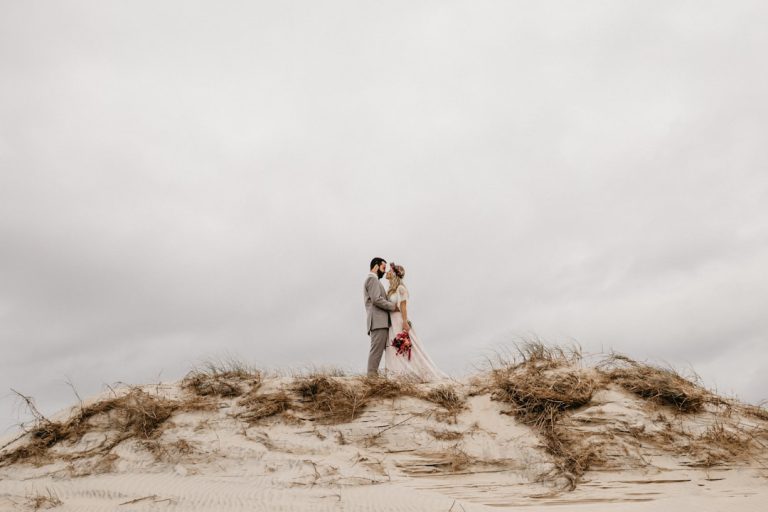
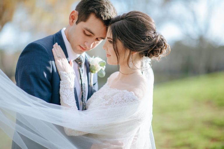
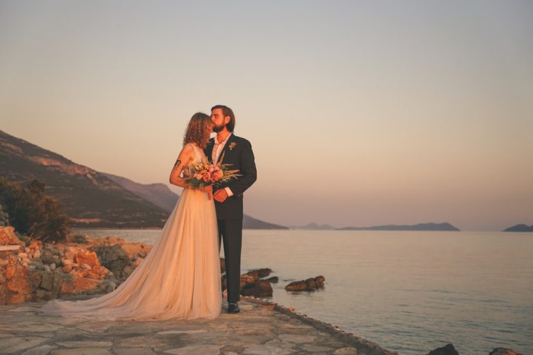
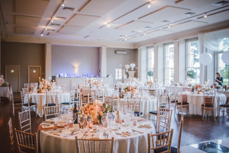
Asset inspiration (images and resources)
Explore these links:
Video resource
Final checklist for typography-ready wedding stationery
Ensure you have completed:
- [ ] Mood and theme defined with 3–5 descriptive words.
- [ ] Hero font chosen for names/monogram.
- [ ] Secondary readable font selected for details.
- [ ] Accent font limited to one, used sparingly.
- [ ] Color palette and paper stock chosen and tested.
- [ ] Digital and print fonts reconciled for consistency.
- [ ] Proofs requested in actual sizes before final printing.
Actionable takeaways for brides
Remember:
- Start early: Choose fonts and design direction at least 4–6 months before invitations print deadlines (6–8 months for complex letterpress or foil).
- Prioritize legibility for date, time, and venue; make the decorative choices for names and headers.
- Keep the palette cohesive: extract type colors from your wedding color palettes for consistent design.
- Test everything: print one test copy, check contrast and readability, and refine.
- Lean on experts: a short design consultation can prevent reprints and save time.
Bring your wedding visual identity to life
Typography is a high-impact, accessible way to elevate your wedding design. Whether you’re leaning into a rustic wedding, boho wedding, or modern wedding aesthetic, considered font pairings and a cohesive visual system will make your wedding materials memorable and functional.
Ready to explore typefaces and download curated wedding fonts and designs? Visit https://fonts.wedding to browse collections tailored for every wedding theme and download fonts, logos, and stationery templates to jumpstart your design.
If you’d like a personalized consultation, our team can help you select fonts, create a wedding logo, and develop a full stationery suite tailored to your wedding ideas and budget. Let’s design a day that looks as good on Instagram as it feels in real life.
Explore fonts, download beautiful templates, or schedule a design session at https://fonts.wedding — and make your wedding visuals unforgettable.